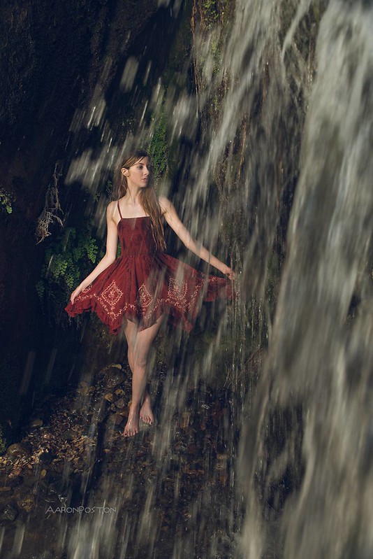
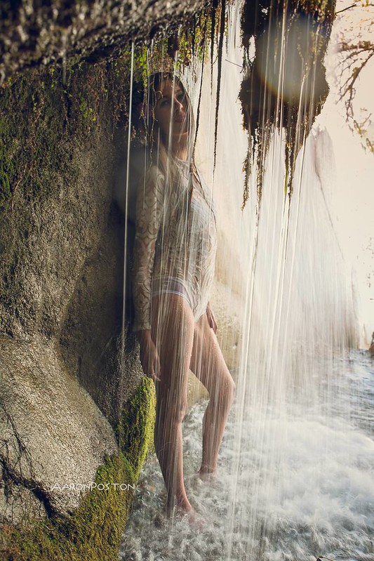
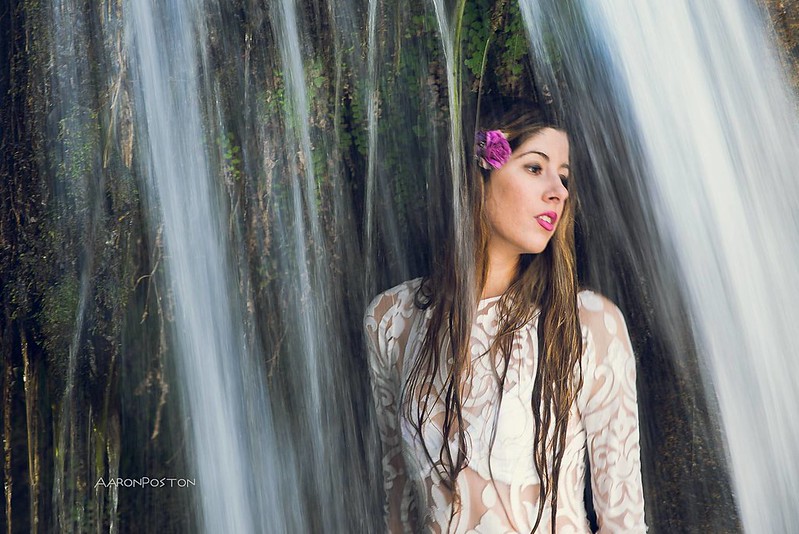
Second, I love all 3. I love shots that play with water and these are good ones.
With the first shot, he negative space in the upper left plus some of the water drops bother me a little but I still love the shot. For the second shot, three things both me...the falling water that isn't vertical but at an angle, the mass of moss which is silhouetted (and drew my attention) and the lens flare on it. But again, a really terrific shot and I like it a lot despite those 3 elements. For #3, it's a beautiful shot and I love how the break in the water frames the model. I don't like the bra she's wearing...it's not that I wanted to see a wet top on a braless model....you can always eliminate nipple marks if need be. But you've got this beautiful lace that suddenly disappears with the triangle of the bra cup..ruins the flow and look of the shot for me. I like it a bunch but it doesn't feel as special and unique and artistic as the first two.
I agree with Joe, BUT as they are these are wonderful photos and something well worth printing and displaying large high quality prints! They would look great on the wall of your studio!!!
I'll go with the flow... (*Groan*) A lovely set and a great location. #1 takes the prize.
#2 would be better imho if you'd level it so the water streams are vertical rather than slightly backward running, it's only a degree or two but it was the first thing that jumped out and splashed me in the face.
I guess it would be more useful if I gave some constructive feedback. The first photo is the only one that I really like, but I think you could brighten the red a bit to make it pop. Number 2 could have been, but either her bathing suit separated from her body or she was posed at a very unflattering angle. Her stomach should have tucked behind her breast to give her some curvature/dimension if you will. The way it was shot, it looks like her body goes straight down starting from the breast to the pelvic area. It looks unwanting. I also agree with the angle of the water pouring down.


![[No title]](/data/xfmg/thumbnail/42/42057-1509913128bb1db2bc11235c05832fd4.jpg?1619739993)
![[No title]](/data/xfmg/thumbnail/32/32930-09414fc020c2a60a456ff59a05c5ef8f.jpg?1619735759)
![[No title]](/data/xfmg/thumbnail/42/42055-105f2ee23a1fd79c786de42c5578274b.jpg?1619739992)

![[No title]](/data/xfmg/thumbnail/32/32933-a3726bc86a7c36fb222612f8aeab6b84.jpg?1619735763)