What's new

One Image for CC...

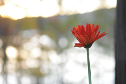
Not it's not. The opposite. The eye goes from left to right and ends on the flower. That's why it works.

I like starting somewhere I suppose.I went to the space first, then the flower.


That is good use of negative space.

most of us are trained to work left to right.

This works because start at little and pull you to the flower.

I feel it makes this simple image much more powerful


i agree, on the originol i started looking at the background and my eye worked towards the flower. when it was flipped it was heres the flower then my eye goes away to the background pulling itself away from the flower. kinda like a movie, you work up to the climax.
 
Usually the eye leads from left to right, so this one is the opposite, but it does work.

Not it's not. The opposite. The eye goes from left to right and ends on the flower. That's why it works.
I don't think that's true in this case. The red is what caught my eye first. And then I was awkwardly backtracking right to left.

I like the crop and the defocused space.
 
I like starting somewhere I suppose.I went to the space first, then the flower.


That is good use of negative space.

most of us are trained to work left to right.

This works because start at little and pull you to the flower.

I feel it makes this simple image much more powerful


i agree, on the originol i started looking at the background and my eye worked towards the flower. when it was flipped it was heres the flower then my eye goes away to the background pulling itself away from the flower. kinda like a movie, you work up to the climax.

well put.
 
Usually the eye leads from left to right, so this one is the opposite, but it does work.

Not it's not. The opposite. The eye goes from left to right and ends on the flower. That's why it works.

Totally agreed. The eyes reared left to right, at least for us westerners. So with the original version, I feel like I enter from the left, then travel right until I find the flower, and then rest on it. With the flip, I feel Ike I enter from the left, immediately find the flower, but en continue traveling right, where I find nothing. The original works better, IMO.

The only real negative critiques I would have, is that I think tithe flower is a bit over-saturated and it seems like the red channel is slightly clipped. I would pull it back in post. And I also find the bright bokeh spot too bright, and i feel like they pull attention away from the flower. If those weren't so hot, I think it would be stronger.

Also, OP. I love the litte limerick in your signature. Where did you find that, and who is it attributed to? It's a perfect motto for photography!
 
It's very odd how the flower looks wrong in the flip, it looks uncomfortable, i absolutely adore the original though. Even your little signature on it works perfectly where it is.

The out of focus detail leads to the flower beautifully, like a trail of flower pollen.

Gorgeous :heart:
 
I think it is always interesting to see the original unedited photos so I will post the SOOC for this image.


Norris Lake 2010 457 by Matt Francosky, on Flickr

You can see what I am talking about in regards to the distracting background that had to be cropped out.

Thanks for all the compliments.


p!nK
 
You could work some magic in photoshop or lightroom to tone down the background if that's your thing.
 
The eyes reared left to right, at least for us westerners.

That as been a question for me for a while but I've not yet met anyone from a culture that reads in a different direction and is trained in design to tell me how they compose images... :D
 

Create an account or login to comment

You must be a member in order to leave a comment

Create account

Create an account on our community. It's easy!

Log in

Already have an account? Log in here.

Back
Top Bottom