What's new

Oranges...

TamiAz

Been spending a lot of time on here!
Joined
Sep 26, 2011
Messages
1,004
Reaction score
524
Location
Arizona
Can others edit my Photos
Photos OK to edit
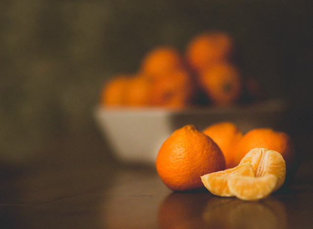
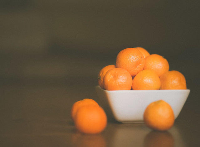
I'm really into fruit lately... I was playing with my new camera and messing with the ISO. This was shot in low light so I had my ISO bumped up to 6400. Maybe too much noise???

8385689700_221737a270_z.jpg


8384606655_a2f7e420a7_z.jpg
 
I dunno if it's the noise that hurts the first shot, as much as the lack of color richness; the loss of color richness, and the loss of overall dynamic range, are the things that really elevated ISO levels seem to impair the most with today's d-slrs. I think the noise is not nearly as objectionable as the weak color, and the lack of richness. I mean, I can see some very even noise...it's even, and not blotchy, and so it's not all "that bad"...it's visible, yes, but not full of chroma noise (not full of colored speckles). But the color is weak, and the image looks pale and washed out.
The composition and the arrangement of the fruit in shot #1 is not too bad though!

 
^could that have been put in post? the "washed out" look is everywhere...
 
Thanks for the feedback, gentlemen... I see what your saying about the one segment being out of focus. :)

^could that have been put in post? the "washed out" look is everywhere...

Yes, it was done in post. I was playing with some presets and wanted a more matte look.
 
I like the first best. The fruit bowl in the back gives some nice depth to the photo. Noise doesn't bother me.
 
I really like the first. And I like the look you went for with these.
 
I like the first one except the OOF slice.... you do not even need that slice as it makes the group look clumped....worth a redo
 
I like the first one best, and I don't mind the noise, I even quite like it! I like the matt look you're going for too
 
Well done is #1; yes, one slice that is in the foreground should not have been OOF. Leaving that, i liked it very much :D
 
First one is nice. The background has that great painterly-still-life look, or would if you pushed the bottom half of the tonal range down a bit.

I don't mind the out of focus foreground segment at all.

Derrel's hit it on the head with the washed out color. Try it in b&w, or desaturate a moderate amount to make it look deliberate rather than a technical problem?
 
When you look at grain you can also consider it as texture which can work in certain situations. In this situation it works for me. The one draw back in this image is that if you are shooting macro/ detail work make sure your main subject is pin sharp. But overall I like it.
 
I dunno if it's the noise that hurts the first shot, as much as the lack of color richness; the loss of color richness, and the loss of overall dynamic range ...snip...

But the color is weak, and the image looks pale and washed out.

I agree with Derrel here, this is what hurts the shots far more than high ISO. The impression of colour is in the variety of hues and the variety in their luminance. It's not the properties of a single colour that counts but the way all the colours within the image contrast each other. If they are similar in both hue and luminosity you loose these contrasts and the image looks duller and more washed out. Offered only as an example and not correct, note that I have not changed the saturation of the oranges or added any sharpness:

mod-1.webp
 
Last edited:

Create an account or login to comment

You must be a member in order to leave a comment

Create account

Create an account on our community. It's easy!

Log in

Already have an account? Log in here.

Back
Top Bottom