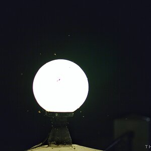
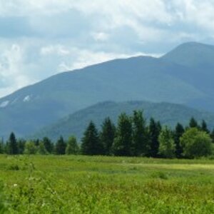
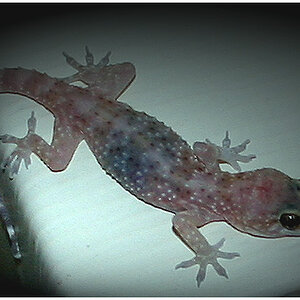
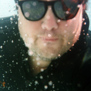
first one is pretty good but has quite a bit of distractions. Second is a little dull. The third is a good portrait almost wish it was in color. Fourth one is interesting i think a little dodge/burn in PS would enhance it further. The last one is a pretty good composition, although the lighting is a tad flat.
first one is pretty good but has quite a bit of distractions. Second is a little dull. The third is a good portrait almost wish it was in color. Fourth one is interesting i think a little dodge/burn in PS would enhance it further. The last one is a pretty good composition, although the lighting is a tad flat.
1. there's a window there if I had used a flash it would have reflected off the window, cause you to see nothing. A reflector would work a lot better and I would keep the natural look.
2. I agree, but as I said before I was going for a minimalist look.
3. Why are you?
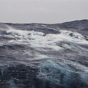
4. The horizon is level it's just bent because I shot this with a lense that has a lot of distortion.
5. Yeah the sky is terrible. I agree that it would be better with something else.
1. there's a window there if I had used a flash it would have reflected off the window, cause you to see nothing. A reflector would work a lot better and I would keep the natural look. There is such a thing as Off Camera Flash.
2. I agree, but as I said before I was going for a minimalist look. The centered horizon makes it look like 2 photos stacked on top of each other.
3. Why are you? What is the space on the left for, compositionally?
4. The horizon is level it's just bent because I shot this with a lense that has a lot of distortion. Image editing software can fix that.
5. Yeah the sky is terrible. I agree that it would be better with something else.


")