Pastels and Watercolors (and a few other art media)

It's going to be so pretty, with this palette and even more blue.

Love this little white fence! I agree with getting the drawing just the way you want it before reaching for those watercolors. It will make painting it easier. Good on you for doing this prep and planning.
 
I’m a little happier with my horizon and fence perspective in this ine but the flowers are too large I think.

B4A623BD-0FB6-4CEF-BBBA-AF94CAD8DF26.jpeg
 
Your flowers are larger on the left and getting smaller as the eye moves to the right, so your perspective looks good.

As far as being too large, that's artistic choice. ;) You can add green to show shrubbery under and around them, too, if you want. I think it looks interesting.
 
Have any of you ever tried alcohol inks? I am fascinated by this account on Flickr and considering giving this a try.

I got an email from Michael’s (arts and crafts store) that listed free classes. One was on using alcohol markers; I’m considering it.

https://www.michaels.com/online classes#id=national-online-class-how-to-use-copic-alcohol-ink.

I know there is a “gun” that allows these markers to be used as an airbrush.
Those can give you a lot of interesting looks. Could be fun!
 
It has been a while since I last painted anything. Messed around with some watercolors tonight. It’s a sloppy copy of a piece I admire by someone else. I can’t quite duplicate her chaotic harmony. But I had a blast painting this so I will try it again and again. It was great practice.

AE828564-608F-4368-AF6A-4F0D01902307.jpeg
 
Nice, Sharon.

I've set up the "studio" part of the office space but haven't used it, yet. Now, the room is full of boxes from SIL's place, mostly old photos that need to be scanned. And we're about to tackle mom's place (even more work). I really need to pull an hour here, and there.
 
Nice harmony in the colors @SquarePeg.
Thanks! These watercolors are a relatively cheap set I bought off Amazon by GenCrafts and I’m amazed by how vibrant they are! Beginners luck on that buy 😎.

Nice, Sharon.

I've set up the "studio" part of the office space but haven't used it, yet. Now, the room is full of boxes from SIL's place, mostly old photos that need to be scanned. And we're about to tackle mom's place (even more work). I really need to pull an hour here, and there.
Thanks bear! I have all my supplies in an old armoire in the dining room and when I get the urge to paint I throw one of those cheap felt backed vinyl tablecloths over the table and spread out. It’s a counter height table so I can sit or stand while I paint which is helpful for my cranky back. Eventually when Princess moves out on her own 😢, I’ll turn her room into a guest room/office/studio. She’s got some great afternoon light in there!

Re your boxes and old photos - save it for a rainy weekend when you’re not feeling inspired. Also there are a couple of new phone apps that are supposedly better than scanners for digitalizing old photos. Could save you a lot of time.
 
All my art supplies are packed. We had to paint that bedroom before we could show the house, per the Realtor.

I went from my glorious mess:

20211212_132612.jpg


20211212_132606.jpg


To this sterile, soulless room:

20220103_101954.jpg


At least we got up all the OP stains. That cleaned up nicely. 🤣
 
I did do a couple of final projects, before I had to break everything down - just have had no time to post.

I call it my "One sketch, three faces" project - for lack of anything better. I had a random graphite portrait in my sketchbook from awhile back, and decided to just have a play with it.

The idea was to make three different faces and associate them with different emotions, sticking fairly close to the original sketch. I wanted colors to help reflect mood as well as subtle changes to the sketch, while keeping it basically the same. (I’m not sure why I thought this was a great idea for a project, but it got my hands dirty again with OP’s, so I started.) ;)

These are all done on Arches oil paper, 12x16”. I used my Neopastels, Mungyo Gallery Artist Soft, and Sennelier OP’s.

First, the graphite sketch from my sketchbook:

In the Pink graphite sketch.jpg


Here’s the first one. Again, they're all supposed to reflect moods with color and expressions. This one is to represent the most confident, happy one of the trio.

In the Pink:

In the Pink final.jpg


For the next one, I made some minor changes to the mouth and brows to change the mood.

So this one became the tense, unhappy one of the trio.

All Kinds of Blue:

All Kinds of Blue new.jpg


Finally (and since I couldn’t really decide on an emotion to capture), I went for a little bit more intense... maybe even off-kilter emotionally. (If anyone has ever looked at Cindy Sherman's portraits you'll see my inspiration for this one.) ;)

Not everything about her is exaggerated, but quite a bit is. ;) I’m the least confident about this one because I’m not sure I pulled that off, but here she is.

Dream Date:

Dream Date final final.jpg


I took a couple of random WIP pics and close-ups while I was working to get the texture, since it doesn't seem to show up on the final shots:

1642348537091.png


1642348599956.png


1642348628268.png
 
I got an email from Michael’s (arts and crafts store) that listed free classes. One was on using alcohol markers; I’m considering it.

https://www.michaels.com/online classes#id=national-online-class-how-to-use-copic-alcohol-ink.

I know there is a “gun” that allows these markers to be used as an airbrush.
You should. I’ve really enjoyed working with them, but be forewarned that those markers are ridiculously overpriced at Michaels. If you want to get into them, I’d suggest the Ohuhu markers at first, similar to Copic, until you want to go that route. At the moment, I can’t justify Copic…

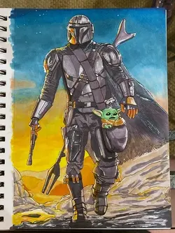
I haven’t done much of anything for quite some time, but starting to get back into it. This is one of my later ones.
 

Attachments

  • E8C0442C-AAFF-4AF9-84FC-6921913CB884.jpeg
    E8C0442C-AAFF-4AF9-84FC-6921913CB884.jpeg
    117.2 KB · Views: 43
I love this!!!

Your style with WC has always been so loose and beautiful! I think you're a natural, @SquarePeg !
Thanks so much terri! My loose “style” owes more to lack of patience for details than any artistic technique! I’m trying to work my way around to at least knowing how to do more detailed work even if that’s not my preferred process.
I did do a couple of final projects, before I had to break everything down - just have had no time to post.

I call it my "One sketch, three faces" project - for lack of anything better. I had a random graphite portrait in my sketchbook from awhile back, and decided to just have a play with it.

The idea was to make three different faces and associate them with different emotions, sticking fairly close to the original sketch. I wanted colors to help reflect mood as well as subtle changes to the sketch, while keeping it basically the same. (I’m not sure why I thought this was a great idea for a project, but it got my hands dirty again with OP’s, so I started.) ;)

These are all done on Arches oil paper, 12x16”. I used my Neopastels, Mungyo Gallery Artist Soft, and Sennelier OP’s.

First, the graphite sketch from my sketchbook:

View attachment 252788


Here’s the first one. Again, they're all supposed to reflect moods with color and expressions. This one is to represent the most confident, happy one of the trio.

In the Pink:

View attachment 252789


For the next one, I made some minor changes to the mouth and brows to change the mood.

So this one became the tense, unhappy one of the trio.

All Kinds of Blue:

View attachment 252790


Finally (and since I couldn’t really decide on an emotion to capture), I went for a little bit more intense... maybe even off-kilter emotionally. (If anyone has ever looked at Cindy Sherman's portraits you'll see my inspiration for this one.) ;)

Not everything about her is exaggerated, but quite a bit is. ;) I’m the least confident about this one because I’m not sure I pulled that off, but here she is.

Dream Date:

View attachment 252791


I took a couple of random WIP pics and close-ups while I was working to get the texture, since it doesn't seem to show up on the final shots:

View attachment 252793


View attachment 252794


View attachment 252795
These are all fantastic! I enjoy looking at the WIP photos. I really need to remember to do that next time. Which will hopefully be tonight as I plan to sit down with a nice martini and paint all night.
You should. I’ve really enjoyed working with them, but be forewarned that those markers are ridiculously overpriced at Michaels. If you want to get into them, I’d suggest the Ohuhu markers at first, similar to Copic, until you want to go that route. At the moment, I can’t justify Copic…

I haven’t done much of anything for quite some time, but starting to get back into it. This is one of my later ones.
Hi my friend! Glad to see your post. I hope you’ll share some more of your work.
 

Most reactions

New Topics

Back
Top