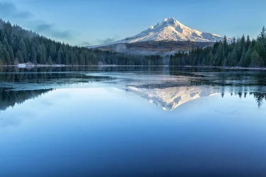
Without the stumps it's a postcard, and not a very good one.
I think PixelRabbit might be on to something with pulling more detail there, and I think perhaps a slightly different vantage point might have been an improvement -- let the stumps be the thing that breaks symmetry, let them stand out even more, let this photograph be about the stumps. Even a crop, dropping perhaps 10% off the left side of the frame, I think strengthens the image.
Anyways. Good idea to use the stumps. Everyone likes the picture postcards of Mt Hood, because it's such a pretty pretty mountain, but we don't exactly need more of them.
I climbed it once when I was a kid. A few years later it killed a bunch of kids from the same school, and at least one teacher I knew and liked pretty well. It's pretty, but you still can't be messing about with it.







![[No title]](/data/xfmg/thumbnail/36/36132-5bd4fa365c199003273e0ff128bf42f4.jpg?1734168228)

![[No title]](/data/xfmg/thumbnail/36/36602-3001bbe07fa5517ccd4b03e049c7b844.jpg?1734169055)