What's new

peeling posts

KenC

Been spending a lot of time on here!
Joined
Jan 18, 2010
Messages
5,699
Reaction score
1,472
Location
Philadelphia
Can others edit my Photos
Photos NOT OK to edit
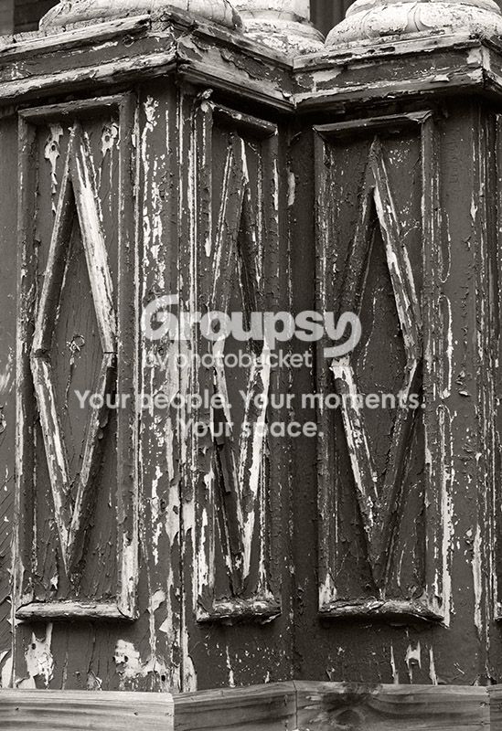
wood092912.jpg
 
Thanks!
 
I feel like this wants to be an abstract, but can't quite commit. The material at the top of the frame both makes the composition top-heavy and grounds it in the world, but without being present enough to make this a "photograph of a thing".

I feel like the side-to-side framing isn't quite right either.

These are the kinds of things that are really hard -- it's just some crap. Visually interesting crap, but just some crap, and somehow it's very hard to get the "visually interesting" into the frame, and get the "crap" out of it. I have no magic bullet here, and rather wish I did.
 
I feel like this wants to be an abstract, but can't quite commit. The material at the top of the frame both makes the composition top-heavy and grounds it in the world, but without being present enough to make this a "photograph of a thing".

I feel like the side-to-side framing isn't quite right either.

These are the kinds of things that are really hard -- it's just some crap. Visually interesting crap, but just some crap, and somehow it's very hard to get the "visually interesting" into the frame, and get the "crap" out of it. I have no magic bullet here, and rather wish I did.

This isn't a great image, and probably not even a very good one. My crackpot explanation is that we've all seen a lot of peeling paint/weathered wood images over the years and this one doesn't really add anything to the genre, so it won't stand out for most people. However, I don't think it's useful to analyze images by category, as you appear to be doing, at least in part. Assuming for the moment (and this is a big assumption) that you and I have similar definitions of "abstract" and "photograph of a thing", this one clearly is a "photograph of a thing", although it relies (however unsuccessfully) on pattern, texture and line more than on simple representation of the thing itself. Very few of the photos identified as "abstract" really fit most definitions of that term, and I don't think this is anywhere near it. If I had wanted to present it as something close to that I would have cropped the stuff at the top, which may or may not have been a better choice, and you've made me question that choice, which is of course a very good thing (thank you for that). The fact that I didn't puts it squarely in the "thing" category, so now we're back to fundamentals of composition, tonal relationships, etc. Since I'm not really crazy about this image either I would be interested in your "category-free" analysis. I don't expect a "magic bullet" to improve this image, but just an opinion as to where it falls short. I normally don't push people for further critique, but you've posted some very thoughtful stuff on here so I know you're up to it.
 
Category-free, huh? This is sort of stream of consciousness outright wrestling with the image, reacting to it, and writing down whatever seems right. Maybe there's something in here that will make sense to you, maybe not.

Well. The frame feels unbalanced to me, left-to-right, I think because the pattern of three diamonds isn't centered, and it's a strong repeated shape.

It also feels unbalanced top-to-bottom, I have a feeling of weight on the top of the frame (I think I am imagining columns pressing down on the things you have partially cropped, so I imaging literal *weight* here and maybe that's translating to a sense of visual weight? I don't know..)

The image also feels somehow "cramped". We're obviously looking at a small part of something larger, which isn't really a problem as such, but somehow I feel like the hints of stuff around the edge of the frame make me want a larger and looser frame. I feel like I am peering through a keyhole in a way that is irritating to me.

The whole result is that I am vaguely unsatisfied. As if what I am seeing suggests something interesting to look at, if only I could see it all instead of this piece of it. I find myself wondering if this is maybe the basic problem with photographing this sort of thing, maybe you can never get a big enough frame to somehow pull the "interesting" inside, maybe the "interesting" is about the whole world and the peeling paint's relationship to it, or some similar artsy-fartsy crap, so it's always just outside the boundary of the frame.

 

Create an account or login to comment

You must be a member in order to leave a comment

Create account

Create an account on our community. It's easy!

Log in

Already have an account? Log in here.

New Topics

Back
Top Bottom