What's new

People Photos - C & C Appreciated

littlenomad

TPF Noob!
Joined
Aug 26, 2012
Messages
33
Reaction score
2
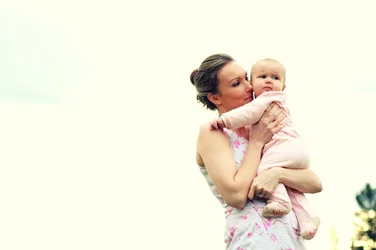
Just a few shots of people I've done recently. I would very much appreciate any honest feedback, I find it so hard to see this as others might. I can get a bit carried away with processing so let me know if I have been too heavy handed there as well. I am a relative beginner, so much to learn still. Would be great to know if I'm at least on the right track or meandering about in the bush of shocking photography!! :mrgreen:

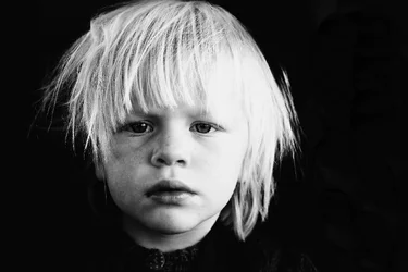
The first one is slightly out of focus, I realize this.
$IMG_8732b.webp$IMG_0830.webp$IMG_8453.webp$IMG_8612.webp
 
Last edited:
My guess is that you haven't been reading in this forum much because the constantly recurring advice is to post 1, 2 or 3 images and they should be numbered.
 
My guess is that you haven't been reading in this forum much because the constantly recurring advice is to post 1, 2 or 3 images and they should be numbered.
There is a reason ( or a few) for this.
It takes a lot of time to thoroughly critique an image. If you are posting 10 you are not going to get any REAL thorough help because there is too many. You'll get some very bland, overall suggestions or nothing at all. All of which won't help you much.
When you post them all consecutively like this it's harder to keep them straight and to know we are always on the same page with what image we're discussing.
Please place them each on a new line and number them. Much easier for both you and the person giving critique.

My overall bland advice to you: Calibrate your monitor. Your contrast is pretty extreme and it's obliterating much of the details in eyes and faces. Your skin tones are overly warm/pink and a bit plastic looking in the smoothing or noise removal.
 
Lotsa' pics! Some of the photos are very enjoyable to look at processing-wise. I would strongly consider the possibility that you have a case of horizontalitis, since in this post you are showing 10 of 10 horizontals, even on photos where the subjects and their actions/poses are "taller than they are wide", such as the majority of the mother-and-baby close-ups. It would be far,far,far better to see more of the BABY, and the mother's shoulders, hands, and body, that it would to see an out of focus tree, or barren sky.
 
yep.. lots of vertical subjects... lots of horizontal shots... why? That only works if the background ADDS to the shot... most of these, it doesn't!
 
Sorry, didn't see the forum rules about number of images, tried to delete some but can't seem to delete the thumbnails?
I generally just wanted a general critique as they are all very similar. Yes, I guess I do have something about the horizontal. I do have plenty of verticals ;o) just happened to not post them.
 
Sorry, didn't see the forum rules about number of images,

It isn't a 'rule' per se , it just works better that way and you'll get more and better input


but can't seem to delete the thumbnails?

Edit > Advanced> goto the bottom, Manage Attachments then click in upper right corner to delete each little thumbnail
 
OK from one noob to another I'm going to take a shot at the C&C thing but the junkies on here may disagree with some of this.
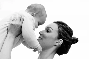
1. I think the subject should have been framed to the left side of he photo. The baby is craning its neck to look at something and I'm left with a bunch of overcast sky. No interest there. I'd rather see more of the tree in the lower right than all that sky.
2. Seems a bit blown out to me. There's a lot of detail to the hair and freckles on the left and nothing but light on the right.
3. I like this one.
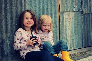
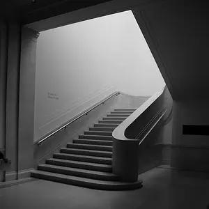
4. Agree with previous comments about going vertical, I think it would have added a lot of interest to this one.
 
I really like #4 but I do agree with the cropping to vertical. Losing a little on the right and left would leave a higher impact on the subjects.
 
nice collage but i think the picture with the boy in a all dark environment doesn't suit the overall jovial set up of the entire collage. You could also follow this link to some photography website. its quite cool and you can show your photography works and describe some of your passions in the field.
Progetto 100 fotografi | Fotografare in Digitale

100 Photographer Project
 
#1 is interesting. Compositionally it's weird -- huge negative space left, and the subjects looking out of frame right. Total no-no. I think it works well in this case, though. Can't put my finger on it, but I like it (maybe just because I like the set pretty well?)

#2 is wonderful. The super harsh, no greys at all, works well with the kid's expression and appearance. It supports the "messy/dirty/angry/defiant/effed-up" look. The kid's expression is ambiguous, but whatever's going on in the kid's head, the picture works with it.

#3 is more eh. There's a moment going on there, but it's a small one. The juxtaposition of the wall (looks like a homemade shanty in India) with the relatively well-dressed kids is a little off kilter. Not sure I love it or just sort of eh maybe like it?

#4 Is more banal. A well executed traditional mom+baby shot. You tendency to push the tones toward harshness doesn't work as well here -- this is a gentle and loving image, the harsh blacks do NOT support that feeling (you haven't gone as fat as #2 obviously, but you're pushing in that direction). I want the subject to be more right in the frame, for some reason. It feels subtly out of balance.

Overall I like all of them, though -- some are lesser and some are greater, but all are pretty good. A definite cut above a lot of the work we see on here, even from the "pros".
 
Overall I like all of them, though -- some are lesser and some are greater, but all are pretty good. A definite cut above a lot of the work we see on here, even from the "pros".

Amolitor, this is the second or third comment from you bashing the "pros" here... Is there a problem?

I am NOT a pro.. haven't shot professionally in a long time. However I do disagree with a lot of the comments where you are gushing over amatuerish work, saying it is better than the "pros" and reinforcing the way it was shot, rather than making accurate assessments and attempting to help the OP correct the issues. Not attacking you.. just wondering what is up with this.

You hardly ever / never post shots yourself, describe yourself as an amateur on your "Blog", and yet you always have an opinion on everything. The trouble is that your opinion is almost always totally opposite of everyone else's (mostly those with 30 or 40 years of experience in photography)... but since you are complimenting the OP's "work", guess who the OP listens too? That is neither good for the OP, nor does it lend any real credibility to you.

Again.. not attacking! Just wondering why you are so negative about the more experienced people around here? Also wondering why you choose to reinforce so much bad photography rather than trying to help correct it?
 
Last edited:
Four shots? Yeah, I can work with that. C&C per req:


1. Would have been stronger in portrait aspect. You've got reasonably good exposure on the subjects, but at the cost of almost totally blowing out the sky. Fill flash would have taken care of this nicely. Also, as a general rule, shoot at eye-level, ESPECIALLY if you're not doing full-body shots. Also, watch the details; that little bit of plant lower right is really annoying.


2. There's potential here, but the key light is just a bit too hot, blowing out some detail on his/her hair, and the shadows on the far side are just a bit too deep, especially in the eyes. Consider a big reflector on the opposite side to the key next time.


3. Cute, but poorly cropped limbs kill it for me. IF you have to crop limbs, always do it boldly, and never at/near a joint, and NEVER, I REPEAT: NEVER laterally! The image seems slightly under-exposed, but nothing that isn't easily remedied in post.


4. Whose arms are holding the child up? Try and avoid disembodied limbs; if you'd raised the camera up a little more and opened up to include all of the moterher's arms, this would have been a nice shot. If you'd moved a bit farther right so we could see more of the child's face, it would have been a winner. Nice monochrome.


Just my $00.02 worth - your mileage may vary.

~John
 
This is the obvious problem with taking pictures of pretty babies and nice looking women and using them to judge one's success.
It is too hard to look past the cuteness and associations to judge the actual pictures.

For example: She and the baby are looking into the margin with all that space behind.
Her arm and hand are much brighter than her face.
She has an unsightly arm-flesh bulge.

img8732bllll.jpg
 

Create an account or login to comment

You must be a member in order to leave a comment

Create account

Create an account on our community. It's easy!

Log in

Already have an account? Log in here.

New Topics

Back
Top Bottom