redbourn
No longer a newbie, moving up!
- Joined
- Dec 18, 2009
- Messages
- 476
- Reaction score
- 36
- Location
- Nazaré, Portugal
- Website
- best-food.info
- Can others edit my Photos
- Photos OK to edit
Photos? For Us of for others?
Although I worked in the film industry for 35 years, I only really got into photography a few months ago because I'm compiling a cookbook.
I bought a Nikon d3300 and a Nikkor 35mm 1:1.8G lens and then bought a softbox, lights etc and started learning.
So what's the problem?
Well two things really.
I have about 1200 Facebook friends and post photos to see what they like.
They overwhelmingly prefer the photos that I don't care for or even like. They like very high contrast.
I always like water colors more than oil paintings.
But my photos are for a book. So should I use photos that I prefer or use ones that others prefer?
The other issue is that they prefer photos shot on my phone to those shot on my Nikon.
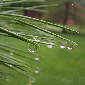
Below are two photos that they are raving about .
"Best of your photos. Really great and makes me feel hungry". etc both shot on my phone.


And a third photo which is more to my taste shot with the Nikon.
.jpg")
I'd love your feedback and comments.
Thanks,
Michael
Although I worked in the film industry for 35 years, I only really got into photography a few months ago because I'm compiling a cookbook.
I bought a Nikon d3300 and a Nikkor 35mm 1:1.8G lens and then bought a softbox, lights etc and started learning.
So what's the problem?
Well two things really.
I have about 1200 Facebook friends and post photos to see what they like.
They overwhelmingly prefer the photos that I don't care for or even like. They like very high contrast.
I always like water colors more than oil paintings.
But my photos are for a book. So should I use photos that I prefer or use ones that others prefer?
The other issue is that they prefer photos shot on my phone to those shot on my Nikon.
Below are two photos that they are raving about .
"Best of your photos. Really great and makes me feel hungry". etc both shot on my phone.
And a third photo which is more to my taste shot with the Nikon.
I'd love your feedback and comments.
Thanks,
Michael
") ) Also, you should shoot from a tripod and go for more Depth of Field so that all the food is in focus by using with a smaller aperture. Google "how to take food pictures". There are some good recommendations by people in the business. I also would check with a pro who has made food books to check out their recommendations. Nice meals.
) Also, you should shoot from a tripod and go for more Depth of Field so that all the food is in focus by using with a smaller aperture. Google "how to take food pictures". There are some good recommendations by people in the business. I also would check with a pro who has made food books to check out their recommendations. Nice meals.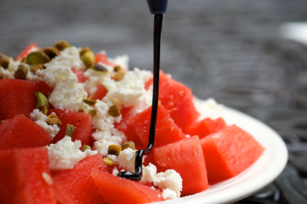


![[No title]](/data/xfmg/thumbnail/42/42466-109a1021e2f0f132abfd74e1a6e39444.jpg?1619740192)

![[No title]](/data/xfmg/thumbnail/41/41784-8cbc2bbf42c1ea67cfe2f77fdd5c53ec.jpg?1619739891)