
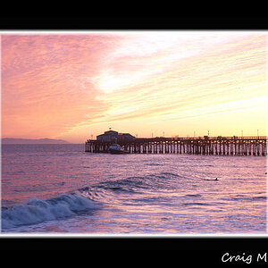
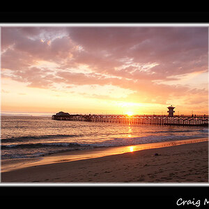
Alright, I know 5 is too many but I had a hard time choosing, I'd love any feedback. I think overall I have some issues with the color balance, some seem off to me.
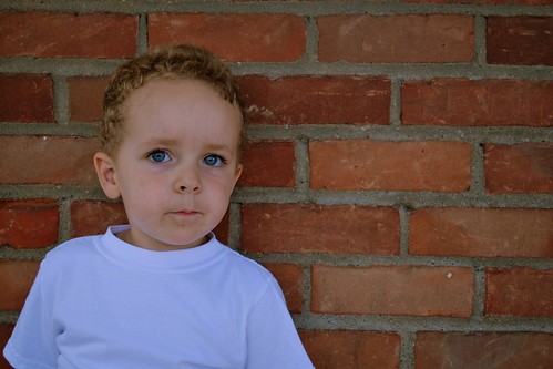
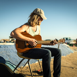
1. This one I darkened a little, 28.0mmm, 1/125, f/4.5, ISO 250 (maybe this was too high?)
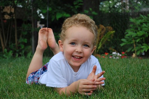
2. I like this one but not the dead fern in the background....55mm, 1/125, f/5.6, ISO 220
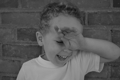
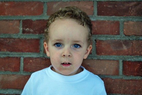
3. I wish the top of his hair didn't get cut off on this one, I also warmed it up a little PP 42mm, 1/125, f/4.5, 280 ISO
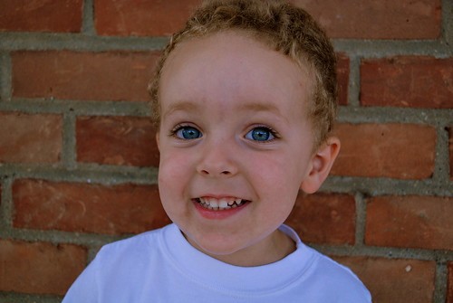
4. I think this is my fav 28mm, f/4.5, 1/125, ISO220
5. This one I did color fix in the camera, but it looks a little blue to me...
28mm, 1/125, f/4.5, 220 ISO
1. This one I darkened a little, 28.0mmm, 1/125, f/4.5, ISO 250 (maybe this was too high?)
2. I like this one but not the dead fern in the background....55mm, 1/125, f/5.6, ISO 220
3. I wish the top of his hair didn't get cut off on this one, I also warmed it up a little PP 42mm, 1/125, f/4.5, 280 ISO
4. I think this is my fav 28mm, f/4.5, 1/125, ISO220
5. This one I did color fix in the camera, but it looks a little blue to me...
28mm, 1/125, f/4.5, 220 ISO
![[No title]](/data/xfmg/thumbnail/42/42461-e2a94a39b9483a804af86010fc52244b.jpg?1619740192)


![[No title]](/data/xfmg/thumbnail/42/42462-2adb6efc01a19638fca25cd3000f5575.jpg?1619740192)
![[No title]](/data/xfmg/thumbnail/37/37626-4a6ffc3f17ab3a8e97170fda3276640e.jpg?1619738154)
![[No title]](/data/xfmg/thumbnail/42/42460-80970c44cc9fb42dd0c86d08e7bc401d.jpg?1619740191)