Please critique this for me....

coastietech

TPF Noob!
Joined
Mar 25, 2007
Messages
155
Reaction score
0
Location
Va, USA
Can others edit my Photos
Photos OK to edit
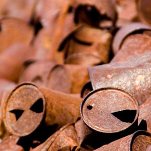
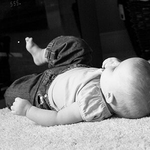
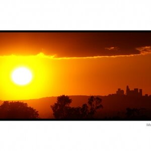
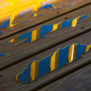
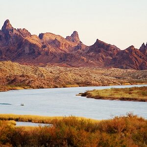
I went shooting the other day and out of the pictures I took this is the one that I kept the other came out like crap. :( So please let me know what you think. Is it a keeper or a dunce? How would you have made it better? Thank you for all your help in advance.

_DSC0370-1.jpg
 
I think it's a dunce. I personally shoot mostly black and white, and am only prompted to shoot color when there is lots of color to shoot. What I mean is that no film or post-processing is really going to make colors pop if they aren't already kinda popping on their own. If I saw that in real life, I wouldn't have taken the picture. The greens are too close to the browns (or is it the other way around?). By the way, where in VA are you?
 
well, i think it's a keeper. I think if you play with it you'll get somethign nice. Here's my quick (sloppy) idea of where you can go with it. My version of your picture an obviously processed photo - but I think it looks okay. I played with unsharpening, curves, dodging some browns, and blurs.

tpf.jpg
 
What I mean is that no film or post-processing is really going to make colors pop if they aren't already kinda popping on their own. If I saw that in real life, I wouldn't have taken the picture. The greens are too close to the browns (or is it the other way around?).

I agree to a certain extent i was kind of bothered by the colors blending together and also the post not being completely centered. I took some time to try to make something out of it i really emphisized the yellow to bring out some of the green without being too overbearing. It was a quick edit though so let me know what you think. Im going to try again when im not so tired i want to get the water looking clearer but that will have to be tomorrow.

dsc03701aq6.jpg
 
I think the photo is a keeper, if you're willing to do some processing. As is, it's bland and not so appealing to the eye.


well, i think it's a keeper. I think if you play with it you'll get somethign nice. Here's my quick (sloppy) idea of where you can go with it. My version of your picture an obviously processed photo - but I think it looks okay. I played with unsharpening, curves, dodging some browns, and blurs.

Could you let me in on how you dodged a selected color (like you used browns)?
 
max, I manually did it adjusting the size of the dodge tool. I used about a size of a quarter for the lower third of the frame, and then changed the tool to make it about the size of a pencil eraser and dodged the tree trunks and bridge. I'm sure there's a better/faster way to do it - but, it works.

I also played with the fading of the dodging quite a bit.
 
Coastietech, this is a wonderful spot and nicely seen and framed.
As the two edits show, there is more in your photo than meets the eye from your photo alone.
As it is, your photo is very green (something that I like, mostly so the spring green of young leaves!) with all the greens and browns blending ... so your photo does not have many contrasts, not to mention the total lack of colour contrasts.

But as you can see, you can bring about more if you put this pic to some pp treatment, so I would not want to go with MaxBloom here and call this a "dunce". It is not.

I am glad that you saw the scene, realised that it has some merits that may be brought out more by taking them out of their context and framing them to become an entity of their own ... all that now needs to be done is a little after-work. And voilà!
 
This is what I tried to do with it:

coastietech_DSC0370-1_myedit.jpg


I first added a few missing highlights in the levels, then desaturated all the colours save yellow which I enriched by 20 degrees (to later go back on this, mind you) ... then I selected several areas by lassoing them (feathered at 40px) to selectively adjust shadows and highlights and also or only midtones, just like I felt it could be right, such as the water-stone"beach"-triangle, for example), and when I had selectively adjusted the top area, I felt there were too many colours, so I desaturated the previously enriched yellows again.
 
Personally... althought these guys have done some nice tidying up. I think Corinnas keeps the most natural look to it...
I'm just not to keen on it.
The skinny tree on the right just keeps drawing my attention to it.
I'd have like to have been drawn over and under the bridge.

Keep at it :)
 
I think it's a dunce. I personally shoot mostly black and white, and am only prompted to shoot color when there is lots of color to shoot.

Perhaps MaxBloom should actually post some pictures to match the generosity of his critiques.

What I mean is that no film or post-processing is really going to make colors pop if they aren't already kinda popping on their own. If I saw that in real life, I wouldn't have taken the picture. The greens are too close to the browns (or is it the other way around?).

This is the kind of picture that postprocessing in Lab mode works well for - separating the various green tones from each other and from the red ones. Look for books by Margulis.

dsc03701bbhd7.jpg
 
@TheTraveler:

So I don't think it's that great of a photo...sue me. And no, I don't feel like posting my work for critique. What I say about other people's photographs has absolutely nothing to do with my technical abilities or sense of photographic prescience. I am far more critical of myself than I am of other people. I print only the best of the best of my photographs, and don't really care what most people have to say about them.

As is evidenced by other people's responses aside from or in opposition to what I write, you don't have to pay attention to a thing that I say.

And no, I don't think post-processing makes much of a difference in this case. You can PP any way you like, and I'd still insist that it's not that great. You could hang it in the MOMA for all I care. I refuse to give the same ridiculous band-aid response that everyone else does. Post-processing cannot turn a mediocre photograph into a great one.

My constructive advice is that the subject is cluttered and uninteresting, and the composition is mundane. If it was hanging in a gallery and you asked me why I wouldn't buy it, that's what I'd tell you.

In that vein, I think that everyone who gives the "just post process it and it'll be great" response is being far less constructive than I am. In fact, I think that to give such a response as a critique is really detrimental to the photographic learning process. Take DigitalMatt's work, for example. He does quite a bit of post-processing, but his shots are great to begin with.

This is what I have to say about the photo, and what comments people have made concerning my critique, and I'll make no apologies. So don't sweat me.


wow. you sure seem to care a lot.


I agree with you that the photo is cluttered and not the best in the world, but I disagree saying that it's unusable. For me personally, using post-processing techniques for not my best work only improves my eye the next time that I go to shoot a photograph so I don't make that mistake again.

I think so far everyone has lended a response that allows the photographer to think about the work. It's not a "it's nice, good work!" or "it sucks" response...but rather a here's what I think you can do with it.
 
Thank you very much for all the help and critiques. I will make an attempt to play with it a little bit and see what I can come up with. I really like some of the examples that are posted up here. As for MaxBloom, I take no offense. I have seen pictures my wife took that I thought were awful and others have thought them to be great. I am trying to keep the amount of post processing down to a minimum. And I do agree with you regarding the fact that if a photo isn't good to begin with PP isn't always going to make it better. Also to answer MB I am located in the Hampton Roads area.

-Ashford is it safe to assume that your avatar was taken at the Garden of the Gods? I used to be stationed at Ft Carson.
 
yes sir! how long ago were you at ft.carson? the base is getting a large influx of troops soon - should change the face of that place.
 

Most reactions

Back
Top