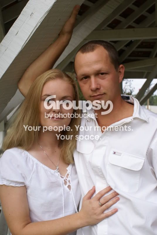
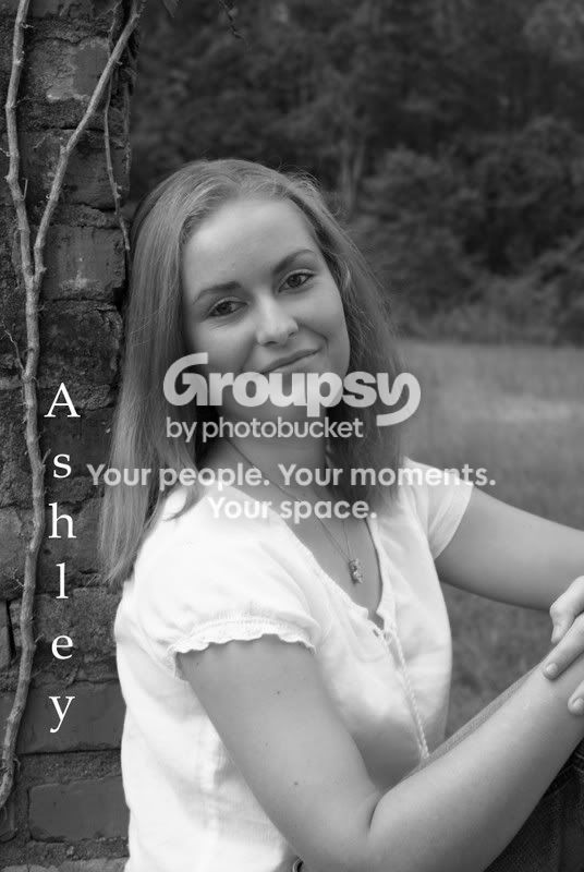
I don't think that going black & white really helps most portraits. The color photo is the nicest to look at. The B&Ws are lacking contrast both in processing and composition, and in the third one her shirt is dominating. I think the second photo needs to be rotated a tiny bit clockwise.
I agree with the comments about the lettering. A little script font in the corner of a photo might not be too distracting, but the lettering here screams "hey look, my name!"
I think that you did a really nice job posing your subjects. Definite potential IMO.





![[No title]](/data/xfmg/thumbnail/37/37425-6c82b8d207549743954f4b99b56a8153.jpg?1734170466)

![[No title]](/data/xfmg/thumbnail/37/37611-325cc048f59de7016225f9d516b910ee.jpg?1734170737)
![[No title]](/data/xfmg/thumbnail/37/37612-989c0c475619355f32a5941a187cfa74.jpg?1734170738)
![[No title]](/data/xfmg/thumbnail/33/33906-2f9b24e4b1e1be07f68257916df0f2b3.jpg?1734164328)