Portrait: Hadyn - C&C appreciated

helenjune

TPF Noob!
Joined
Jun 5, 2011
Messages
43
Reaction score
2
Location
Australia
Can others edit my Photos
Photos OK to edit


Hi everyone,

It feels like it's been ages since I was here.

I feel like my relationship to photography has definitely changed, for the better. I treat it just like a hobby now, which feels a lot better as opposed to taking everything about it so very seriously. I feel like I was trying to gain something from it that isn't possible for me to gain through this medium, and that's totally fine.

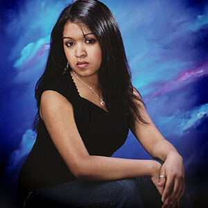
Onto the picture. I feel like this is my best portrait so far. I am probably rather bias, because I have an emotional attachment to it (I have a huge crush on this guy! lol ;))

Here is my self-critique:


Positives:

  • I like the colours, I think they all work well together.
  • The shallow DOF really makes him stand out a lot.
  • Subject looks relaxed and genuine
  • Framing/composition adheres to Rule of Thirds and help make him the focus.

Negatives:
  • The colours might be too vibrant/overbearing? Not sure here.
  • The angle of his face makes his eyes appear too close together?
  • Picture a little too flat looking? Not enough difference between subject and the background... or something along those lines?
  • Lighting is too uneven on his face? Something about the lighting kind of bugs me...(I stood him in front of a tree that light was bouncing off, to try to light his face, but I think it only lit the bottom part of his face and not around his eyes/forehead.)
Photoshopping:

- The picture was too light/over-exposed when I took it. I shoot in Raw so I was lucky enough to be able to bring his skin tone back down (I know it's not good practice, I don't usually depend on being able to do this)
- Dodged his eyes and around his face to lighten various areas
- Contrast & colour enhancements/corrections.
- A tiny bit of airbrushing on the side of his nose. Tiny.

Anyway, let me know what you think! C&C will be very much appreciated.
 
Last edited:
For me, the first thing I notice is the distortion. How close were you when you took this photo? At what focal length? It looks like you may have used a very wide angle lens from fairly close.

I would agree that the colors are a bit on the vivid side, and I'm sure you noticed the overexposure on his left cheek. For me, this image does look a bit flat, with the exception of the very bright rim lighting.

Think I would have preferred him completely in the shade using something to reflect more light in to give it some dimension.

Also, before Derrel can say it, generally, portraits are shot in a portrait orientation unless there is a good reason for a landscape orientation. In this one, I don't know that landscape is adding anything.

Also, I take it you did some blurring on some parts of the photo? Just looks a bit weird to me.

Honestly, I can tell you put some thought into it, but it just doesn't work for me. Just a bit too much going on.
 
Hey Kerbouchard,

For me, the first thing I notice is the distortion. How close were you when you took this photo? At what focal length? It looks like you may have used a very wide angle lens from fairly close.

I used a 50mm 1.4. I was standing pretty close to him maybe about 2-3 feet away. I agree about the distortion, I do think it makes him look a bit cartoony, but I think I like that about it.

I would agree that the colors are a bit on the vivid side, and I'm sure you noticed the overexposure on his left cheek. For me, this image does look a bit flat, with the exception of the very bright rim lighting.

Thanks for commenting on that, it confirms/mirrors my feelings about those things.

Also, before Derrel can say it, generally, portraits are shot in a portrait orientation unless there is a good reason for a landscape orientation. In this one, I don't know that landscape is adding anything.

Also, I take it you did some blurring on some parts of the photo? Just looks a bit weird to me.


Yes, I know, I'm gonna get it from Derrel (assuming he comments) I tried to use the tree branch in the foreground to frame the picture....I don't know why I preferred taking it horizontally, I think it's just a stuck, sucky habit that I have. I think I probably want to include too much in the picture all of the time.

There is no added blurring in any of this photo, it's just taken wide open at 1.4.

I can see how you feel there is a bit much going on, and I agree to some degree. Now that I look at it, that big blurry branch to the side is distracting. Hmm, I really do think the colours are a bit much.

Thanks for your comments, I appreciate them :)
 
The composition is well ( I'd only crop the tree it disturbs be....) and It feels like it has a lot of sharpness plus I guess the DOF also might be an issue .
 

Most reactions

Back
Top