Navigation
Install the app
How to install the app on iOS
Follow along with the video below to see how to install our site as a web app on your home screen.

Note: This feature currently requires accessing the site using the built-in Safari browser.
More options
You are using an out of date browser. It may not display this or other websites correctly.
You should upgrade or use an alternative browser.
You should upgrade or use an alternative browser.
Portrait practice - C&C please
- Thread starter amnd2323
- Start date
Live_free
TPF Noob!
- Joined
- Dec 25, 2009
- Messages
- 599
- Reaction score
- 7
- Location
- Washington
- Can others edit my Photos
- Photos OK to edit
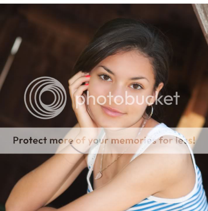
Face seems incredibly soft and blurry, basically slightly out of focus. Her pose looks good, but I'd go into photoshop and darken her skin color on her closest shoulder to make it look more natural. Other than that I like the shot.
MDWine
TPF Noob!
- Joined
- Jan 4, 2010
- Messages
- 57
- Reaction score
- 0
- Location
- Manassas Park, Virginia
- Can others edit my Photos
- Photos OK to edit
The focus seems a bit soft to me.
I think some would complain about the bright spots behind her.
You could get those out of there easily enough, however.
Otherwise, for me, it's a nice shot!
I think some would complain about the bright spots behind her.
You could get those out of there easily enough, however.
Otherwise, for me, it's a nice shot!
Aayria
TPF Noob!
- Joined
- Mar 12, 2010
- Messages
- 787
- Reaction score
- 40
- Location
- U.S.
- Can others edit my Photos
- Photos NOT OK to edit
Not a bad first try- the exposure is good, and the background is mostly non distracting, so your subject is clearly the focus of the shot..
Please don't take this critique too personally- I realize this is your daughter, and she is very lovely! But looking strictly from a photographic standpoint, I did notice several things to keep an eye out for in the future.
1) The focus is a little soft on her face. It almost seems a bit like you have her lower arm in more sharp focus than the eyes- could be a matter of adjusting your focussing mode, or just practice.
2) It was a good, traditional portrait pose- to have her hand resting lightly on her cheek, but you have to be careful. It's best to ask your model not to actually "push" on her cheek with her hand, but just to bring her hand up to her face as close as possible without actually pushing... Otherwise you get the effect like your picture shows- with the face all scrunched under the pressure from her hand instead of smooth and even.
3) Her elbow is resting on something, but the way this image is cropped, it really cuts her out too much. Since her weight is rested on that arm, it seems very awkward to chop the arm out of the frame.
4) The orange-ish nail polish is a bit distracting, especially so close to her eyes, which you want to be the main focus.
5) The background is tilted far too much, there is sort of a pillar cutting right through her back and sticking out of her body which is awkward. I would try to play around with shooting from different angles and just being more aware of when objects are sticking out of your subject. Use your environment to help compliment or frame the subject, not detract, obstruct, or interfere.
6) This one is going to be VERY important, especially if you want to begin photographing OTHER people's daughters. The angle you took this from is very very unflattering when it comes to blouses or shirts with a low neckline. Having that gap of fabric under her armpit to the left of her necklace, is very unflattering... It makes her clothing look too loose and draws attention to her chest. Maybe this is just my opinion, speaking as a mother myself.. But I would not appreciate a picture of my child showing her chest at that angle.
Those are the main things that stood out to me, I apologize if the tone seemed to harsh! But portrait photography is meant to bring out the best features of a person- to capture them as they are in my opinion, without subtle flaws that can easily ruin a shot. It's the subtle things to always be on the look out for- watch everything in your frame and consider other possible ways to catch the personality of your subject. I would also add, her expression seems a bit dull.. Kind of like she'd rather not be there having her picture done, or she's a bit annoyed. It's a good idea to engage your subject and to catch expressions that show more of there personality.
That's just my opinion, take it or leave it- but overall I think it's a nice picture, and as a mom I would definitely keep it in my family album =)
Derrel
Mr. Rain Cloud
- Joined
- Jul 23, 2009
- Messages
- 48,225
- Reaction score
- 18,941
- Location
- USA
- Website
- www.pbase.com
- Can others edit my Photos
- Photos OK to edit
Your focus is spot-on, but your shutter speed is very slow, and what we are seeing is a very slight ghost image. I will speculate that the very dark background fooled your camera's light metering system into delivering a very slow,long shutter speed in an effort to brighten up all that dark background. This amount of ghosting makes this photo technically unacceptable. You cannot let the shutter speeds on flash shots drop into that slow speed territory, or you risk ruining shots due to this kind of blurring. I would also concur with most of Aayriya's C&C in the post immediately above mine. The posing and the tilted background are my main concerns.
amnd2323
TPF Noob!
- Joined
- Nov 16, 2009
- Messages
- 24
- Reaction score
- 0
- Location
- Dallas
- Can others edit my Photos
- Photos OK to edit
Thanks for ALL the feedback....much appreciated. I actually photoshopped her face with a gaussian blur to get rid of some blemishes.....maybe I overdid it since most comments speak of her "blurry" face.
I'll try some more taking all of your comments into consideration! I'm determined to get good at this!!!
I'll try some more taking all of your comments into consideration! I'm determined to get good at this!!!
bennielou
TPF Noob!
- Joined
- Nov 27, 2009
- Messages
- 1,798
- Reaction score
- 172
- Location
- Dallas, TX
- Can others edit my Photos
- Photos OK to edit
Frankly, I find it very well done. The expression is great. I like the tilt. I like the composition and colors.
Thumbs up from me.
Thumbs up from me.
bazooka
No longer a newbie, moving up!
- Joined
- Dec 28, 2009
- Messages
- 2,293
- Reaction score
- 294
- Location
- Houston
- Website
- www.dirtjournal.com
- Can others edit my Photos
- Photos OK to edit
Out of curiosity, how did you blend the gaussian blur layer?
amnd2323
TPF Noob!
- Joined
- Nov 16, 2009
- Messages
- 24
- Reaction score
- 0
- Location
- Dallas
- Can others edit my Photos
- Photos OK to edit
Out of curiosity, how did you blend the gaussian blur layer?
I used the brush tool (soft edged brush at about 65 pixels I think), then I lowered the opacity to 50% and chose "lighten" in the mode pop-up menu. Then I "painted" over her blemishes. I think next time I'll try 25% opacity and not "paint" over so much of her face. We'll see if that helps with the bluriness.



![[No title]](/data/xfmg/thumbnail/37/37606-3c9ffb5906173fa2aa489341967e1468.jpg?1619738148)
![[No title]](/data/xfmg/thumbnail/37/37602-1ef8dbb1c2d0e4ff347ee65d328c3603.jpg?1619738147)
![[No title]](/data/xfmg/thumbnail/1/1592-cfae4a7ea791f96c6e2d03484be2e454.jpg?1619729144)

