Portraits from the weekend (C & C!)

RubyMagic

TPF Noob!
Joined
May 2, 2008
Messages
132
Reaction score
0
Location
Berea, KY
Can others edit my Photos
Photos NOT OK to edit
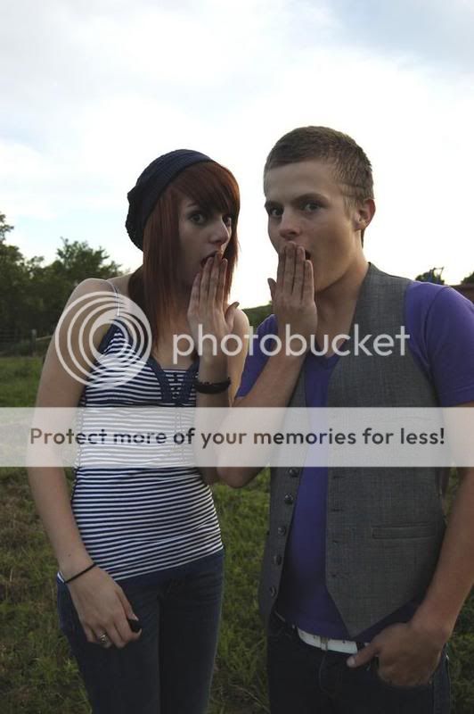
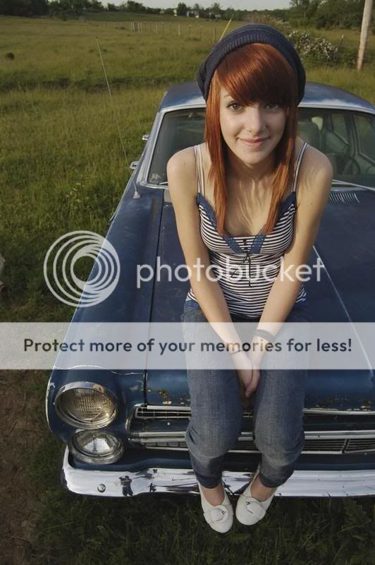
As some of you know, I have been working on my portrait taking skills. I'm working very hard on it and this weekend I think I finally got some results. These photo's were taken on a farm in Berea, KY with my girlfriend.

Tell me what you think and dont hesitate to criticize.


1-9.jpg


2-9.jpg


3-8.jpg


4-6.jpg


5-4.jpg


6-4.jpg


7-4.jpg


8-4.jpg


9-4.jpg
 
1. and 2. are greats shots, and they belong together. If I'm wrong, they are at least amusing.
3. A bit overexposed, and it would have been better had your gf looked at the camera.
4. to 9. Using wide angle is unflattering. You got away with it in a couple of pics, but not in all.

IMHO of course.
 
Haha. Thanks.


It seems you get away with a lot when you have a good model.


*Thumbs Up*
 
ohhh the wide angle on the girlfriend is not good. It always will give someone a big nose, not flattering at all.
I like the first two of her sitting on the car, though in the first one there is something on the ground by her feet that is distracting and the second one looks crooked.
 
Not bad, but next time carry a flash and a polarizer. Now work on your retouching skills.
 
I like three and five a lot. In both I think it's the composition that appeals to me, with the car neatly sliced but her entire body featured (that sounds creepy, but you know what I mean - no limbs cut off or anything). The color of the car, the sky, and her clothing all work well together.

I like the subjects of 1 and 2, but I think the lighting could be better, especially the blown-out sky. This is very hard to do, but I think on a different day or with a different lighting setup (flash as recommended above may help) you could make these even better.

I agree that the wide angle pictures at the end are not especially flattering.
 
I like 3 alot - but thats about it - I'm sorry! They are not very flattering for her - and in a few you cut off her arm - # 2 is cute (but not portrait to me) and #1 just looks awkward!
 
I dig 3-5 most. One and two look flat to me.. maybe you need more contrast. Number 8 looks a little too soft focus to me. Also, I would suggest you throw these images into Photoshop to retouch some of the close-ups (skin). Maybe even brighten up the eyes a bit.

Overall, nice work!
 
Thanks, you guys!

Its very hard for me to critique photo's of my girlfriend, as I am a bit biased.
 
Fill flash and/or reflector would have benefitted #1 & 2.

Unless going for comic relief, wide angle lenses and portraits aren't a good match.

Clone yourself out of the bumper shots.

Remove or clone out distracting features like the item at her feet in #3.

Some nice shots in there and an attractive model.
 

Most reactions

New Topics

Back
Top