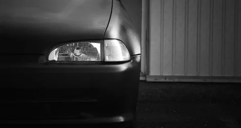
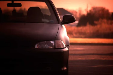
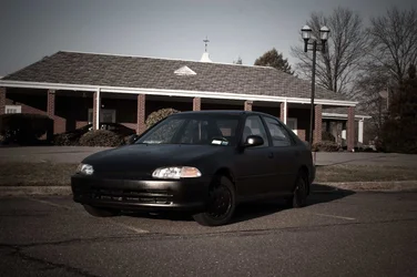
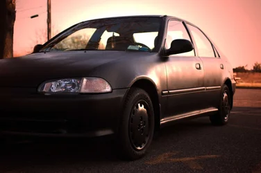
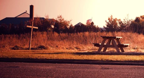
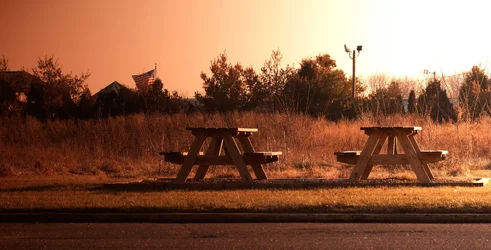
The "stance" is fine, but the exposure and location don't work well. In the first (In future please number images, it makes critique much easier) has the car too dark, and the subject almost appears to be the paneling. The second (UR), again, the care is too dark, and the eye is pulled too the brighter background. #3 (LL)the car is really lost among all the detail of the surroundings. A simpler location and much less DoF would have helped. #4 (LR)would be much stronger had you used at least one light low left to illuminate the front clip/grill area.
The picnic table shots would be much stronger IMO, without the buildings and light standards in the background.




![[No title]](/data/xfmg/thumbnail/32/32809-afb9514cb8c02e2e41c241946e185251.jpg?1734162494)

![[No title]](/data/xfmg/thumbnail/42/42351-b976e32171d0405397bf5237bc4b902e.jpg?1734176880)