What's new

pub philosopher

eiqht

TPF Noob!
Joined
Sep 25, 2012
Messages
12
Reaction score
2
Location
Birmingham UK
Can others edit my Photos
Photos NOT OK to edit
$5737676731_28a50e6a02_z.webp
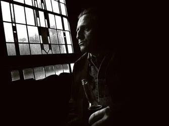
a writer friend of mine - on a session we did for some pub-licity photographs for his publisher.
the original image had a lot less contrast - i worked on this to bring it right down to as dark as i could get it....
 
I'm personally not a big fan of the tilt. Tilt usually gives 'energy' to the subject while the feel of this pictures seems to call for a more contemplative treatment.

Otherwise I like it very much.
 
I love the contrasts and tilt in this photo. It really gives this portrait an edge , an almost film noir feel. Very nice.
 
Love it... But also wanna compare an untitled version
 
I like the tilt. It makes me kind of lean into the picture to compensate, bringing me closer to the subject. hehe.
 
I like it a lot, I think you should leave it uncropped and on the current angle, it lends to the mood of the photo. His expression makes me want to peek inside his mind.
 
Quite intense. like it in this form.
 
I'm always fine with tilt when it makes sense, but unfortunately it doesn't make sense here. Level it.

Unfortunately when you level it (I tried myself but you said "not ok to edit photos" so I won't post it), you wind up with a lot of dead space that just doesn't work either. It's a tough framing of a very interesting subject.

I really like it very much but I don't think you can really salvage it unless you go for a non-traditional crop.
 
$5739797378_b9aa325904_z.webp
thanks for taking the time to look and comment - it's all being taken-in by me!
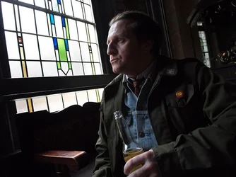
this is the original image(for once i actually kept it, i usually don't archive the original image, as it forces me to get it right first time), you can see where i've added contrast and so on...
at the time, i was paying close attention to the light/shadow on the subject, and the light coming-in off the window - i knew i would be adding a lot of contrast to kill the background and leave only the light falling on his face/hand/jacket... it was one of those moments!
the tilt does give it a bit of tension, i think... he's a good bloke but intense, i feel it captures that!
always interesting to hear what other people pick-out from an image.
 
No, the tilt really just looks like a mistake. Honest. It actually pretty much wrecks an otherwise brilliant shot.

EDIT: Interestingly, I think the tilt works better in the color shot than the b/w... though I'm still not saying the tilt is a good idea.
 
Last edited:
I like it a lot, i dont know why but it has an Irish feel to it,also like the colour version
 

Create an account or login to comment

You must be a member in order to leave a comment

Create account

Create an account on our community. It's easy!

Log in

Already have an account? Log in here.

New Topics

Back
Top Bottom