What's new

Putting in a little work (aka practice)

ronlane

What's next?
Joined
Aug 3, 2012
Messages
10,224
Reaction score
4,962
Location
Mustang Oklahoma
Can others edit my Photos
Photos OK to edit
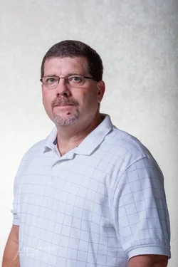
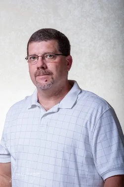
Starting the long weekend by building me a frame to hang a backdrop that I can use for portraits. A trip to Lowe's and $44 of PVC and spring clamps. Got home, cut it and glued the pieces that needed it. Let it dry and then went to work setting up to practice a few selfies.

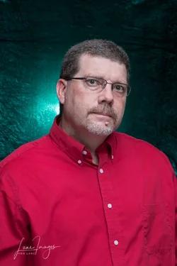
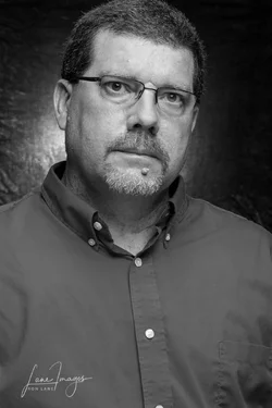
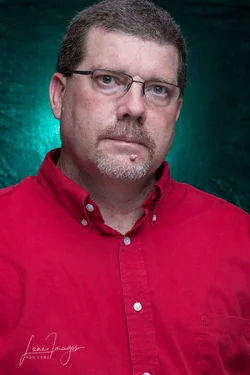
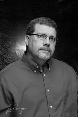
I can't decide on these. Two images, one with a 50mm f/1.8 and one with an 85mm f/1.8. Then I couldn't decide on color or black and white.

1) 50mm
RLane-headshots-3-Edit-Edit.webp RLane-headshots-3-Edit.webp

2) 85mm

RLane-headshots-4-Edit.webp RLane-headshots-4-Edit-Edit.webp

3) bts lighting and backdrop set up.
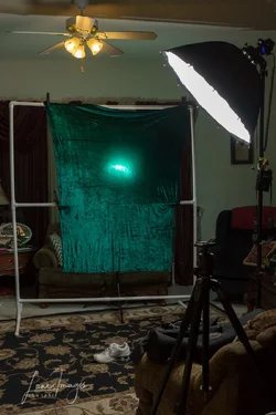
RLane-headshots-39.webp
 
My choice would be the b&w version 85mm, but that`s just me.
 
Last edited:
I prefer the B&W only because of the clash with the red shirt and background. I use this as a good reference when planning shots Basic color schemes: Color Theory Introduction . Prefer the 85 mm for head and shoulder, but my preference is a little more head room at the top, and less torso.

I thought about pvc for a background stand but ultimately went with a collapsible metal model off fleabay for less than what you paid in parts. It's a little more flimsy then I'd like but gets the job done. May yet construct a more substantial model, what size pvc did you use. I found that canvas painters drop cloths make good backdrops. They're inexpensive and can be painted or dyed. They work better if you wash them before use, not as stiff.
 
Last edited:
I go for the 85 and just frame your head a little better; agree on the mono conversion. I will say your taste in models is NOT improving! ;)
 
I prefer the B&W only because of the clash with the red shirt and background.
+1 The only problem I have with the colour shots is the choice of colours.

I like the 85mm best but I would like to see it tighter like below. Cutting off the head doesn't bother me.


rlane.webp
 
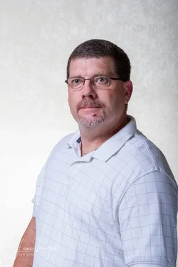
Thanks to everyone for the comments, suggestions and opinions. I will continue to work with this to get everything just like I want it. I set back up this weekend and put on the off-white velour backdrop. I didn't have my streaklight 360, so I used my studio strobes with a bounced umbrella and reflector for main light and a strobe to light the background. I also changed the shirt and went with a white one. Who knew that a plain red shirt would cause an issue. From the stuff that I have said you want a plain shirt.

I'll keep working on it and get my 360 out to be able to soften the light on my face a little more.

1)
R-Lane-II-30-Edit-2.webp

2)
R-Lane-II-45-Edit.webp

3)
R-Lane-II-46-Edit.webp
 
I also changed the shirt and went with a white one. Who knew that a plain red shirt would cause an issue. From the stuff that I have said you want a plain shirt.

I think there may be some confusion, the red shirt or the colored background individually were not the issue, it's when you put them together that it was a problem, that's why I posted a link on color theory. Red and green are complimentary colors, located directly across from each other on the color wheel, and can be a bit harsh for a portrait, even if they correct. However your background (at least on my monitor) was coming off more to the blue/green side creating a conflict. Added to that, red is a primary color on the warm side, it has the effect of advancing in the frame.

I also changed the shirt and went with a white one

Actually you chose a white shirt with a pattern. Not a fan of any pattern, especially one that has horizontal lines (they add pounds). Solid white, gray or one of the subdued muted colors like ruby red, emerald green, and sapphire blue, but stay away from the pastels. If you're wearing a short sleeve then show the arms and hands, or not, but don't show parts. Lastly knit colors look sloppy no matter what, your first choice (button down) was a much better choice.

get my 360 out to be able to soften the light on my face a little more.

Why? What is your goal?? In the edit that Zombiesniper you had a good shot, just needed some headroom. Shadows sculpt and define the face, and are important features on the masculine face. At minimum I shoot for at least a 2:1 and prefer 4:1 or better.
 
get my 360 out to be able to soften the light on my face a little more.

Why? What is your goal?? In the edit that Zombiesniper you had a good shot, just needed some headroom. Shadows sculpt and define the face, and are important features on the masculine face. At minimum I shoot for at least a 2:1 and prefer 4:1 or better.

The light in the original shots were VERY specular and I used PS to "heal" the hot spots where they were really shiny on my nose, forehead and cheeks. The octabox and 360, I can better control the light quantity and quality compared to my cheap studio strobe and umbrellas.

Again, thank you for the comments.
 
I go for the 85 and just frame your head a little better; agree on the mono conversion. I will say your taste in models is NOT improving! ;)

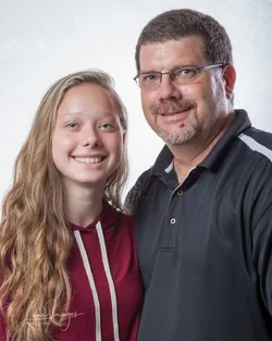
@tirediron, I found a way to improve the looks of my model. Well at least not make her look too bad. It took a dinner date at her favorite italian restaurant to get a handful of photos of her.

This one is a 3 light set up and a reflector, as I tried to add a hair light camera right.

Amanda-test-11-Edit.webp
 
Last edited:

Create an account or login to comment

You must be a member in order to leave a comment

Create account

Create an account on our community. It's easy!

Log in

Already have an account? Log in here.

Back
Top Bottom