Question on politician head shot.

twocolor

No longer a newbie, moving up!
Joined
Feb 26, 2008
Messages
1,044
Reaction score
227
Location
Utah
Website
www.twocolorphotography.com
Can others edit my Photos
Photos NOT OK to edit
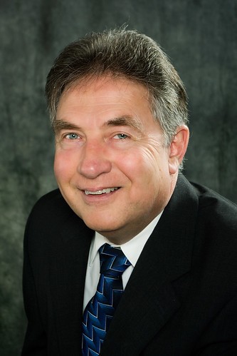
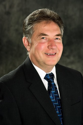
I was asked to take some professional, business style head shots for a local politician. He approved the pics, I designed and had his brochure printed. He loved the pics, loved his brochure . . . then someone told him the pic made him look like he had a big head. Called and apologized and wants a reshoot.

I think it looks fine. I did everything I've been trained to do from lighting to posing.

So, I'm doing him a redo, but I want critiques from my peers to see what I could have done to make this better.

4366167795_bd6bf31deb.jpg
 
I believe you were using the wrong equipment for a politician headshot. Bwahaha. Seriously though, the pose (having his head pushed so far forward) makes his head look larger than his body. It looks as though he is coming headfirst at the camera and it messes the proportions up.. at least in my eyes.
 
I believe you were using the wrong equipment for a politician headshot. Bwahaha. Seriously though, the pose (having his head pushed so far forward) makes his head look larger than his body. It looks as though he is coming headfirst at the camera and it messes the proportions up.. at least in my eyes.

I agree with that. I was taught to always have them bend forward, pulling their chin up a tich. It is supposed to evoke less of a STATIC feel (which may have been perfect for a politician) and minimize the whole double chin issue. So, a pair of sixes maybe?????
 
hello twocolor. i like your photography. i don't like the background in this though. looks like a cave. better in a boardroom or office setting maybe. i'm wondering whether the head-size 'issue' is due to you shooting downwards..also whether including his left shoulder/arm in shot would help?
 
I hadn't considered shooting in an "office" setting. Maybe go with a similar but reposed shot, with him sitting in front of a book shelf?
 
He looks hunched over,and that strong hair/sidelight coming in from camera-right shows the wrinkles in his cheek pretty plainly. I would position his body so that his shoulders fill the total,entire width of the frame, creating a "base" for his head. His suit coat is bunching up at the collar area, further reinforcing the idea that he is hunching over at the shoulders. The bright light on his upper facial planes combined with the darkness on his under-chin areas and his suit front is making him look "jowly"--which is complicated by the fact that he is,uh, kinda' jowly.

The muslin backdrop is in pretty good focus,and having that space on the camera left side allows the eye to run up and down the frame. Overall, the lighting is light, bright, airy, and feels kind of effeminate for a man in a leadership role. He looks like a slightly tough client to flatter. I would be tempted to go with a lower-key, more rugged lighting style--one that would minimize his wrinkled cheekbone areas, and well...make him look a bit more rugged.
 
hello twocolor. i like your photography. i don't like the background in this though. looks like a cave. better in a boardroom or office setting maybe. i'm wondering whether the head-size 'issue' is due to you shooting downwards..also whether including his left shoulder/arm in shot would help?

That is a really good idea. I wonder if he'd be up for that. Thanks!
 
He looks hunched over,and that strong hair/sidelight coming in from camera-right shows the wrinkles in his cheek pretty plainly. I would position his body so that his shoulders fill the total,entire width of the frame, creating a "base" for his head. His suit coat is bunching up at the collar area, further reinforcing the idea that he is hunching over at the shoulders. The bright light on his upper facial planes combined with the darkness on his under-chin areas and his suit front is making him look "jowly"--which is complicated by the fact that he is,uh, kinda' jowly.

The muslin backdrop is in pretty good focus,and having that space on the camera left side allows the eye to run up and down the frame. Overall, the lighting is light, bright, airy, and feels kind of effeminate for a man in a leadership role. He looks like a slightly tough client to flatter. I would be tempted to go with a lower-key, more rugged lighting style--one that would minimize his wrinkled cheekbone areas, and well...make him look a bit more rugged.

YES.

WOW.

So, maybe smaller depth of field to blur the background. I thought I had given him a base for his head, but maybe more squared into the camera? Now lighting . . . darken my hair light? Am I looking for less light on the face in general, or more distinct shadows on the face. A touch more light to camera left to give me some loop lighting - actually, that would cause worse wrinkle definition . . . I'll take more lighting tips for this one!
 
I wanted to thank everyone. I reshot the politician tonight. I tried to follow everyone's advice. Pulled him away from the backdrop a titch. Used a longer lens. Toned down the lighting. Lit into the narrow side of his face. Turned his good eye towards the camera. Yada, Yada, Yada.

Here's the final from tonight.
4369541958_ce54c21f6e.jpg
 
I like this one much better. I like the lighting and pose much better.
 
Wow--you've already done the re-shoot and posted it! You get on a move, dontcha'!? YES, the base looks so,so much better--powerful,masculine, good-fitting suit jacket, direct eye gaze to engage the voters/citizens, muslin a bit colder-toned and a perfect harmony for the jacket...crisp hair light showing his salt-n-pepper hair color...definitely a better presentation of him as a "leader". I think I'd crop of just a scant bit on the left side of the frame to balance out where his eyes are in the frame.

You've done a much better job of slimming down his head; by comparison his head looked fat in the first shot, and sort of squat; in the re-shoot,his head looks longer and narrower. The man in the second shot looks taller, leaner, fitter, and more masculine and more-powerful. Even though it's the same jacket, same tie, same hair combing. With the background more out of focus, and the crisper lighting, the second photo has much more of a feeling of three-dimensionality and Pop! It's quite a difference.
 
Wow--you've already done the re-shoot and posted it! You get on a move, dontcha'!?

It's easy when it's a dozen shots in studio, and one to edit. If that's all the job ever entailed, I'd have alot more time on my hands! (maybe more money too!)
 
A definite improvement. It looks like what I'd expect to see with a corporate headshot, which probably isn't that much different than that of a politician.
 

Most reactions

Back
Top