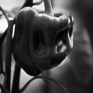
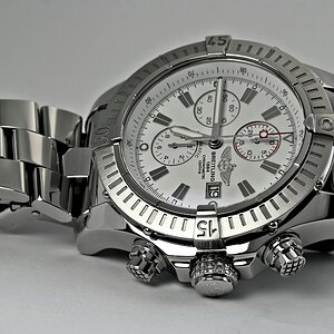
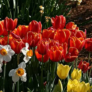
#1 is pleasing to the eye. I like the color contrast and the interest that the space between the boards provides. The yellow looks a touch overexposed to me, but it could be because it's a smaller image.
#2 Simple I like, but with a very soft out of focus background, I like to see silky smooth. Here I see some noise, either from your 640 ISO, or jpg compression, or low bit depth. It could be quite easily fixed with some post work.
#3 The base photograph has some clipping, mostly on the bottom petal. The composition is pleasing. I'm torn about the post processing texturing. It does make the image look nicer, but I think it also might become a crutch to lean on when the photograph is not strong.



![[No title]](/data/xfmg/thumbnail/41/41786-0de67cacf7270937b4833f67d003f9c2.jpg?1734176090)
![[No title]](/data/xfmg/thumbnail/34/34080-185a5f2093f069e6e3033e66044844f5.jpg?1734164515)