What's new

Rate the photo above you

cool thread idea!

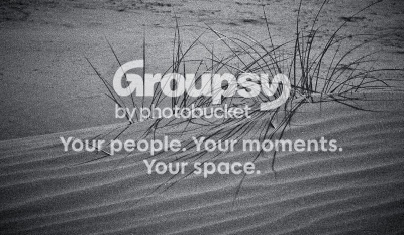
dennycrane, 9/10 love the detail and what is probably a monster crop. could use a bit more negative room imo.

DSC_0990-2e.jpg
 
I like this- I have tried to do this a few times and it did not turn out as interesting. However, the "leaf" kind of thing is distracting- and this isn't really telling a story. What would be really cool is if you got a blurry silhouette of a person with a umbrella in the background. or.. something. over all, I would give it a 7 : )

_MG_4631-1.jpg
(note: I added the noise- tell me if that was a horrible idea please)
 
6.5/10. I think the subject is great and very interesting in B&W. I think there could be just a little bit more room above the top of the grass rather than having the space below it. I don't like the grain in the background beyond the ridge where the plant is as it looks like it was just taken with a high ISO setting. In the foreground the grain just looks like sand. I'm not a fan of the vignetting and I think it takes away slightly from the image.

img0688modbw.jpg

(wish I had left more space around the lower left power pole)
 
intersting... i like the angle and the way the picture's come out..

P8090133.jpg
 
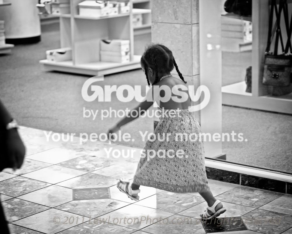
@shreyab 5/10 No area of the photo is in sharp focus, distracting background, the photo is not interesting.

5215880855_c55b53c4c8_o.jpg
 
Last edited:
6/10

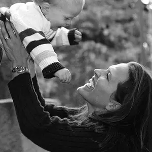
While the pose is fine, the lighting betrays this picture, I think.
The skin parts just arise out of the black background. We can't see the woman's clothing so she is a disembodied head.
The light is too strong on the baby and so the baby's head is bleached out and his arms are darker.

With no light on the background and no clothing viewable on the woman, lots of the space is dark and doesn't contribute anything.
Solution, light on background, less light on baby, brighter clothing on female.


_0797315_0166-2.jpg


since this seems to have stalled the thread as no one wants to respond, how about this one?

Leah__0793989.jpg
 
Last edited:
try [/IMG] at the end...
6/10 While the pose is fine, the lighting betrays this picture, I think.The skin parts just arise out of the black background. We can't see the woman's clothing so she is a disembodied head. The light is too strong on the baby and so the baby's head is bleached out and his arms are darker.With no light on the background and no clothing viewable on the woman, lots of the space is dark and doesn't contribute anything.Solution, light on background, less light on baby, brighter clothing on female.

Thank you.
 
7/10 - I like most of this image, nicely sharp, nicely exposed, nicely rendered colors. There bare limbs on the right are not adding anything for me.


595939427_TSd8J-L.jpg
 
Last edited:
6- I love the subject- but the duck needs to have more of a profile and the shadow on the water from the duck isn't pleasing to me. Really cool shot if they would of cooperated better. The story to it is great. Good eye to see it and snap it, wish they would of played nicer : )

IMG_9861.jpg
 
Love the contrast and wish I could take a photo this clear lol
8/10

Taken at Niagara falls.
C&C would be great. I love the comp of the photos but not sure if the exposure and edits work.
a68989b6-8f8c-1737.jpg
 

Create an account or login to comment

You must be a member in order to leave a comment

Create account

Create an account on our community. It's easy!

Log in

Already have an account? Log in here.

Back
Top Bottom