Recent Shots C&C

Bee Bee

TPF Noob!
Joined
Jul 26, 2009
Messages
195
Reaction score
1
Location
East Anglia - UK
Website
www.photographybybon.co.uk
Can others edit my Photos
Photos NOT OK to edit
Hi, I'm pretty new here so bear with me! These are some shots I took last week with my Canon 450D. Unfortunately it was really windy so that sand was blowing all over! Any critism appreciated! xxx:sexywink:

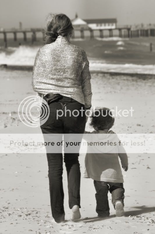
IMG_5122.jpg

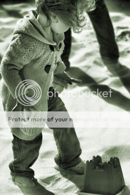
IMG_5110.jpg

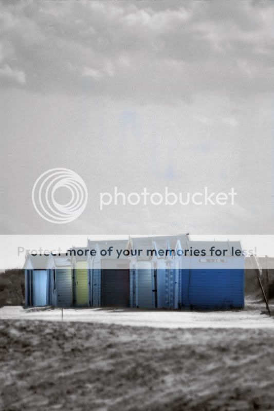
IMG_5257.jpg
 
i'm new to this so not much for you but i love #2. it's very strong
 
I like 2 a lot. Was quite surprised by it. The legs in the background are unfortunate, as I think the shot would be even better without them. Still, the crop is kinda wrong and very cool at the same time. You cut her head off! Yet, it seems to work. Texture in the oversized sweater, texture in the sand, neat three-side frame including the sand toy. Really very nice.

The first one is a cute moment. I would try pushing the contrast up.

The third one didn't work for me... post processing is a bit too evident, I think the scene wanted landscape more than portrait as the sky isn't interesting enough to pull your attention up... also there's something wonky going on in the space between the shed things and the sky.
 
Thank you - I would have loved to have taken the legs out of the second one but I am not experienced enough to attempt it! I'm glad you like the 2nd one manaheim - I was going more for the textures in the photograph than the actual shot as I felt they really contrasted well. I didn't want to take just a plain old straight photograph either!

The third one is a difficult one - the huts themselves were wonky and also the ground behind was wonky too - is there any way I can rectify this in PP? Also do you think that cropping the picture would give the effect of landscape rather than portrait? Thank you again for your comments - I need CC from other photogs so that I can improve! xxx
 
I agree with Chris in his comments regarding your middle image. Despite her head being cut off, it works because the rest of the image is composed well, with excellent range light to dark. And the child's hands are so expressive. Your image really catches the feeling of wonder and intensity of a child's world.

There's appropriate depth of field, with the child (and especially her sweater detail) in focus, and her mother's legs not in focus. The mother's legs not being in focus makes them more of an abstract compositional element and not so distracting from your main subject, the child and her involvement with her bucket.

I'm afraid I also agree with Chris regarding the beach huts.

Even if in PP you were to burn the clouds in more, there isn't enough connection between them and the lower portion of the image. I like your idea for the selective colouration.

Perhaps shooting from a different angle would have provided a more balanced composition?

Something I like in all three images: your exposure. Shooting at the beach can be quite challenging. It's easy to blow out highlights or lose shadow detail. You've done very well avoiding both.

I'm looking forward to seeing lots more of your photos!
 
i like the composition of all three shots ... the selective color shot (#3) is nice but I think it would've been better if you had left it all b/w.
 
Wow - I can honestly say you have made my day! I think the problem with the beach huts I was about 3/4 of a mile away from them and so didn't have enough scope to play around with angles etc as they were across the river!

I love that you got the expressiveness of the child's hands - it's actually my niece and at 22 months she is the most expressive child I have met! Everything is Wow! And Look! But not only is she verbally expressive, she is physically expressive also which makes her an absolute pleasure to photograph.

I am also so chuffed that you think my beach pictures work - I have major admissions to make here - although I have been taking pictures for a while, I own no lighting equipment whatsoever and literally rely on natural light ( although I find that more fun!) and the beach is my favourite place to take pictures as it's my favourite place to be! I shall upload some more pictures for you to CC - I need as much as I can get as I am studying at the moment - and my current module is for a local travel brochure so with the beach being local I wanted to concentrate on that, and also I am a perfectionist and so CC is so important to me to get things just right - also no one I know is serious about photography so although they can say they think my pictures are good I never take that as a qualified opinion if you know what I mean!

Anyway enough waffling from me - I am so grateful for the CC and will continue to shoot the beach!! Now off to dig out some more beach pics for CC!

One very happy smiley Bee!:)
xxx
 
I didnt like the first shot at all ..it was out of focus and just seemed like a snapshot. the second has been spoken for well by everyone else so i agree and the third should have stayed either in color or all b&w selective coloring has its place and that shot wasnt it.
 
question: what does it mean when someone says "it looks like a snapshot"?

Not much attention paid to composition and generally something that appeals only to the person who took the image- as would be the case of of a shot of some friends drinking beers over at your house one Christmas eve or some such.

I STRONGLY disagree with the assessment that the first shot is a snapshot. I think it needs some work, but there is emotion and compositional care in the image.
 
I like 2. I agree with boosting contrast in 1. Selective coloring is almost never accepted here, so youre brave posting #3. :lol:

Mark
 
Mark - thanks for the tip on selective colouring! Obviously those kind of tips are helpful to a total noob like me!!!

Manaheim - although some would say I am biased because it's my work, I too disagree with the snapshot theory on #1. The focus is on the detail in the shawl which then brings you down to the dark trousers which in turn takes you to the feet, which are both positioned in the same way ( for which I had my camera on sports mode as I hate posing shots!). I wanted the image to show the bond between my niece and sister without focussing on facial expression or major physical expression. I think I captured this. The reason some of it may look out of focus is because as I mentioned in my first post, it was a very windy day and the sand was blowing everywhere - which is more evident at the feet. I agree on the contrast and will work on that - I think the other thing I need to do is learn how to adjust the skyline so it is straight! The pier in the background is intentional because it's part of where they live.

xxx
 
Yup, I got all that. I even noticed the feet. As always on here, you have to take in all the feedback and decide which ones to listen to on your own.
 
#1 - I don't think anyone else mentioned this, but the horizon isn't level. I apologize because this is a big pet peeve of mine. I'm also guilty of it. Half the landscape shots I take I end up having to straighten. Even though it isn't level, leveling it might actually make the woman and child look like they are leaning, strangely enough, because it appears that they are both standing straight. So, I might experiment with the straightening to see what it does to the shot.

#2 - I really like this shot. The composition is great even though it isn't your typical "rule of thirds" style composition. The child's head being cut off actually adds to the shot I think by drawing your eye down to what she's focusing on (the sand castle).

#3 - I personally am not a fan of selective coloring. Were those huts that color, or did you add the color? I think the shot would look better as a pure B&W, and I'd actually like to see it like that.
 

Most reactions

Back
Top