Revamped Website

Craig checked it out and I like it alot. I haven't seen your old site so I have nothing to compare it with but surely enough I like. I was really intrigued by the product photography section :thumbup:
 
Thanks Camz! You know I love your work so your reply means a lot to me.

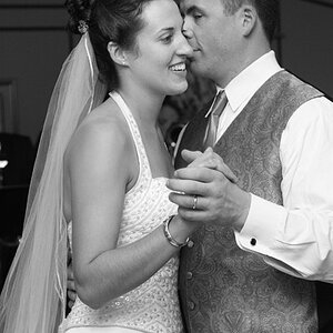
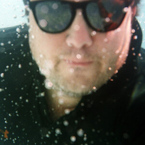
Glad you like the product section. According to Google Analytics (at this point) most folks gravitate toward the people section. Not seeing a whole of money in that facet of my work, but you never know.

Love & Bass
 
You could rename product 'commercial' if you wanted, it still would work.

Haven't seen your old site, but this is pretty clean, minimalistic... the text on the right could be a bit to the left but otherwise... :
 
Agree with above comments. Change "product" to "commercial"

Would be better if page would fill monitor without having to scroll right and left to see the entire page on one screen.

I have to do that with your website on both of my monitors (17" and 20").

But I like the overall design.
 
I agree with the other commenters.

I like how your site is to the point and simple to navigate.

It's never going to get found by search engines though. It's all flash except the mainpage which has very little text on the first page. A little SEO would be in order.
PM me if you have some questions about that.
 
This is a small thing, you may want to increase your indent on the left side.
In your Contact/about page the text is flat against the edge and it makes it difficult to read smoothly.

As well I can see your entire page but I have a gigantic monitor, I would sugest formatting for the most common monitor size.
 
Thanks for all the comments gang!! They are just what I needed. I will take them into consideration except changing product to commercial. Commercial is too broad a term.

Love & Bass
 
One thing that I'm not real fond of is the thumbnails diapering to the left, and the fact that the list scrolls in the opposite direction of where you move the mouse, but I have a hunch that those features are built into the viewer?

Other than that, I like the bright uncluttered approach, you let your work sell itself.
 
Thanks Ryan! I do have the option of the placement of the thumbnails. They can be placed at the top, bottom, left or right. They can also appear on scroll over or be constant.

I like them disappearing, but I will investigate their placement.

Love & Bass
 
People = portrait(ure)
 
Thanks for your reply FC! I like to think that I photograph people. Not portraits of them. Portraits or portraiture seems like an outdated concept. I want to keep the human element.

Love & Bass
 
I like the simplicity of the site and I like a lot of your images.

I would possibly edit your photos down a little, you have enough to do so. Because you have some really strong images, and then some mediocre images mixed in with the bunch (in all 3 sections). It stands out most in the portrait section. You have some photogenic people in good looking photographs, and then you have some decent looking people who really aren't very photogenic in my opinion in other photographs. There is nothing wrong with the latter photos, technically they are good, but the people aren't model material and I think that it hurts the portfolio a little.
 

Most reactions

New Topics

Back
Top