
- Joined
- Jul 14, 2011
- Messages
- 4,173
- Reaction score
- 2,551
- Can others edit my Photos
- Photos OK to edit
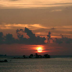
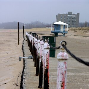
These were taken on a recent trip to the Oregon coast.
Poor weather didn't stop me from braving the elements to get some shots!
#1

#2 Bandon Archway

#3

#4 Lone rock

Poor weather didn't stop me from braving the elements to get some shots!
#1
#2 Bandon Archway
#3
#4 Lone rock
Last edited:


![[No title]](/data/xfmg/thumbnail/31/31750-f3936d67895e1ef2756eb06d7b15fe9c.jpg?1619734990)

![[No title]](/data/xfmg/thumbnail/42/42065-b846d670a79653fe9a60fc2ba4bc683f.jpg?1619739998)