Second wedding of the season

flipmachine

TPF Noob!
Joined
Apr 5, 2009
Messages
42
Reaction score
0
Location
montreal
Can others edit my Photos
Photos OK to edit
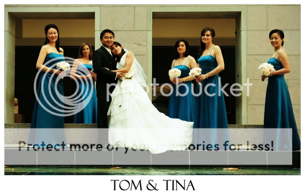
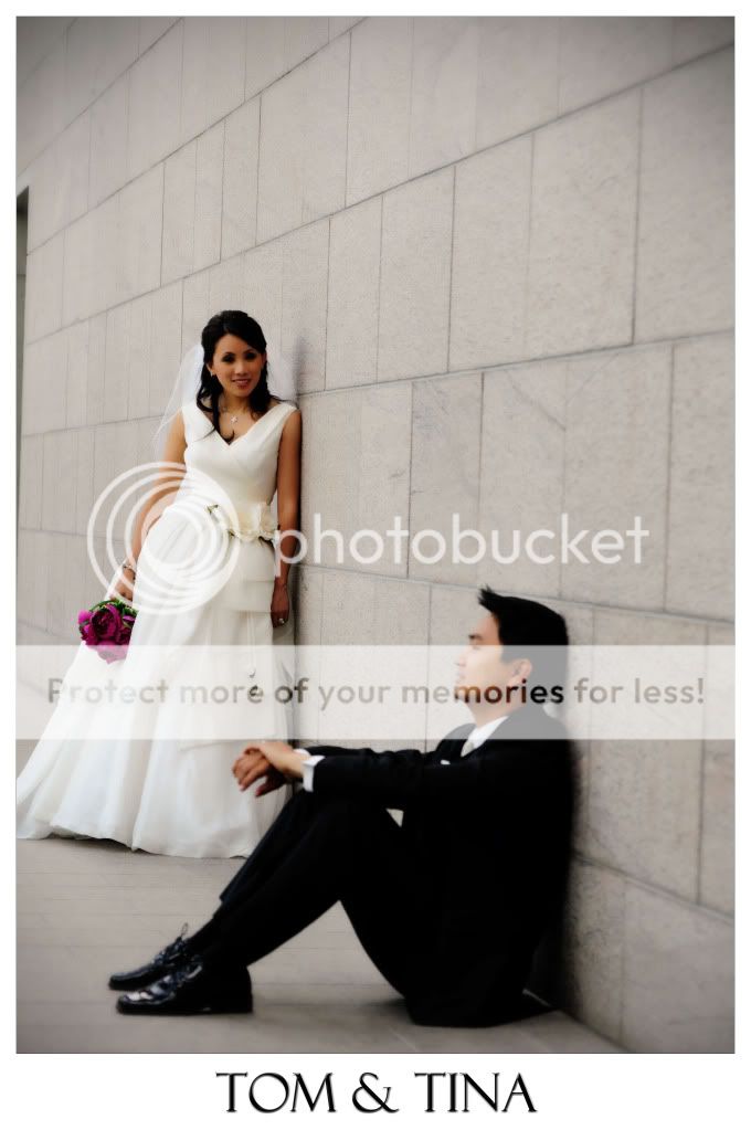
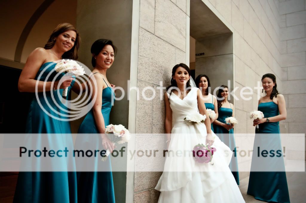
Here is my second wedding of the season, C&C always welcome, helps me take a better shot next time.

1
Tomtina120.jpg

2
Tomtina131.jpg

3
Tomtina34.jpg

4
Tomtina26.jpg

5
Tomtina117.jpg
 
First pic is now cropped a little to fix water line.
 
I wouldn't have cut off the feet in 4 and 5.
 
I'm kind of iffy with these.

1- The first is a nice group shot, but I find that the spacing between the subjects is random and not consistent, mainly with the girl on the far right. Did she fart or something? The exposure seems a bit off too, the dress comes out as very white, almost blown.

2- This one has me baffled in terms of composition. My eye goes straight to the dead space above her arm, and I figure this isn't the part of the image you wanted the viewer to focus on. I guess you were going to an intimate moment with her arm on his shoulder, but that action is too far up in the frame. I would see this shot as higher up, more to the left to maybe get some of the bride's face in the image.
Other than that, the fingers are cut and the elbow is cut. Moving in closer to see the ring would of been great as well.

3- Either a DOF issue or a focus issue, but the guy is blurry and I personally dont like that. There is way too much wall in this image and you see part of the frame of a doorway or something on the far left. Alot of empty space up top.

4- I really REALLY do not like the pose of the person on the chair. Reminds me of a stripper. This is not flattering and unless it was specifically requested to be like this, I would not have a crotch shot as a wedding photo. The people in the back are again spaced out oddly and while I dont mind one girl talking to the other, I dont like the left most one who is looking down as it looks like she is blinking (or was she blinking?). The total blow out of the sky on the right hand side is distracting. You have some dead space up top as well, so to fix both the crotch issue and the dead space, simply zoom in or move in more.

Moving more to your right and have the right most woman move in to all be in front of the tree might help.

5- I'm not a fan of having a staggered look like this when the bride is not in the front. The way you have them setup, the person in the back comes out as really not important. Again, a bit too much dead space ontop. I dont mind room on top, but have something interesting going on there. Again, parts of the dress seem blown out.
 

Most reactions

Back
Top