Self critique of first strobe portrait (other critiques welcome)

dsiglin

TPF Noob!
Joined
Jan 10, 2012
Messages
266
Reaction score
73
Location
Greenville, SC
Can others edit my Photos
Photos OK to edit
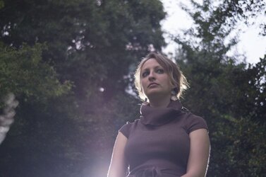
Photography for me is a hobby and it can get rather expensive. I want to start making back some of the money I invested by doing portrait work. To that end I decided I needed a lighting kit. I haven't had much time to test the setup but last night I convinced Rachel my wife to stand outside while I did some test shots. The lighting was not very good as the sun had already slipped behind the trees but I was able to pull out one photo I liked reasonably well. This has been post processed to give it that low contrast look I seem to be in love with right now. For this shot the remaining sunlight was filling in the face with the flash behind and me crouching looking up. ISO was 1600 I think, yeah the light was that low. I did use a slow lens, Minolta AF 35-105 (it was around 70mm @f4) with the LEA2 adapter. Should have used my Canon FD 50mm 1.4.
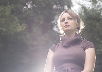

$Rachel_Flash6.JPG

My own critique:
After the shot I realized her arms are cut off at elbows, ouch!
Angle of light makes hairs on arm stand out, not very flattering. Stray hairs next to collar are distracting.
I definitely should have used a much faster lens, the noise even at this small size degrades quality and the background isn't rendered as well as a larger aperture would do.
I love the rim lighting on the hair and I even like the flare from the flash that is just off camera. I love the ethereal feel it gives especially in the twilight hours.
To me the way the shadows fall on her face is pleasing and I like that both eyes are lit well.
I wish I had been able to pull more color out of them as she has very distinct light hazel eyes.

This was just a quick shot, I am going to take more time and be more deliberate next time. I just need to round up some friends to pose for me. :)
 
For me to give input on your lighting, I'd have to see the SOOC original. From the above, I see issues... but it's hard to tell which are technique, and which are intentionally injected in PS to give that "look you're loving".

And you've already noticed the main things... composition and the effect of the backlight.
 
Crit per req: WHY were you so low? The shooting position, combined with the lighting are, IMO, very unflattering. In particular is the effect that it's had on her breasts. You've made them look almost as large her head which gives the image a very unbalanced look. Shooting from above the subject empowers the viewer, shooting from below empowers the subject. In this case, I could see this as a cover shot for "Gulliver's Travels" and not much else. Even when you're shooting to empower viewer or subject, it shouldn't be that extreme.

I would also like to know why she's looking away from the camera; generally speaking the subject should be engaging the viewer by looking at them.

I'm NOT a fan of the desaturated look, but I can appreciate how it can add to an image, 'though in this case that, combined with the flare just makes me think 'bad exposure'.

My suggestion would be to start with the basics and get those down pat before you worry about trying to get artistic. Start with a simple one light basic upper-body shot and once you've got that down, begin experimenting. In short learn to walk before you even think about trying to run!

Just my $00.02 worth - your mileage may vary.

~John
 
Camera angle is very low, and the horizontal camera orientation as you mentioned crops her off badly. This is a situation where a vertical camera orientation could have made her look powerful. With such a sideways eye direction, she could have used more room to "look into", I think. I personally think that the a strong, hot-lighted hair lighted by a flash placed behind the head looks very "1980's", and is an old affectation that's better left in the past, and not moved forward. Unless it is done exceptionally subtly, a speedlight plopped behind a person very often looks very ad hoc; if you want to do that, then by all means, use a grid over the light, and maybe even pair the grid with a diffuser, or use a modifier like the Flash Bender or something else that'll really take the "artificiality" off of the raw, Fresnel-lensed speedlight look. For a first effort though, I think you did some things mostly right, and were headed in a generally favorable direction. I've seen many first efforts of all types that were not done as well as this, so take heart!
 
This is one for the recycle bin and start again
If you're going to make a statement like that, how about giving some suggestions for where the OP should start for an improved result? Not much point in just saying, "It's junk" if you don't tell them why, and how to fix it!
 
I'm not a fan of the flare. It looks like a very localized magenta fog.

Also the background is distracting due to the lightest part being directly behind her head.
 
I'm glad I futzed this up because it gets more responses than if I did a rather midling photo. :)
Here is the OOC raw file.


$rachel.jpg


My current setup is a 43" umbrella with a yn560ii shot into it. I tried using the speedlight to light her face but I didn't like the results. As I mentioned there was no sunlight hitting her, just ambient light and that was very faint so using the speedlight on her face even when shot into an umbrella on a 1/128 lit just her face with everything else being dark and the effect was not very nice looking. That's when I decided to try rim lighting with the speedlight and use the available ambiant light to light her face.


I guess if I were to do this same setup again I'd dial back the speedlight to give just a soft glow around the head and body to pull her from the background but avoid the 80s as Derrel put it. :) I'd also shoot higher and put the speedlight above and behind the head to give nice rim lighting without the blow out hair. Sounds like my best option really is to not do it again and instead do something super simple, maybe find a few portraits I like and try to recreate them.


What does a grid over the light do? A diffuser I understand.

EDIT: a few weeks ago I did take a non-flash portrait that actually has eye contact and no cut appendages.

$Rachel_web.jpg


Thank you all for your critiques, it has not been wasted on me.
 
Last edited:
This is one for the recycle bin and start again

yea...this one just isn't working for me. heres why....
1: sun flare. ugh. (a popular "look", but i think it very rarely adds anything good to a photo. its a cheap gimmick)
2: desaturation. UGH! (yea, i get that this is another "look", but I don't think its a very good one. pretty much ever. another cheap gimmick. make the colors look good)
3: low shooting position. unflattering. get the camera up higher.
4: why was this shot horizontal? nothing off to the side interesting enough for me to feel like it should have been included in the frame. im not saying portraits can NEVER be horizontal....but I think vertical orientation would have been better in this case.

you have a very attractive subject. talk her into letting your practice on her more.
 
...What does a grid over the light do? A diffuser I understand.

EDIT: a few weeks ago I did take a non-flash portrait that actually has eye contact and no cut appendages.

View attachment 55930


Thank you all for your critiques, it has not been wasted on me.
Grids focus the light instead of allowing it to spread; it's a great tool for use in feathering light and controlling spill/fall off. That monochrome portrait is GREAT!
 
Yes, the B&W shot is pretty solid. She looks good, and engages the viewer directly, the eyes have sparkle, and it has a very candid, of-the-moment feel.
 
But her head is cut off!!!!!!!!!!!!
 
im going to start a photography business doing just portraits.
i will shoot ALL portraits with the heads cut off.
it will be called "Red Queen Photography"
it will be trendy.
 
it was a joke.

as for the OP's picture, the face isn't exposed properly and that ruins it for me. as well as the flare, which seems to have been added in digitally?
 
But her head is cut off!!!!!!!!!!!!

You might joke...buuuut...this is a VERTICAL shot, with plenty of space below her chin. She is not just a "floating head", since the pose, and the framing, both match....tall, narrow subject, tall, narrow frame...yes, her head top is cut off...this is a close-up, and with the placement of the EYEBALLS at the proper elevation in the frame, this looks like a reasonably well executed shot. The crop mid-arm is perfectly fine, and acceptable.

See, it's much more than knee-jerk commentary....there's actual reasoning underlying this. And AGAIN, this is framed with subject/frame coordination, not just a what has long been called "a floating head" in a horizontal frame, filled with dead space; her shoulders, chest, and arm all create a classic "base" for the portrait.

Comparing the original, off-center horizontal shot, and the second, B&W close-up, which makes good use of simple compositional theories, and one can see that, yes Virginia, there *is* a visual language.
 

Most reactions

Back
Top