What's new

Shoot with Esther

Austin Greene

Been spending a lot of time on here!
Joined
Jan 6, 2012
Messages
1,472
Reaction score
855
Location
Mountain View, California
Can others edit my Photos
Photos NOT OK to edit
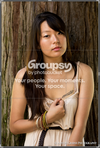
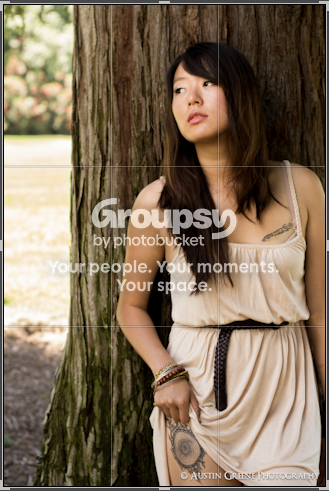
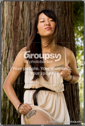
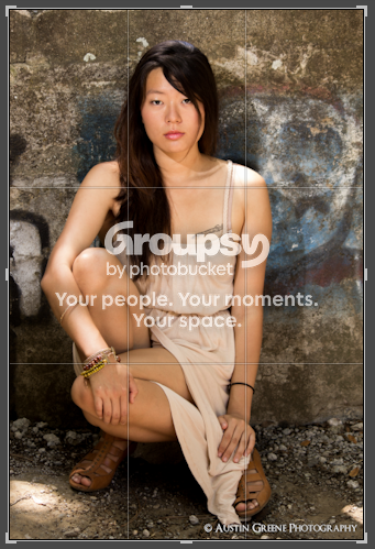
I had my second ever shoot today! First time model named Esther, but you can bet it won't be her last, she was great! The only available time had us shooting in direct overhead sunlight (90F!) with very little shade, so that was tough to manage, but I think it wen't well enough ;) In several of the shots I emphasized her tattoos on purpose since they had significant meaning to her. My biggest CC would be that I should have asked her to remove the hair band from her arm.

I don't expect CC on each image (though feel welcome to if your up for it), but what do you think? Any glaring errors overall? Things I should try not doing, or things I'm doing right?

If nothing else, general "Good Job" or "Better luck next time!" would suffice :)


Hope you enjoy them!

Best,

Toga


1.

Untitled by TogaLive, on Flickr

2. One of my favorites.
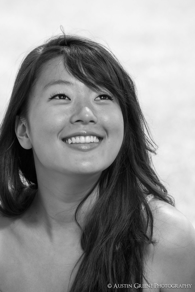
Untitled by TogaLive, on Flickr

3. Probably my favorite from the shoot. Something about it just gets to me.
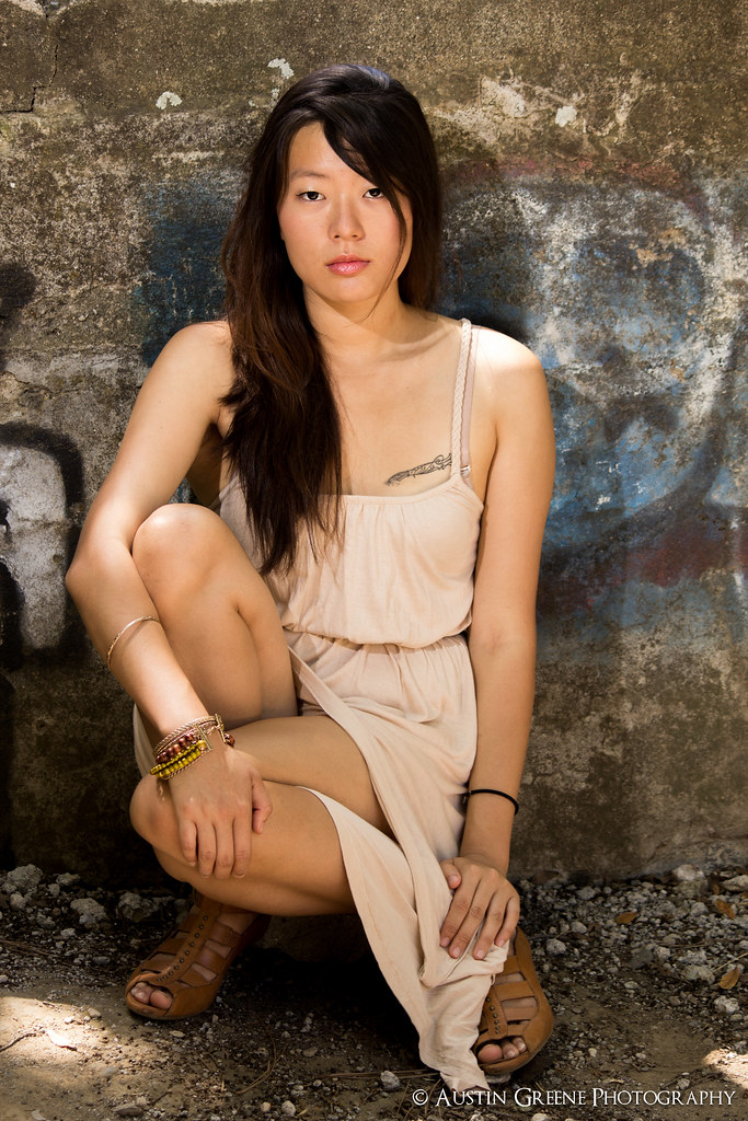
Untitled by TogaLive, on Flickr

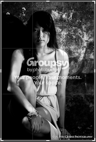
4. Wanted to try something a little different and go for a feeling of insecurity, distrust, or maybe even veiled fear.
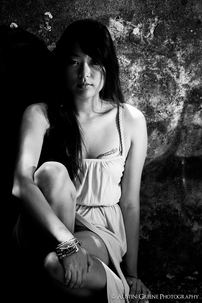
Untitled by TogaLive, on Flickr

5. Another favorite from the shoot.
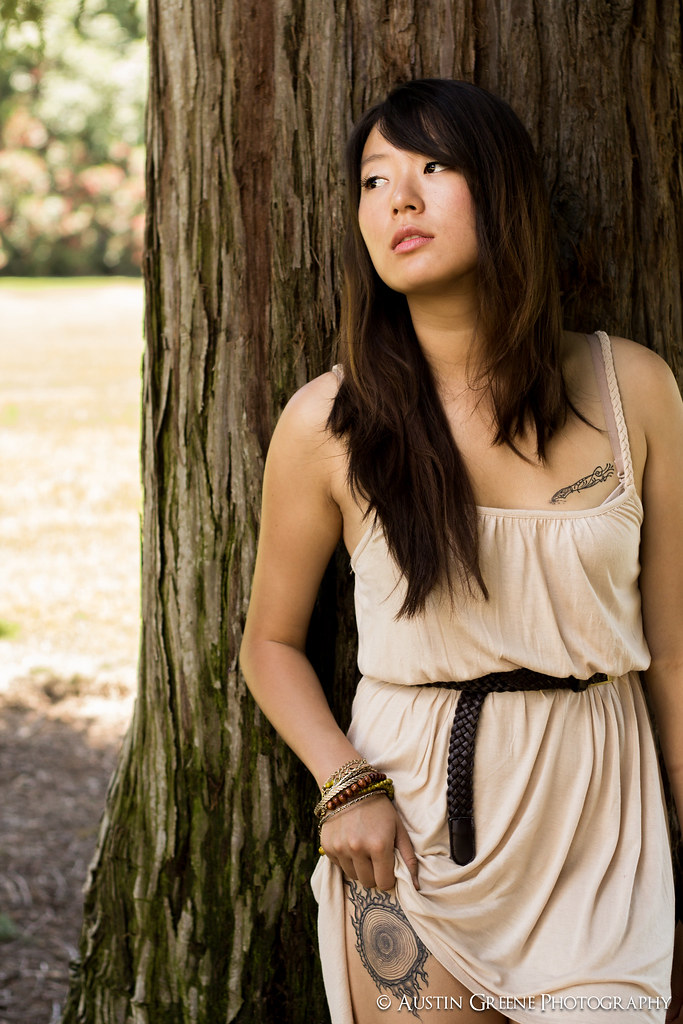
Untitled by TogaLive, on Flickr

6.
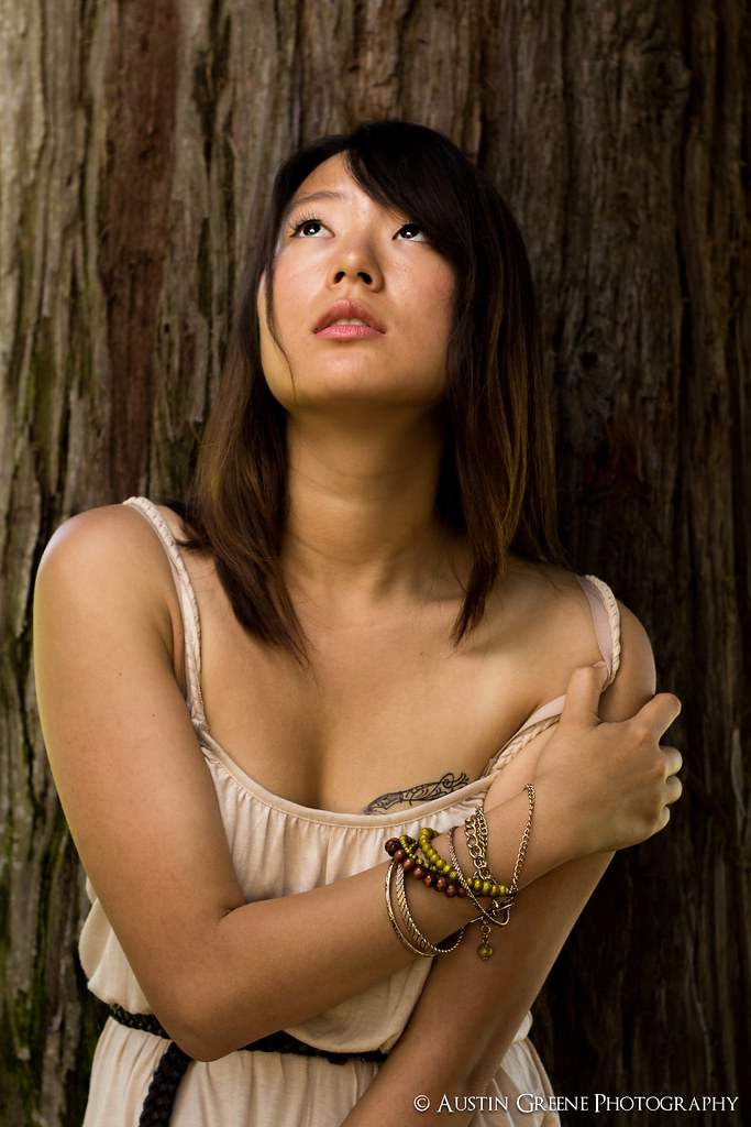
Untitled by TogaLive, on Flickr

7.
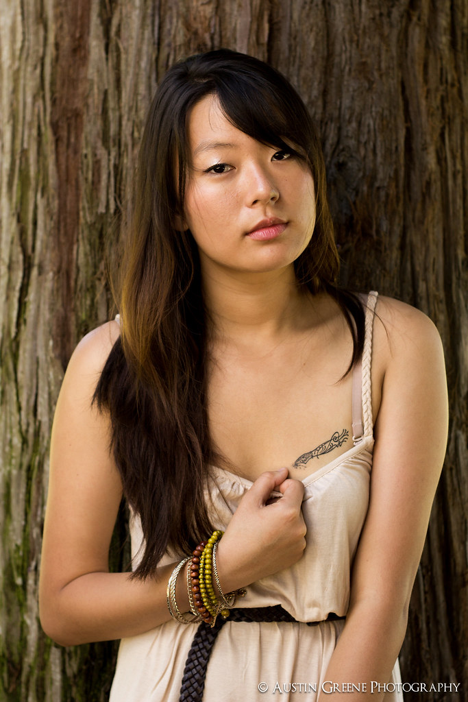
Untitled by TogaLive, on Flickr

8. Feelin' Spunky!
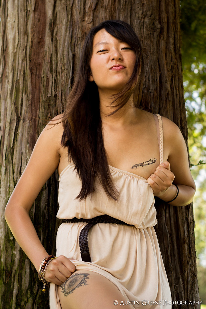
Untitled by TogaLive, on Flickr
 
Last edited:
2,3,5,8. My faves.

Good stuff. Shoot her again...I think she likes it.
 
her bra strap keeps staring at me. I think number two is my favorite. But see that one piece of hair in the middle sticking out? yeah its bothering me. In number four, you seem to loose her hair witht her shadows. But great set!
 
2,4,8 my favs
she works well with the camera :thumbup:
 
showing off the tattoo does not look natural to me. I would find a pose where her tattoo on the leg is shown naturally.
 
My main comment holds for nearly every one of these, and that is you seem to have "locked into" the "rule of thirds", or something like that. It is disconcerting when the framing seems "contrived" to the point of cropping your subject only to have included unnecessary background (for no apparent reason).

#1 There are some white spots floating around that should be cloned out. Also, the horizontal format is not working.
#2 Frame should be moved to the left to include her hair.
#3 Very good pose, frame, and focus, but there is a shadow caused by the flash.
#4 Pretty good, overall, but the flash caught just her right elbow, creating a "hot spot" just where it is not needed.
#5 You cropped the model to get the blown out background.
#6 Very good, but maybe for next time she could wear a strapless bra.
#7 Probably means more to the model than to everyone else.
#8 I predict that she will bury this photo in the bottom of the junk drawer in a couple of years.

Summer is coming up; ask her to wear a bikini if she wants to show off her tats.
 
2,3,5,8. My faves.

Good stuff. Shoot her again...I think she likes it.

Glad you liked them! We will definitely be doing a reshoot, particularly with better lighting conditions.

great shots....

Thanks!

her bra strap keeps staring at me. I think number two is my favorite. But see that one piece of hair in the middle sticking out? yeah its bothering me. In number four, you seem to loose her hair witht her shadows. But great set!

Duly noted, it wasn't something that could be changed at the time of the shoot, but you can bet it will be for the next! As for #4, the loss of contrast you speak of was done intentionally ;)

2,4,8 my favs
she works well with the camera :thumbup:

Thanks Pickle, hopefully we'll have another shoot sometime soon!

showing off the tattoo does not look natural to me. I would find a pose where her tattoo on the leg is shown naturally.

I appreciate the honesty Schwetty! Besides a swimsuit, do you have any suggestions on how to show off the tattoos more naturally next time around? Maybe just a shorter/more revealing dress so she doesn't have to work so hard to show it off?

My main comment holds for nearly every one of these, and that is you seem to have "locked into" the "rule of thirds", or something like that. It is disconcerting when the framing seems "contrived" to the point of cropping your subject only to have included unnecessary background (for no apparent reason).

#1 There are some white spots floating around that should be cloned out. Also, the horizontal format is not working.
#2 Frame should be moved to the left to include her hair.
#3 Very good pose, frame, and focus, but there is a shadow caused by the flash.
#4 Pretty good, overall, but the flash caught just her right elbow, creating a "hot spot" just where it is not needed.
#5 You cropped the model to get the blown out background.
#6 Very good, but maybe for next time she could wear a strapless bra.
#7 Probably means more to the model than to everyone else.
#8 I predict that she will bury this photo in the bottom of the junk drawer in a couple of years.

Summer is coming up; ask her to wear a bikini if she wants to show off her tats.

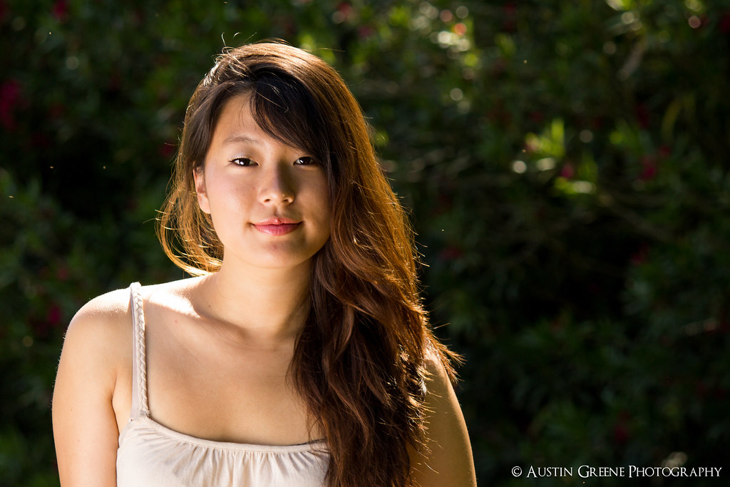
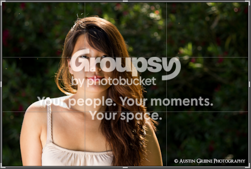
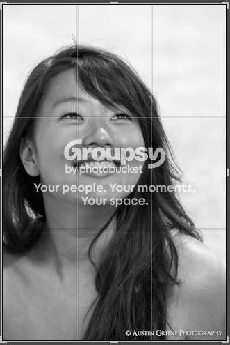
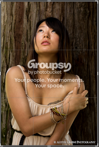
I'll approach this one piece-wise. First off, I appreciate the CC! I don't agree with it all, but its good to hear someone else's point of view. As for the RoT, I think we might have varied opinions on that. If I wanted to "Lock into the RoT" I would have framed the shot as I did for #1 and #2, with the intersection directly on the eyes. All the other shots do not follow this trend, I've included uploads to visually demonstrate. As for the background, all I'll say is that the backgrounds that were included were done so for a reason, not "contrived" because of the framing.

#1: I totally agree, those "white spots" are small bugs flying around. Like mentioned before these are not final edits, so they will be cloned out.
#2: I have to disagree, but thats my opinion. You can't see it in the shot, but just to the left is her dress and bra straps. Having straps prominent on one side but not the other would have damaged the shot imo.
#3: Glad you like the frame and pose! The shadow was done intentionally, but I understand how its not the best for everyone.
#4: Couldn't agree more, that highlight on her elbow has been removed in post ;)
#5: Again, I think we just have different perspectives on backgrounds. Had I not cropped the model, her hand would have been chopped off at the bottom of the frame. The background was included to provide perspective, it serves its purpose imo.
#6: I absolutely agree that a strapless bra is in order for the next shoot! Unfortunately it couldn't be changed for this go around.
#7: I think you read that one right on. The purpose of the shoot is more to provide the model with shots they can personally use then shots for my portfolio, especially since they are volunteering. There was quite a lot of personal meaning to the shot, something that the average viewer should be able to interpret with a little inspection.
#8: Maybe, maybe not. All I know is that its one of her favorites at the moment, and if she's happy with it, then I'm happy ;)

Here are those references to RoT I was mentioning:

The two that follow RoT:
Screenshot2012-06-03at31428PM.png

Screenshot2012-06-03at31351PM.png


The other 6/8 that don't (imo) strictly follow RoT:
Screenshot2012-06-03at31336PM.png

Screenshot2012-06-03at31326PM.png

Screenshot2012-06-03at31314PM.png

Screenshot2012-06-03at31302PM.png

Screenshot2012-06-03at31249PM.png

Screenshot2012-06-03at31236PM.png


All in all, I really appreciate all the great feedback everyone's given! Portraiture is a whole new area for me and every bit of advice counts, Esther was only the second person I've ever photographed. I make a point of using all your advice in new shoots, and its great to see repeated feedback by the folks who give it! I've got another shoot this coming Friday and I'll post images from it as soon as possible!

Best,

Toga
 
Last edited:

Create an account or login to comment

You must be a member in order to leave a comment

Create account

Create an account on our community. It's easy!

Log in

Already have an account? Log in here.

Back
Top Bottom