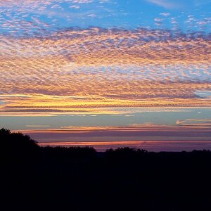
whats with the two spots on the top one? i always get the best silhouette when i put the lens right beside the sun and set exposure off that try it out let us know...i also really like the tree but perhaps move it off center a bit
i cant say i'm a fan.. as they dont look totally silhouetted to me... i can still see the textures of the trees and such... my experience with silhouettes is that they just look straight black, no textures, just black
First one is kinda neat. Is that horizon the way it should be? Looks a bit off-level- use the tree to judge straightness, maybe.
I would want to crop off the left or right to put that tree more into the rule of thirds position, but its a shame because I really want to push it more to the left and that would cut out a lot of interesting objects.
Regardless, looks like you got silhoettes, which is what you wanted, so cheers.
I don't see anything silhoetteish in the second one... it's just a "shot in the dark" <guffaw>. (btw, that one needs levelling also)
personally i dont like any of them at all. the first one the horizon is pretty crooked and not really that much color except the orange and i think the bottom of the pic in the first one is ugly. Also, I think you should show very little maybe one iinch (in the final photograph) of the forground and a lot more of the sky. just put the horizon the the bottom 1/3 of the photo.
the send one i think could have been a lot sharper and the tree could have been straight and whatever is in the foreground (i think lawn chairs?) should be mmoved.
but i really think the second scene has potential for a nice shot.



 (btw, that one needs levelling also)




![[No title]](/data/xfmg/thumbnail/34/34686-9d6b51a2427064204f762b07c8b00f70.jpg?1734165692)