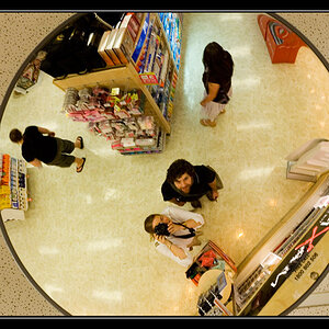
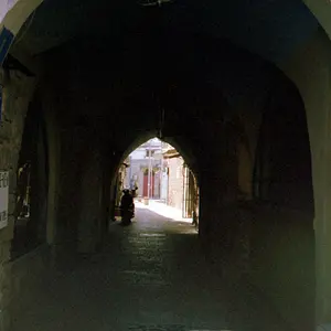
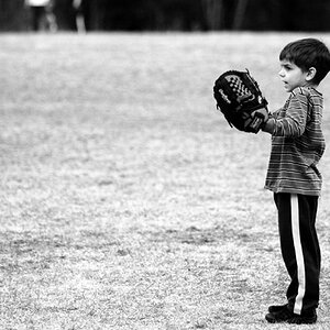
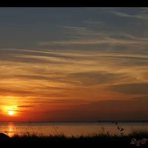
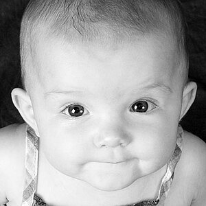
I was going to say I thought the first one could have been framed lower, that it looked like there was more space than necessary at the top and was too cut off at the bottom. I like there being more space in the second one, I'm not sure what the original looks like of course to know what would be the best way to crop it. Something looks off to me, I see what looks like a white outline around the ears. Maybe you did a little too much editing? and it might have been better without quite so much. Nice getting the moment, I think that takes practice.