SO frustrated... MORE Help!

MLeeK

TPF Noob!
Joined
Oct 20, 2011
Messages
6,761
Reaction score
1,380
Location
NY
Can others edit my Photos
Photos OK to edit
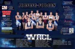
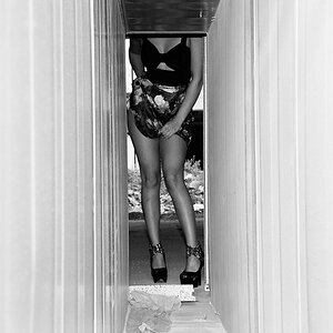
So... I designed this poster for one of the wrestling teams around what they asked for.
THEN they decided it needed to have advertisements on the front-originally it was to be coupons on the back, but evidently they didn't get enough advertisements in time for that. So then I had to cram everything in and I am just disgusted. Completely and toatlly disgusted.
Hate the image they chose. Hate the layout. Hate it all.

I'm not supposed to share this yet... so I will be removing it after you HELP ME!

So, give me some help to get all this crap on one 11x17 page without it looking this sh!tty?
8170773418_5cc7bed64b_c.jpg
 
How small are the advertisements allowed to be? It looks like you could make them smaller and cleaner along the edges at least so they are not touching any of the people in the picture. I'm no pro just suggesting.
 
I wonder if Yokum's Meat Processing can make some good venison jerky with the 5x5 buck I downed yesterday??? Now, that's the place out on West Side Hill Road, right? DO you know if old man Yokum is still running the place? I want a guy with some 'sperience!
 
I wonder if Yokum's Meat processing can make some good venison jerky with the 5x5 buck I downed yesterday???
Derrel, I officially hate you. We haven't had any venison for a year and a half. Normally we put in somewhere between 6 and 10 a year. NOT ONE last year. No archery this year for us and shotgun doesn't open till next week. I am crossing my fingers!
 
One round of .348 Winchester from the ancient 1936 Model 71...
 
How small are the advertisements allowed to be? It looks like you could make them smaller and cleaner along the edges at least so they are not touching any of the people in the picture. I'm no pro just suggesting.
I have a couple on there that are pushing the edge of too small on the fonts, so I am pretty stuck with the size they are

Yikes, I really don't think it looks bad at all. Some of the advertisements look like they can be pushed towards the edge more and maybe be more organized? It looks like your stuck with that format, I really can't think of a way to rearrange that whole thing. Too much going on and its bs they threw that at you last minute.
 
My husband works for a print shop, and has these issues daily! He suggests: 1) lighten color on background a little...2) change the font so the bottom four sections are more even. Stair stepping looks more cluttered. Make the columns more equal in size which will also allow for more space. My opinion transfer one of the advertisement from the left side to the right. Too much color on one side and mostly text on the other. Looks lopsided. Good luck. I have designed invitations and have had similiar problems. Clients do not realize the time that goes into creating something from zero.
 
How small are the advertisements allowed to be? It looks like you could make them smaller and cleaner along the edges at least so they are not touching any of the people in the picture. I'm no pro just suggesting.
I have a couple on there that are pushing the edge of too small on the fonts, so I am pretty stuck with the size they are

Yikes, I really don't think it looks bad at all. Some of the advertisements look like they can be pushed towards the edge more and maybe be more organized? It looks like your stuck with that format, I really can't think of a way to rearrange that whole thing. Too much going on and its bs they threw that at you last minute.

This has the space at the edge for my bleed. When printed the ads are JUST inside the edge. The original design was nice and clean.
My husband works for a print shop, and has these issues daily! He suggests: 1) lighten color on background a little...2) change the font so the bottom four sections are more even. Stair stepping looks more cluttered. Make the columns more equal in size which will also allow for more space. My opinion transfer one of the advertisement from the left side to the right. Too much color on one side and mostly text on the other. Looks lopsided. Good luck. I have designed invitations and have had similiar problems. Clients do not realize the time that goes into creating something from zero.
I thought that about the background too. I'll lighten.
The bottom is something I am frustrated with. The first column is the modified team's schedule. THe second two columns are the varsity schedule. How about if I made the center column shorter and the last one match the first? Think that'd work?
I'll mess with the ads more. I'd like to get that red one on the other side somehow.
 
Can you put the sponsors inside a border? When I look at it the wrestlers and the sponsors both catch my eye equally. Some way to make the wrestlers stand out more? (Nice photo, btw.) There's some empty space in the schedule section - maybe squeeze that area together more to make more room for the wrestlers and sponsors? Do you like the "Joining Forces" font? It kind of looks like WWF or Military Recruiting font which makes it look a little hokey and/or not very serious (to me at least).
 
Can you full justify as much of the text as possible? Makes for harder reading, but a (IMO) better looking product. As well, how about a sans-serif font?
 
I wonder if Yokum's Meat processing can make some good venison jerky with the 5x5 buck I downed yesterday???
Derrel, I officially hate you. We haven't had any venison for a year and a half. Normally we put in somewhere between 6 and 10 a year. NOT ONE last year. No archery this year for us and shotgun doesn't open till next week. I am crossing my fingers!


MLeek you're really going to hate when I say my brother just threw away over 150 lbs of venison from deer season last year. He didn't have power for a week due to Sandy. Lost it all. :/ I just can't wait until my dad starts his deer jerky!!!!! YUMMMMMM
 
Hugely cluttered.
How about making the central picture smaller so that it doesn't crowd the ads.
Take out every element that isn't necessary = extra lines, make everything simpler.
Simpler background.
Take away everything you can that isn't absolutely necessary - get rid of clutter - including making that huge WRCL smaller
 

Attachments

  • $8170773418_5cc7bed64b_clll.jpg
    $8170773418_5cc7bed64b_clll.jpg
    78.1 KB · Views: 101
Ok. I reworked the whole danged thing again...
I didn't see the suggestion to justify the text and you are SO right... I'll do that now... OTHERWISE

8170908519_56eec6da65_c.jpg
 
Yokum's Meat Processing now has much better placement!! They will be thrilled!
 

Most reactions

Back
Top