SO frustrated... MORE Help!

OK... This is getting to the point that I am just laughing as I put these up here!
This one I reduced the size of the wrestlers
Reduced some of the ads and played with them a bit
Justified the type in the schedule
Removed the lines in the header and WRCL
Reduced the size of the font on the Modified schedule so it'd match a bit more. And I have no clue what the hell else I did. Thank God it's all in layers!

8170943331_9f63b4e9d6_c.jpg
 
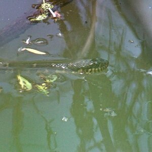
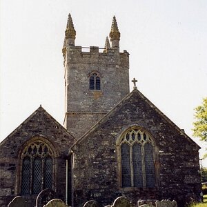
Still looks really cluttered to me.
Please consider taking out extra doodads

I hadn't seen your reply till I posted that edit. How 'bout now?
 
OH! And Jaimz's shoes drive me insane. BUT they are PERFECT for this blending team, so they show their color.
 
Looks great now! I am glad you were able to move the ads over and make them a tad bit smaller so they are no longer touching the players. Looks nice and professional to me. I like it. :)
 
Whatever is overlayed on WRCL is basically un-readable in that font...that typeface needs to be MUCH more-clearly readable. You might think your poster looks like c***, but uh...THAT IS WHAT the ones in my home town look like...pretty much the same...these are for the SPONSORS...nobody else give's a rat's ... .

Do not sweat it. Finalize a version and send it along on its destination.
That's one of those things out of my control. It's the file they gave me for the logo. Wonder if I can find the font for the WRCL and do something about it.
I fixed the fact that the WRCL is off center too.
 
The only thing I don't like about this (after the edits) is the text over WRCL. It is nearly impossible to read.
 
Yokum's Meat Processing now has much better placement!! They will be thrilled!
Derrel brings up a good point - is there any preferential placement here (ie, did anyone pay a little extra for "pole position" (Upper LH))?
 
That last one looks so much better. Less cluttered and more streamlined. Probably not too much you can do about their logo (WRCL) unless you just lighten that area around the boys shorts a bit so that stands out more. Derrel is really worried about his meat MLeek. So make sure his sausage and meatballs look perfect before they get packed and shipped. :)
 
T Derrel is really worried about his meat MLeek. So make sure his sausage and meatballs look perfect before they get packed and shipped. :)

Thanks for the thought, Kathy.
I feel the same way about my own; I always want them to look their absolute best.
A silly preoccupation but there it is.
 
Can you make the logos bigger? There, I said it before the client did. :angry1:

I designed this poster for one of the wrestling teams around what they asked for.
THEN they decided it needed to have advertisements on the front-originally it was to be coupons on the back, but evidently they didn't get enough advertisements in time for that. So then I had to cram everything in
You're trying to put lipstick on a pig. It is what it is and for what it is it's fine. I wouldn't lose too much sleep over this one because in the end they'll be thilled. "Cram" .... not a design term you want to use, right?
 
That last one looks so much better. Less cluttered and more streamlined. Probably not too much you can do about their logo (WRCL) unless you just lighten that area around the boys shorts a bit so that stands out more. Derrel is really worried about his meat MLeek. So make sure his sausage and meatballs look perfect before they get packed and shipped. :)
I'm NOT packing his sausage and meatballs. I'll leave that to 'old man Yokum.'
Thanks everyone!
 
I think you did a fantastic job on putting this together. I don't have the ability to do anything like this and I think the last one would be one they would be pleased with.
I know I wouldn't want to wrestle with any of them. I would get slammed first round.

Very good job.


Richard
 

Most reactions

New Topics

Back
Top