What's new

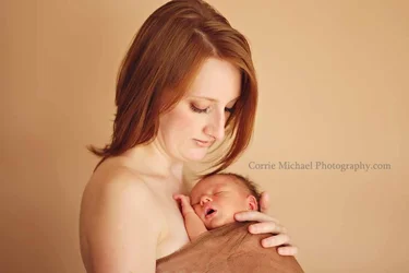
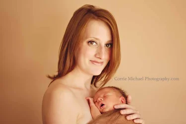
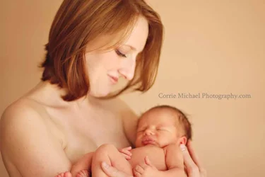
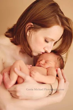
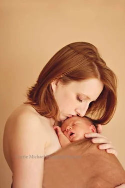
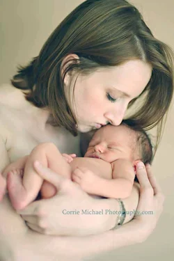
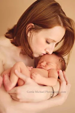
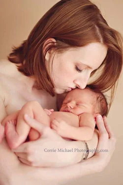
Some Mom and Babe from one of my latest newborn shoots C&C Welcome :)

CorrieMichael

No longer a newbie, moving up!
Joined
Sep 28, 2012
Messages
447
Reaction score
166
Location
Canada
Can others edit my Photos
Photos OK to edit
1. $IMG_7336lighteuph.webp2.$IMG_7343lighteuph.webp3.$IMG_7374lighteuph.webp4.$IMG_7386lighteuph.webp
 
In the first two, the baby is "riding way low in the frame", to use an old expression. In the third shot, the baby is up a bit higher, yet still not satisfyingly high enough. In the fourth shot, by way of vertical framing, we can finally SEE the baby being held in the motherly arms that were not present in shots one,two,and three. The first three poses might have looked okay because you were actually THERE, and experiencing the mother and child bond first-hand in person, but for us, the viewers, the first three are simply not very good poses or photos. Spinning the camera around to vertical orientation would have automatically improved the shots--without you having done anything at all. OR, you could have brought the baby "up", so the child was not cut off entirely by the bottom edge of the frame.

The pose in #4 is what is called a "completed pose". The first three are not 'completed poses' because they have basic posing flaws, or camera handling flaws. This is formal portraiture, and so I am using the language of formal studio portraiture to offer my C&C on these. I don't want this to come off as harsh, because, believe it or not, this is not harsh coming from me. I hope you can look at the images and literally see that 1,2,and 3 are very weak when compared against #4, which is a perfectly fine,lovely portrait that shows, literally shows, the mother, holding her new baby, in a way that looks natural, and which uses the entire frame, and is not filled with dead space that does nothing to advance the composition, and which even more egregiously, STEALS space from....the baby!!!! I do not think the cropped-off foot in #4 is that 'serious'. This is the as-in-a-painting type of composition style, and the subjects both touch all four sides of the frame, which is consistent with that type of as-in-a-painting style of using the WHOLE frame area to a great degree.

 
Last edited:
I kinda like #2, but like Derrel says the child is cut off. I'm not is vigorous a proponent of portrait orientation as he, but that's definitely a solution. So is stepping back a couple paces.

The whole thing feels quite yellow. Warm is good for this sort of thing, but it feels maybe a little overdone.

Not in love with the flesh-toned background. By matching the background to her skin you make it feel very.. something. I want to say commercial. The background and the landscape orientation makes me think you're leaving room for a bunch of ad copy selling a bunch of skin cream.

The posing is excellent throughout. Either your direction or your timing or both is spot on.
 
GREAT! points....I appreciate it! I always think ohhhhh what lovely images I have created then.......I totally see what you are saying and yes could have improved greatly on the first three! I think I sometimes get caught up in what I want portrayed.......ie the connection and sometimes I feel like the closer I am the more you SEE the connection? I know probably sounds quite funny but in my head I think that is what is happening in the heat of the moment. She was directed in these...I had to stop a couple of times and reposition as she liked to move her hands on me every now and then lol
Maybe the commercial feel is just me.....as I do somewhat like a commercial feel to my photos......
Again, I do appreciate all of this information. I have mentored for only a little bit and this is only my 5th newborn shoot so all information is VITAL at this point! I NEEEED to be a sponge and absorb all information whether it is what I want to hear or not!
 
Here is one that shows more of the baby........we did a few orientations where I try to give the client more options to choose from. Although this shows more of the baby it still maybe needs to show her hands holding baby's bum......I am not sure why I didn't? $IMG_7348lighteuph.webp
 
I think they are all beautiful shots, #2 being my favorite. The family will definitely love them.
 
Your open acceptance of C&C is amazing Corrie! I think you are correct; when actually making photos, it is easy to get caught up in the moment, and things can slip through the cracks, to use the old expression. It's true--the emotional bond between a mother and a baby can be very strong, and sometimes when we are too close to a situation, or to the shoot itself, our judgment is not analytical, but rather tied to the emotion of the event. The fact that you've had very little mentoring and that this is only the fifth shoot you have done of this type means that your approach is probably mostly self-directed, and you can not have had a huge amount of "reps" upon which to base a philosophy of posing. Your technicals seem good. Decent lighting, good focus, and so on.
 
Here's a quick edit to correct the skin, using a color balance layer.

View attachment 41079


I took samples on her forehead, cheek and nose. Going off of Correcting Skin Color: CMYK Tone Values & Nationality (Ethnic) Variations | Measuring and Correct Skin Color the perfect values for her skin would be C3, M15, Y16, K0. The actual values in this are C2 M17 Y18 K0. Not "perfect" but gives you an idea.


Funny how this changes it! She is actually a true red head and very accurate to my photo(although the skin tones seem to be too warm for some of you).......but changing the skin tones completely changed her hair colour! And not to offend anyone but although my tones are too warm, I think I like them better than this.....I think this is too cool for me and something seems off about it. Although I do appreciate this interpretation very much! Thank you! for taking the time to show me the correct skin tones! :)
 
Here's a quick edit to correct the skin, using a color balance layer.

View attachment 41079


I took samples on her forehead, cheek and nose. Going off of Correcting Skin Color: CMYK Tone Values & Nationality (Ethnic) Variations | Measuring and Correct Skin Color the perfect values for her skin would be C3, M15, Y16, K0. The actual values in this are C2 M17 Y18 K0. Not "perfect" but gives you an idea.


Funny how this changes it! She is actually a true red head and very accurate to my photo(although the skin tones seem to be too warm for some of you).......but changing the skin tones completely changed her hair colour! And not to offend anyone but although my tones are too warm, I think I like them better than this.....I think this is too cool for me and something seems off about it. Although I do appreciate this interpretation very much! Thank you! for taking the time to show me the correct skin tones! :)

Ummm...the skin tones in this adjusted image (seen above) look very greenish and pale. Totally out of the park no matter what the numbers might be. I just did a very quick Tint adjustment. It's never as good working from a JPEG as it is from the raw data,but I think a tint adjustment helps look a bit more-realistic.

ORIGINAL JPEG image$IMG_7386lighteuph.webp TINT-adjusted JPEG$IMG_7386lighteuph_tint adjusted.webp
 
Here's a quick edit to correct the skin, using a color balance layer.

View attachment 41079


I took samples on her forehead, cheek and nose. Going off of Correcting Skin Color: CMYK Tone Values & Nationality (Ethnic) Variations | Measuring and Correct Skin Color the perfect values for her skin would be C3, M15, Y16, K0. The actual values in this are C2 M17 Y18 K0. Not "perfect" but gives you an idea.


Funny how this changes it! She is actually a true red head and very accurate to my photo(although the skin tones seem to be too warm for some of you).......but changing the skin tones completely changed her hair colour! And not to offend anyone but although my tones are too warm, I think I like them better than this.....I think this is too cool for me and something seems off about it. Although I do appreciate this interpretation very much! Thank you! for taking the time to show me the correct skin tones! :)

Ummm...the skin tones in this adjusted image (seen above) look very greenish and pale. Totally out of the park no matter what the numbers might be. I just did a very quick Tint adjustment. It's never as good working from a JPEG as it is from the raw data,but I think a tint adjustment helps look a bit more-realistic.

ORIGINAL JPEG imageView attachment 41088 TINT-adjusted JPEGView attachment 41089

YES I totally see that! I love the changes in this one!
 
Here's a quick edit to correct the skin, using a color balance layer.

View attachment 41079


I took samples on her forehead, cheek and nose. Going off of Correcting Skin Color: CMYK Tone Values & Nationality (Ethnic) Variations | Measuring and Correct Skin Color the perfect values for her skin would be C3, M15, Y16, K0. The actual values in this are C2 M17 Y18 K0. Not "perfect" but gives you an idea.


Funny how this changes it! She is actually a true red head and very accurate to my photo(although the skin tones seem to be too warm for some of you).......but changing the skin tones completely changed her hair colour! And not to offend anyone but although my tones are too warm, I think I like them better than this.....I think this is too cool for me and something seems off about it. Although I do appreciate this interpretation very much! Thank you! for taking the time to show me the correct skin tones! :)

Ummm...the skin tones in this adjusted image (seen above) look very greenish and pale. Totally out of the park no matter what the numbers might be. I just did a very quick Tint adjustment. It's never as good working from a JPEG as it is from the raw data,but I think a tint adjustment helps look a bit more-realistic.

ORIGINAL JPEG imageView attachment 41088 TINT-adjusted JPEGView attachment 41089


Teach me your ways!!! I agree, seeing the edits compared.
 
Ummm...I just imported Corrie's original JPEG into Lightroom 3.6, and adjusted the Tint, to I believe, 13 point to the left...until it looked "realistic", based on my best guess as to the mother's probably hair coloration and probably skin-tone, based on her status as a "natural redhead". I didn't do any hue adjustment or white balance, just a tint adjust, to cancel out the excessive yellow. Color-correction by eye I guess? By guess and by golly?
 
Ummm...I just imported Corrie's original JPEG into Lightroom 3.6, and adjusted the Tint, to I believe, 13 point to the left...until it looked "realistic", based on my best guess as to the mother's probably hair coloration and probably skin-tone, based on her status as a "natural redhead". I didn't do any hue adjustment or white balance, just a tint adjust, to cancel out the excessive yellow. Color-correction by eye I guess? By guess and by golly?

How would you do that in ACR or PS? Color Balance Adj layer in PS?
 
Here's a quick edit to correct the skin, using a color balance layer.

View attachment 41079

I took samples on her forehead, cheek and nose. Going off of Correcting Skin Color: CMYK Tone Values & Nationality (Ethnic) Variations | Measuring and Correct Skin Color the perfect values for her skin would be C3, M15, Y16, K0. The actual values in this are C2 M17 Y18 K0. Not "perfect" but gives you an idea.

Yikes. Way off. This is my formula I use for CMYK in PS. As a general rule, you want your skin midtones to be roughly as follows:
1) Cyan x 4 = Yellow
2) Magenta + (0-10) = Yellow
For example, accurate values might be C:5/M:20/Y:23/K:0
I mainly use LR RGB now to verify my skin tones, but CMYK is how I was originally taught.
 

Create an account or login to comment

You must be a member in order to leave a comment

Create account

Create an account on our community. It's easy!

Log in

Already have an account? Log in here.

New Topics

Back
Top Bottom