highbred3d
TPF Noob!
- Joined
- Nov 29, 2005
- Messages
- 108
- Reaction score
- 2
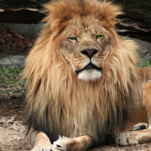
I tried a few variations on my one of the images i posted yesterday... I took LaFoto's advice on trying to get rid of some of the sky space up at the top of the image, but i didn't want to crop it, so i tried some variations on the image to push that area back and bring the character of the stable out instead. What do you think? Any feedback would be greatly appreciated! Thanks!
Orignal:

Variation 1:

Variation 2:

Thanks!
Orignal:

Variation 1:

Variation 2:

Thanks!


![[No title]](/data/xfmg/thumbnail/37/37492-bafc92488a1ab17e4ca6603ee5b38376.jpg?1619738112)
![[No title]](/data/xfmg/thumbnail/30/30991-43abf4dfee0a54010692c71c43f40981.jpg?1619734555)
![[No title]](/data/xfmg/thumbnail/30/30990-df3df397f705643bc2c207cc9d579d08.jpg?1619734554)
![[No title]](/data/xfmg/thumbnail/37/37494-d432dd0601f47668ec55d04f350f243b.jpg?1619738113)
