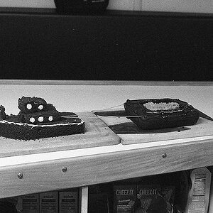
1. Interesting texture and pattern - I like this sort of thing too - but this should be a vertical. It just looks unbalanced with the empty space on the right.
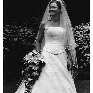
2. Nicely framed shot with good detail, but the highlights are a little overexposed. If you have a raw file you could go back and reprocess for the highlights. I would also darken the right side and bottom foreground, which are a little soft.
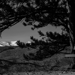
3. Good angle and well framed, but needs more depth of field. If you're going to take this kind of shot with shallow depth of field it's usually better to focus closer to the foreground.
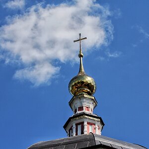
4. Nicely done, but not quite working for me - perhaps more contrast and darken the left and bottom a bit?


![[No title]](/data/xfmg/thumbnail/37/37640-803bb25a4f46642289fe136733ddfbde.jpg?1619738159)
![[No title]](/data/xfmg/thumbnail/33/33359-a5cf76b8e843e82b3831650af6dfa6b3.jpg?1619735923)
![[No title]](/data/xfmg/thumbnail/37/37636-e02c7efccb426a8951ed97a37c0f9307.jpg?1619738157)