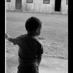
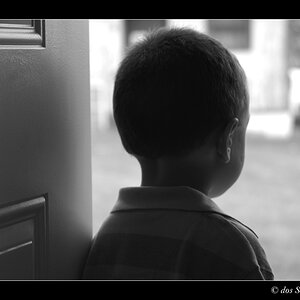
Could just be my monitor, Dean, but this looks to be on the dark side. Overall, the tonal range looks good - very good in fact, and sharp as a briar - but it just looks too dark.
Could just be my monitor, Dean, but this looks to be on the dark side. Overall, the tonal range looks good - very good in fact, and sharp as a briar - but it just looks too dark.
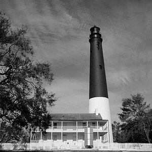
Same here; the image is quite dim...and even though there is a huge tonal range,all the way from specular highlights to white highlights to mid-tone grays and way down to deep, solid blacks, there is a lack of brightness to the shot.
Could just be my monitor, Dean, but this looks to be on the dark side. Overall, the tonal range looks good - very good in fact, and sharp as a briar - but it just looks too dark.
Could just be my monitor, Dean, but this looks to be on the dark side. Overall, the tonal range looks good - very good in fact, and sharp as a briar - but it just looks too dark.
Same here; the image is quite dim...and even though there is a huge tonal range,all the way from specular highlights to white highlights to mid-tone grays and way down to deep, solid blacks, there is a lack of brightness to the shot.
I would crop a bit tighter around the building to get rid of that bit of vehicle on the left of the frame. I'd also consider cloning out the wind sock. And it looks just the tiniest bit slanted - maybe straighten a smidge. Though I could be wrong - it looks straight and then it doesn't...it's totally messing with me
While I do agree, on second look, that the bit of vehicle/signage on the left frame is a mite distracting, I rather like the dear old wind sock - it's such an airport kind of thing, and we're definitely looking outside the hangar. It's a nice capture.
Even better - tighter. The wind sock now rests neatly in the upper left corner and becomes a stronger element in the shot. A photo can be busy without being full of distractions, but you must remove what doesn't belong (clutter).
Take a good look at your first post as compared with this one - you've learned a lot just from this one image.
Ooh, definitely better. And yes, leaving the sock in was the right choice. It's such a slight change but it makes the whole image feel stronger and more purposeful.



 . This concludes our lesson for the day


![[No title]](/data/xfmg/thumbnail/38/38266-292dc43125dad0d89dbd806503618171.jpg?1734172158)

![[No title]](/data/xfmg/thumbnail/37/37603-739c5d9b541a083a12f2f30e45ca2b7b.jpg?1734170731)
![[No title]](/data/xfmg/thumbnail/38/38263-ad5e4c9e677626ddb5b1e7cdf9ebe40e.jpg?1734172152)