
DGMPhotography
Been spending a lot of time on here!
- Joined
- Mar 23, 2012
- Messages
- 3,160
- Reaction score
- 717
- Can others edit my Photos
- Photos OK to edit
- Thread Starter 🔹
- #16
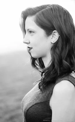
She has a VERY striking profile, and the low camera angle is very flattering to her. I think the hair seen behind the nose "reads" acceptably well, but I am more concerned about the blown-out hair that fades to background white up near her eyes. I do not mind the OOF breast outline at the bottom, as the "base"; the cropped version loses the "base" effect, and also loses the clever dress seam detail on the outside of the breast area. My main issue is why this is looks so soft...my guess is it's yet another of your 50mm lens shot at f/1.8 shots. I'm not sure what you were hoping to achieve, but doggone it...I like to see these kinds of shots done with some sharp, clear focus and some decent depth of field, and some technical fundamentals satisfied. This is border on a neo-realism effort, where I expect to se CRISP, and highly realistic rendering of everything about the subject, so...no shallow DOF, no fuzzy ear, no fuzzy hair.
I sometimes like the cyanotype-style look. I get that. She has a GREAT profile, and a really pretty "look". You made a good picture I think. I can see though that with a slightly different approach and some technical decisions this could have been a great picture. But still, it is a nice picture. I LOVE the face/neck angle congruency, and the bust/shoulder placement and the framing and low camera angle are all very appealing. She looks Goddess-like, which she will probably really like.
Thanks Derrel. As always, great advice, and you explain things so much better than me! The low angle - you nailed it. I like the regal look it creates. Like she's superior. Like you said, a goddess.
I think I like the full crop better as well. You are probably right about the f/1.8. This shoot is actually from awhile ago (before we had that discussion about not doing everything at f/1.8). I had a shoot yesterday for example, and I think I stayed between f/2 and f/3.
Again, thank you!



![[No title]](/data/xfmg/thumbnail/35/35264-5ade32b7036391926536661aeb7491c3.jpg?1734166921)
![[No title]](/data/xfmg/thumbnail/35/35268-34a315519597f60516d59124092e9bc2.jpg?1734166930)
![[No title]](/data/xfmg/thumbnail/35/35266-f58b019dadff6920c09071a847f052c3.jpg?1734166927)
![[No title]](/data/xfmg/thumbnail/36/36664-a1f71b488f6761523649a87f8465fc3d.jpg?1734169172)