The eighth roommate

DanOstergren

TPF Supporters
Supporting Member
Joined
Jun 2, 2013
Messages
4,493
Reaction score
4,141
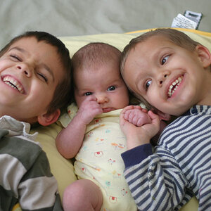
Currently I live in company housing for my employer, and today we got our eighth roommate. I had him posing for portraits about an hour after moving in. I took some of the feedback I got from here on getting a more accurate white balance and this is what I was able to do. I feel that I was still able to keep my style while getting more quality out of the image. Tell me what you think.

$_MG_9715.jpg$_MG_9850.jpg$_MG_9851.jpg

I've also been really trying to train myself to hold back on heavy editing. Again, I feel like I've been able to keep my style and improve the overall look of the image. Here is what my favorite looks like before after:
$_MG_9715.jpg
 
Last edited:
Can't see the images for some reason. Might be on my end though.
 
What company do you work for? Models inc?

I kid but jeez it took me a month before I was posing half naked for my roommate.
 
What company do you work for? Models inc?

I kid but jeez it took me a month before I was posing half naked for my roommate.

Hard to get, eh?
 
Skin tones are much better, more realistic than previous shoots. But on the Before / After... I would say the "before" is probably more accurate to real life, but the "after" is acceptable.
 
#2 and #3 are completely fantastic.

Not a lot of visual pop in either, but you've managed the whole frame very very well. #2 looks like a movie still, and is a terrific horizontal portrait. #3 is just a really great classical composition. Great diagonal line in the model, you got the shoes popping, you got the little cluster of leaves upper right, you got a little visual interest inside the culvert lower left. It looks more "fashiony" than #2, but it's not fashion, it's something else.

I'm starting to really like your color palette, somehow it fits with Alaska and Ketchikan for me. Cool and moist.
 
What company do you work for? Models inc?

I kid but jeez it took me a month before I was posing half naked for my roommate.
Once he saw the first few images he was very willing to adhere to my artistic vision. He's also just a little bit of a narcissist, which to me is always a portrait photographer's friend.
 
Skin tones are much better, more realistic than previous shoots. But on the Before / After... I would say the "before" is probably more accurate to real life, but the "after" is acceptable.
Thanks man! I don't think I've met anyone that red in real life unless they were burnt though. :p
My personal taste just keeps me away from overly red tones as much as possible, and the flat red tone in the original just didn't carry enough depth of light to me.
 
#2 and #3 are completely fantastic.

Not a lot of visual pop in either, but you've managed the whole frame very very well. #2 looks like a movie still, and is a terrific horizontal portrait. #3 is just a really great classical composition. Great diagonal line in the model, you got the shoes popping, you got the little cluster of leaves upper right, you got a little visual interest inside the culvert lower left. It looks more "fashiony" than #2, but it's not fashion, it's something else.

I'm starting to really like your color palette, somehow it fits with Alaska and Ketchikan for me. Cool and moist.
Thank you!
I'm trying to keep it simple lately with my portraits, both with the content in them as well as the editing. I want them to look organic and natural, and Alaska is the perfect place for that.
It's funny you point that out about the colors. When I first started photographing people I would always go for very warm tones, but I really try to keep away from them for the most part now. Funny how our style grow and change as we do.

I started photographing people about 1966... in West Texas, where everybody was either red or brown... no pale corpse looking types around, except for the occasional junkie passing through. We didn't have many punkers, goth didn't exist yet, most of us had never heard of drag queens... and the the only pale skin you saw was when you were in the backseat of your car with your girlfriend on a Saturday night, at the local drive in! ;) Things have changed a little since then.. but I guess maybe you can understand why I like warm tones.
 

Most reactions

Back
Top