Trever1t
Been spending a lot of time on here!
- Joined
- Dec 30, 2010
- Messages
- 9,331
- Reaction score
- 2,724
- Location
- San Jose, CA
- Can others edit my Photos
- Photos NOT OK to edit
C&C invited.
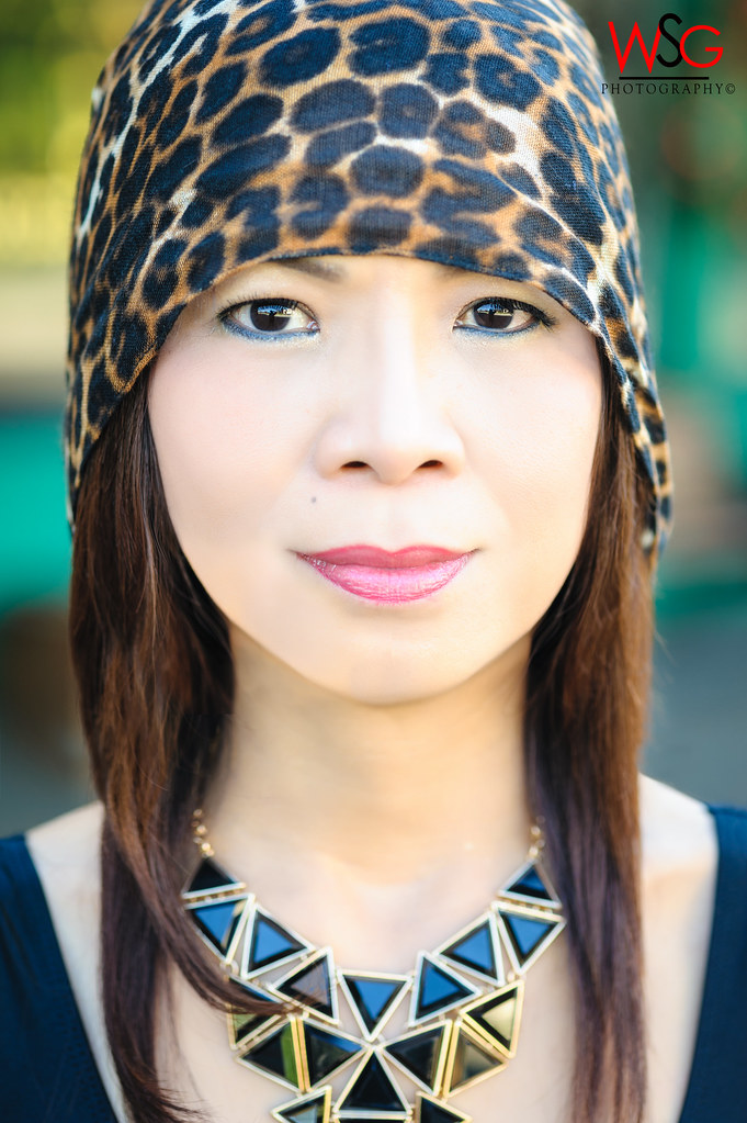
This one the tight little dress has so many hi spots making her look like she has rolls and my skills are not enough to be able to edit fabric but I liked the tonal quality and overall feel of it.

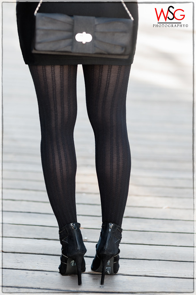
This one the tight little dress has so many hi spots making her look like she has rolls and my skills are not enough to be able to edit fabric but I liked the tonal quality and overall feel of it.









![[No title]](/data/xfmg/thumbnail/36/36601-26ec0a53712c5470af53be9652811a6e.jpg?1734169054)



![[No title]](/data/xfmg/thumbnail/36/36602-3001bbe07fa5517ccd4b03e049c7b844.jpg?1734169055)