What's new

Think I'm getting better

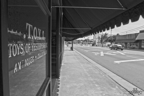
Its a nice pic technically...but what's it saying? When I see it I think "a street..and an old toy store on the left" Doesn't really say much to me. I don't really see a point of focus...what am I supposed to be looking at? What is supposed to draw my attention? (just 'cause I don't see it...doesn't mean it isnt there necessarily. I could be missing it. :-) )

Did you do anything to it post? Or is it pretty much as shot only converted?

I see you titled it "toys". and it is an antique toy store. I wonder if maybe adding some sepia to it and aging it a bit can bring that old/antique feel to it.

It is nice and smooth though...no exposure issues...clear and in focus. So kudos for that part of it.
 
Hmm, well, the window is the focus, but make a good point that there is nothing else. I've really been trying to get the exposure things down. I just converted it to B/W in post and played with the tones a bit. I was really trying to get the window in focus and get detail of the canvas overhang and not have the sky blown out. But yea, no real point to it, your right.
 
Well, for a good practice image, working on focus, detail and exposure, then I think you've done well. as far as the conversion..not bad. One thing that sticks out is lots of darks/blacks/dark grays on left...not so much in middle or right. small things you can do later as you learn (which I still am doing) about converting and making a b&w pop.

Now time to work on comp :-)

Lots of my first images were very boring and horrible (not saying yours is...just saying mine were...probly still are, lol) because I focus on one thing at a time. exposure, color, focus...then started with framing, comp, interest. etc...etc. One day, hopefully soon, I'll be able to bring it all together.


One step at a time. Keep shooting! :-)
 
I'd like it better if there was a person or something on the sidewalk....it is missing something interesting on the right. But overall I like it...the perspective is great. I would play with the levels and boost the contrast a bit also.
 
yeah, for practice....alll kindsa things you can do with it.

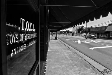
I started by "washing the windows" got all that gunk off, then brought out the lettering to emphasize your desire of the toys as the subject, then tried to darken up the other side of the street in certain areas to level out some, then the street....then down the street, kinda all over the place, edits here n there. Yeah, I messed up on the upper left of window..didnt wanna go back and fix it, just a real quick thing to show that you can use these types of images to practice editing on.


$7332276660_6255a3d125_o-1.webp
 
yeah, for practice....alll kindsa things you can do with it.

I started by "washing the windows" got all that gunk off, then brought out the lettering to emphasize your desire of the toys as the subject, then tried to darken up the other side of the street in certain areas to level out some, then the street....then down the street, kinda all over the place, edits here n there. Yeah, I messed up on the upper left of window..didnt wanna go back and fix it, just a real quick thing to show that you can use these types of images to practice editing on.


View attachment 10420

Very nice edit, specially breaking the window out like that.
 
Thanks. I love practicing. :-)

That looks great! How did you do that to the window?

Use your history tool. Set it on color burn. Start with a size around a pencil eraser, set opacity to around 10%, do an area....judge what it does...then adjust accordingly. Cool thing about it is that it will basically leave the white alone, unless you go over it too much...hence the low opacity. You can go 100% to speed up around areas you want totally blacked out, but around the lettering or reflections...you wanna be careful, you can eat away the subject or reflections.

I use it a lot on windows and water, that need a reflection to show a bit more. Great for "washing windows" as I call it or cleaning up a murky lake/pond so the reflection shows better.

done with photoshop

also, if you lose some of the white, you can set to color dodge and go over it and bring it back out. thats how I got it to pop. gotta be careful though, do it too much and you can blur it... if you bring it out too much you can hit it with "difference" that will reduce strong highlights. and when you like it, you can hit it with around 6-10% softlight and go over all of it with a large brush...adds a bit of contrast to bright whites n dark darks...if you feel its needed.
 
Ernicus, THANK YOU..... I have played with those but backwards, I dont know why but my thought process was backwards and the book I have didn't explain it as plain as you just did. Thank you :)
 
Glad I could help. :-) I'm learning too, just passing on what I read and learn by trial and error.

Might help also to try to look at it like a painting. When I first saw your pic, I though too much of this here, too little of that there...so how can I balance this out...or how can I make this pop or that not. Then grab your tool and start painting. Cool thing about painting like this is you can always ctrl/alt/z and undo if you don't like what you just did. ;-)
 

Create an account or login to comment

You must be a member in order to leave a comment

Create account

Create an account on our community. It's easy!

Log in

Already have an account? Log in here.

New Topics

Back
Top Bottom