From your first post, photos 2, 3 and 4 are the good ones, IMO.
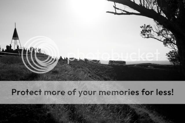
The first one seems to be off in composition. I have to imagine that the left of the photograph was your main subject. I would have done more to show this and the people standing around. The tree on the right hand side is more of a distraction than a piece of the composition.
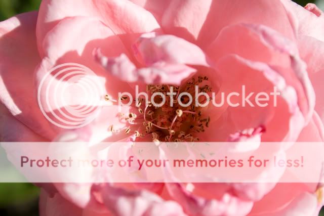
Your floral photo is great, has nice clarity and DOF!
The monument photograph I actually had to put on a grid to see if it was straight, and found that it is. Maybe some kind of optical illusion, but when I turn off the grid, it looks like it's leaning to the left.
The locket photo is my favorite of them all! The only thing i would have done differently would have been to use a not so shallow DOF so that the chain wasn't so blurry in the foreground.
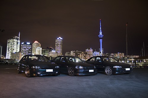
The last one, neither good nor bad in my opinion, is a fairly typical photograph. Try putting something in the foreground of your photos like this, or finding a interesting horizon line that adds something to the photograph. I'd also move the horizon line up to the 1/3 mark or around there.
Hope this helps, and remember these are only my opinion, someone else may come and say the complete opposite!




![[No title]](/data/xfmg/thumbnail/37/37109-62e1b65e6f8bd2a349250acd6d653f1e.jpg?1734169830)

![[No title]](/data/xfmg/thumbnail/30/30862-d177ccfc3a82369b1005863cfe5fd13d.jpg?1734158821)


![[No title]](/data/xfmg/thumbnail/32/32004-4455324f0b4b5cc318dd35877147ac47.jpg?1734160793)
![[No title]](/data/xfmg/thumbnail/30/30865-3dc03385b0036f80524b0636d0d56f07.jpg?1734158833)


