JamesD
Between darkrooms
- Joined
- Mar 20, 2005
- Messages
- 1,053
- Reaction score
- 43
- Location
- Living in Snapshot reality.
- Can others edit my Photos
- Photos NOT OK to edit
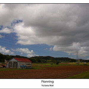
I think that this one would look better with a touch more contrast, and a complete desaturation to pure monochrome.
Compositionally, I think it'd be strengthened substantially by placing the pole further left, on that "rule of thirds" line, and perhaps raising the top of the pole toward the top of the frame, even to the point where the area from which the wires are radiating is near (but not on) the edge. I suppose that could be done with a crop...
Just my thoughts... And you're right, BW is a challenge. If you really start working with it and analyzing it, it's quite abstract compared to color. The best ways I've found to help my improve my BW photography (not that I'm particularly good at it) are working exclusively in BW, and, perhaps even more importantly, analyzing every BW photograph I see to figure out what works and why, even to the point of casually trying to decipher it's deep, embedded meaning (not that I ever have a clue LOL). I look at each feature and describe it briefly to myself and think about what impression it makes on me.
A red filter (like a #25) can be good for trying to see what BW will see. It takes some getting used to, since it's red, not neutral. And, don't look through it for too long, or your eye will start to compensate and you'll notice colors. Also, bear in mind that it's going to increase the contrast in the scene. It can make the blue sky quite dark.


![[No title]](/data/xfmg/thumbnail/42/42253-fef7e43227f484b1a95dd6d85c03bd40.jpg?1619740063)