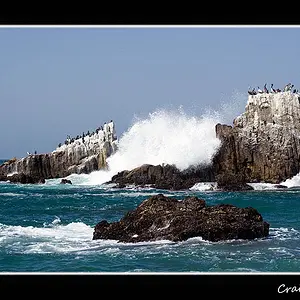
I like these and think they all have great potential. There are some issues that are simple to fix if you can reshoot, but the last one can be fixed in Photoshop easily.
1: The colors are awesome, but the leaves in front are out of focus - only the leaves at the back of the branch are in focus, and I feel like I have to 'look around' the ones in front to see them. Maybe next time try setting a smaller aperture (larger f value) to get more of it in focus.
2: I think this one could be more interesting if you took it from a different perspective. Maybe from a lower angle. No offense, but from this viewpoint it looks like you walked by and said "Oh, that looks cool" *snap*. Try to think about what makes it interesting, and then try to achieve that interpretation in the viewfinder.
3: You've used a really shallow DOF here, and it looks like you barely missed getting the moth in focus. It also looks a tad blown out. The texture of the rock is awesome though.
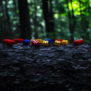
4: The horizon is tilted, and the right half of the frame is really underexposed. If you straighten it and crop it, I think this one is a winner. If you shot it in RAW, you might could get away with 'faking' an HDR to bring up the exposure of the rocks and trees.







![[No title]](/data/xfmg/thumbnail/37/37615-78a9bdab877c191919a156f901325ee1.jpg?1734170740)
![[No title]](/data/xfmg/thumbnail/37/37106-bbbc8e30f409f82c56bead43c7565d5a.jpg?1734169829)



![[No title]](/data/xfmg/thumbnail/36/36667-b3265abf8272f21d759a0abd6a0995c3.jpg?1734169172)
![[No title]](/data/xfmg/thumbnail/37/37108-62307f01c11ef92f5655ed4501d565ce.jpg?1734169830)
![[No title]](/data/xfmg/thumbnail/34/34041-c8aed4d2c55b167d1ec03d9cfbaca453.jpg?1734164448)