Trying to train my "Vision"

HIvill

TPF Noob!
Joined
Jun 5, 2018
Messages
29
Reaction score
38
Can others edit my Photos
Photos OK to edit
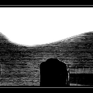
I am relatively new and have a nagging internist in street B/W photography. For some reason I like something about this picture. I know the subject and overall scene may be lacking any internist but there's something about it I kind of like. Here's my question, is there anything good about this?thought invoking? technically pleasing? or is my train of thought off?

WWJLAv6.jpg
 
  • Like
Reactions: Sil
The interest is the little old lady crossing the road. In my opinion, you could crop the rest out.
 
That's something I'm trying to wrap my head around. What negative space can add or take from a photo. Thank you for your comment.
 
I agree, just a quick crop really helps define a focal point.

20180704_195424.jpg
 
Nothing specific about your shot, but digital just looks too clean for street shots. There's something about film that makes streets look better, grittier, whatever.
 
Not sure I agree with the crop suggestions. The right side adds depth and gives a feeling of "distance" in this image. I'd also ask what appeals to you about this image.
 
IMO as presented there are a few problems. Here's a quick edit and the theory behind the changes. First the image is really flat, lacks punch. I adjusted the exposure, contrast, white, black and clarity. Second, I bumped the shadows globally, it could still use some localized adjustment on the woman's face, but it brought out the store window details sufficiently to add interest. I thought the little pedestrian walk sign was a nice touch. Last I cropped to a 14x11 landscape. Doing this brought the woman in as your focal point, and using the rule of thirds, put her directly on the left vertical, with her head/face on the top left intersection. On the right I cropped at the edge of the sidewalk. Doing so gave a nice leading line from the sidewalk all the way through to the white line on the pavement, gives depth to the image, and a sense of direction from which she came.
WWJLAv6-2.jpg
 
Let me ask you ... what exactly do you like about it ?
Something about the woman's glace and her body shape being hunched over. Her walking, possibly to work at her age, is thought provoking to me.

Nothing specific about your shot, but digital just looks too clean for street shots. There's something about film that makes streets look better, grittier, whatever.

I completely agree with you :)

Not sure I agree with the crop suggestions. The right side adds depth and gives a feeling of "distance" in this image. I'd also ask what appeals to you about this image.

That's one reason I framed it the way i did. But I am unsure if it added anything of note to the image.

IMO as presented there are a few problems. Here's a quick edit and the theory behind the changes. First the image is really flat, lacks punch. I adjusted the exposure, contrast, white, black and clarity. Second, I bumped the shadows globally, it could still use some localized adjustment on the woman's face, but it brought out the store window details sufficiently to add interest. I thought the little pedestrian walk sign was a nice touch. Last I cropped to a 14x11 landscape. Doing this brought the woman in as your focal point, and using the rule of thirds, put her directly on the left vertical, with her head/face on the top left intersection. On the right I cropped at the edge of the sidewalk. Doing so gave a nice leading line from the sidewalk all the way through to the white line on the pavement, gives depth to the image, and a sense of direction from which she came.
View attachment 160041

Wow I liked what you've done there, I really appreciate the lesson. I did try to add the walk sign in on purpose, kind of a microcosm if I may. The leading line is what I attempted to do with the entire street, but it seems like less is more with just the sidewalk. Plus the two vehicles are a little distracting in retrospect. I also really like the "punch" you've added. Thank you all for the comments.
 
Last edited:
I think maybe a crop with the window wording, the walking sign and the lady. Her jeans and shoes aren't all that great, so a nice comparison - plus the walk sign is another thing that ties that particular crop together.

The RV, other street, empty space is a little distracting.

Just my opinion though :)
 
kind of a microcosm if I may. The leading line is what I attempted to do with the entire street, but it seems like less is more with just the sidewalk.

There are some fantastic street shooters on here, I do a little, but it's not sole focus. When I do I follow two paths, first is to isolate the subject from their surroundings (portrait). The second is to go with a landscape mode where the subject is the main focal point, but use the environment around to create interest, and portray a slice of life unfolding. Is she going to the store? Going to work/coming home? The long leading sidewalk and the ladies clothes leads one to believe she's been walking awhile in the cold. The high water pants, and clunky shoes suggest a woman more accustomed to struggle then affluence. The store window in the background with the unclothed mannequins, is it open or closed down? The damage to the building wall, is this a rundown section of town? The point is that everything in your image should be about leading your viewer in, to see the points you want to show, to hold their interest long enough to take in all the elements.
 
OK, I see where your eye/brain went ... but the whole image does not fit, so to me it just looks like someone crossing the street.

I think @smoke665 summed it up.
 
IMO as presented there are a few problems. Here's a quick edit and the theory behind the changes. First the image is really flat, lacks punch. I adjusted the exposure, contrast, white, black and clarity. Second, I bumped the shadows globally, it could still use some localized adjustment on the woman's face, but it brought out the store window details sufficiently to add interest. I thought the little pedestrian walk sign was a nice touch. Last I cropped to a 14x11 landscape. Doing this brought the woman in as your focal point, and using the rule of thirds, put her directly on the left vertical, with her head/face on the top left intersection. On the right I cropped at the edge of the sidewalk. Doing so gave a nice leading line from the sidewalk all the way through to the white line on the pavement, gives depth to the image, and a sense of direction from which she came.
View attachment 160041
I was wondering if you could help a fellow newbie here and possibly go into more detail as to what all you did here - " I adjusted the exposure, contrast, white, black and clarity. Second, I bumped the shadows globally" So that when I take a B&W I will know what little bit to do in PP to make the shot less flat and add a little punch.
 
I like the original more that the suggested options. Maybe add some noise and a touch of contrast.
There's not much story here though - and I use the term story very loosely.

The original composition is the one I prefer as I stated already, but shooting people in the street is not street photography. There needs to be something extra. Some story or irony or juxtaposition to make the image more than a snapshot. It isn't easy, but I think you have an eye. Keep working at it.
 
IMO as presented there are a few problems. Here's a quick edit and the theory behind the changes. First the image is really flat, lacks punch. I adjusted the exposure, contrast, white, black and clarity. Second, I bumped the shadows globally, it could still use some localized adjustment on the woman's face, but it brought out the store window details sufficiently to add interest. I thought the little pedestrian walk sign was a nice touch. Last I cropped to a 14x11 landscape. Doing this brought the woman in as your focal point, and using the rule of thirds, put her directly on the left vertical, with her head/face on the top left intersection. On the right I cropped at the edge of the sidewalk. Doing so gave a nice leading line from the sidewalk all the way through to the white line on the pavement, gives depth to the image, and a sense of direction from which she came.
View attachment 160041
I was wondering if you could help a fellow newbie here and possibly go into more detail as to what all you did here - " I adjusted the exposure, contrast, white, black and clarity. Second, I bumped the shadows globally" So that when I take a B&W I will know what little bit to do in PP to make the shot less flat and add a little punch.

That's been awhile and I do well to remember what I did yesterday. However in addition to the above, I worked with the curve, sharpness and luminosity sliders, and all of it was done in LR. Unless I have some really serious editing to do I don't go into PS.

A lot of the "pop" you refer to takes place in the tone curve. Here's some basic information to start you off How to Use the Tone Curve Panel in Lightroom - Photography Life . Read up on everything you can find on using the tone curve as it is one of the most useful tools in LR.

Another element of the "pop" is in sharpening and noise. Sharpening is easy to get wrong as is noise, I've seen both overdone. here's some reading to help Sharpening in Lightroom: Make the Most Out of the Detail Panel

Adding sharpness, contrast, noise.....to an image willy nilly without a good image to begin with and a solid understanding of why you are adding to it, seldom results in anything but a bad image made even worse. Read up on the elements of composition so you can learn to envision an image before you snap the shutter.
 
Last edited:

Most reactions

New Topics

Back
Top