Image 1
Old Melbourne Gaol-perfect construction by Jason.Chen Photography, on Flickr
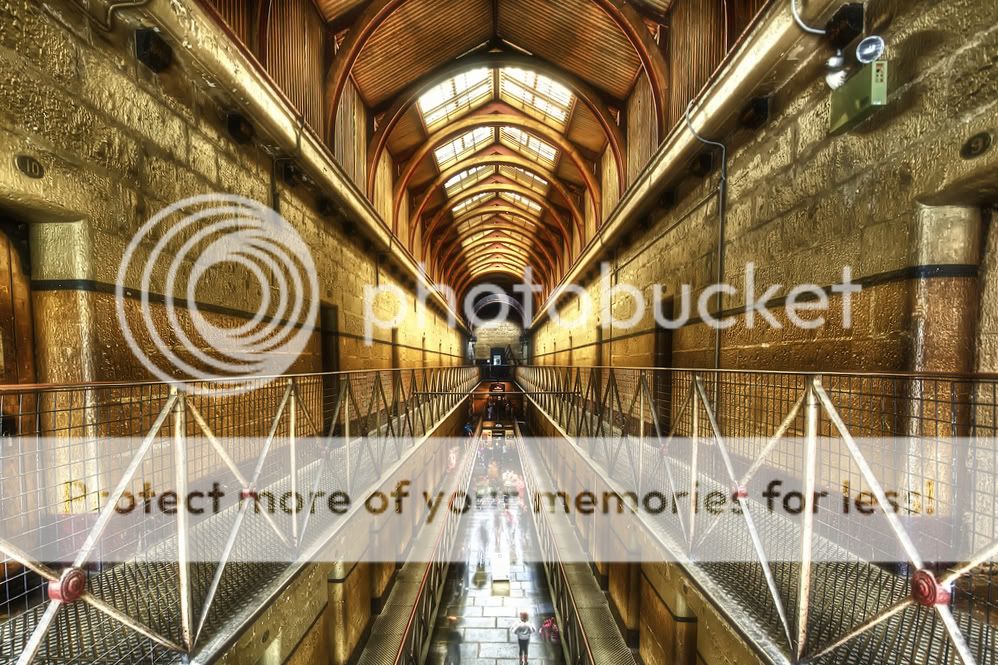
Image 2
Old Melbourne Gaol by Jason.Chen Photography, on Flickr
for image 2 I found it very to do a perfect symmetric style when I was composing the picture, is there a way to improve on it? How do I change the distorted perspective a bit in Lightroom?
regards
Jason
Old Melbourne Gaol-perfect construction by Jason.Chen Photography, on Flickr
Image 2
Old Melbourne Gaol by Jason.Chen Photography, on Flickr
for image 2 I found it very to do a perfect symmetric style when I was composing the picture, is there a way to improve on it? How do I change the distorted perspective a bit in Lightroom?
regards
Jason
 Only that light bothers me a bit.


