Urban Shots C&C

beala

TPF Noob!
Joined
Jul 10, 2009
Messages
63
Reaction score
0
Location
CO
Can others edit my Photos
Photos OK to edit
Here's two shots of places near my apartment. Both shot on 200 iso film.

1.
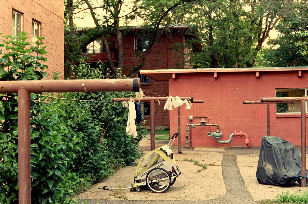
3706538570_7cc599ca7f_b.jpg


2. I noticed that this pic is pretty noisy/grainy. Why is that and how could I have shot it to prevent that?
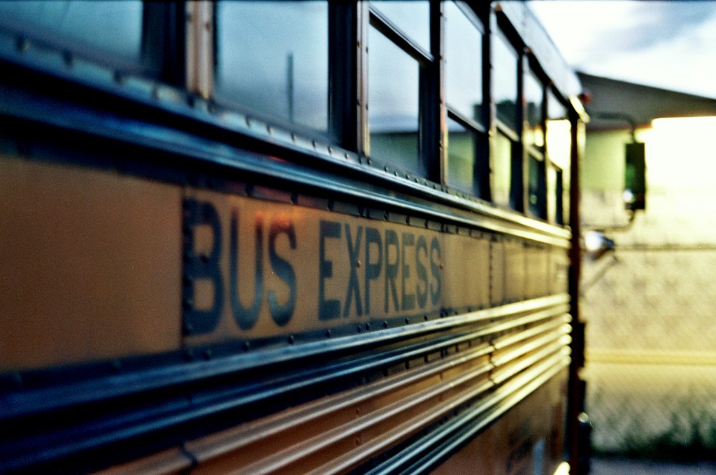
3706489256_93df371164_b.jpg


Thanks!
 
Last edited:
Just snapped this a half hour ago and wanted to throw it in with the rest (DSLR, this time). I'm on the fence about the PP. C&C welcome. Thanks!

3
3728181340_b57373efa5_b.jpg
 
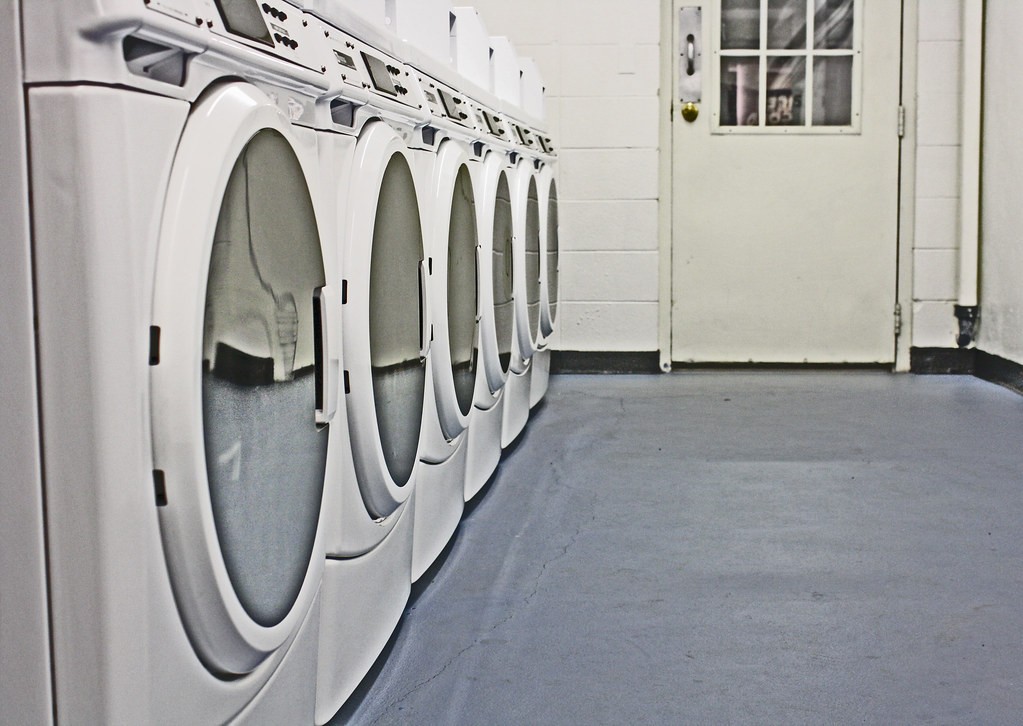
IMO of course, the bus is fantastic. The washing machines have a good pattern, but there's little else there. The one in the yard, I don't really see a strong focal point.

Exposure-wise they look dead on, FWIW. I only have a small screen right now but they look to be exposed pretty well perfectly.
 
#1 i dont like the wight ballance on the first one and like he said theres no strong focal point
#2in the bus i wish the word "bus" was more in focus or i might have tried to move the camera up as the window appears to be the main focal point (im not saying that you should have centered it, just get more of it in frame
#3 it's good just not very exciting
 
i like the patterns opf the washing machines...the others dun really do much for me
 
IMO of course, the bus is fantastic. The washing machines have a good pattern, but there's little else there. The one in the yard, I don't really see a strong focal point.

Exposure-wise they look dead on, FWIW. I only have a small screen right now but they look to be exposed pretty well perfectly.
Thanks for the feedback! I see what you mean about the yard not having a strong focal point. I'm not sure why I like it. For some reason I just thought it was an interesting scene. I think you're right, though, that if there was something to focus on the image would be a lot better (eg someone hanging up clothes, kids playing, etc).

I see what you mean about the washers, too. My gf was suggesting I get some fake blood, and put a pool of it in the shot! I guess I personally like the photo because of the pattern, the contrast, and how minimal it is, but I think I'm going to try the shot again with some props. Thanks again for the feedback!

#1 i dont like the wight ballance on the first one and like he said theres no strong focal point
#2in the bus i wish the word "bus" was more in focus or i might have tried to move the camera up as the window appears to be the main focal point (im not saying that you should have centered it, just get more of it in frame
#3 it's good just not very exciting

The yellowish/warm white balance was actually on purpose. I thought it conveyed age and warmth, which is what I was going for, given that it is a shot of an old family housing complex. Here it is a little more neutral:
01681.jpg


I see what you mean about the bus. I'm going to have to go back and get another shot with a tripod and better DOF.

I'll probably reshoot the washers too, with some more interesting.

Thanks!

i like the patterns opf the washing machines...the others dun really do much for me

Thanks for the feedback!
 
i think number 1 would be better if the bike buggy wasnt in the picture. it seems like it doesnt belong with the rest.

i like the washing machines too. it would be sweet it there was an identical row on the other side of the door so it was a sort of formal symmetrical picture. maybe you could photoshop that somehow with a mirror or something

nice work
 
I really like number 2. The grain is really part of its charm. I also love the hint of green and blue in the tint. It really looks excellent. A previous commenter mentioned the focus on the word bus. I think it actually adds to the picture though. I really like it.
 

Most reactions

Back
Top