thetrue
TPF Noob!
- Joined
- Nov 1, 2012
- Messages
- 1,791
- Reaction score
- 330
- Location
- Bucks County, PA
- Can others edit my Photos
- Photos OK to edit
In this instance, I prefer it that way...........IMHO the bg dominates the subject.
Follow along with the video below to see how to install our site as a web app on your home screen.

Note: This feature currently requires accessing the site using the built-in Safari browser.
In this instance, I prefer it that way...........IMHO the bg dominates the subject.
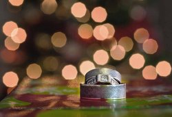
I am not a big fan of sharp-side bokeh with dark circles that ring the outer perimeter of each bokeh ball...just...not...that...pretty...a...bokeh...shape...
I dunno...it was interesting to see how the watermark was almost a visual element in the original shot--it sort of "anchored" my eye, down on the rings. When the watermark was removed, the rings seemed to be less-important visually, and just less of a "factor". In a way, it felt like the rings almost (but not quite) disappeared with the watermark removed. Odd...
")
***My critique is something COMPLETELY out of your control, but may be important anyway***
This images reads really strange to me because the rings don't really look like they go together. I see the man's ring, and her engagement ring, and I'm guessing the third ring is her wedding ring. It looks a whole lot like a man's ring, that, imo, doesn't really go with her engagement ring. There's nothing wrong with this for the couple, and it is a great shot for them to have. However, if I were looking at your portfolio and considering hiring you, this image would leave me asking questions about the wedding. So, while it is a good image, it may not be the best to show to potential clients.

![[No title]](/data/xfmg/thumbnail/40/40290-c6963a3e1b72b7543d1633356ec3fc9c.jpg?1619739409)
![[No title]](/data/xfmg/thumbnail/35/35929-8650428697cfb142a7b9a4e8ef731178.jpg?1619737232)
![[No title]](/data/xfmg/thumbnail/40/40289-d47f888aadd01e2147ff6cfe4b94f2be.jpg?1619739409)
![[No title]](/data/xfmg/thumbnail/31/31704-42c2fcbcc4b6ba8c2c5ae54202cad6ec.jpg?1619734963)
![[No title]](/data/xfmg/thumbnail/31/31706-3e429b21053f11072ed2e5b37c019073.jpg?1619734964)
![[No title]](/data/xfmg/thumbnail/34/34694-c8f837b622c45caaa51c5507b8835376.jpg?1619736605)


![[No title]](/data/xfmg/thumbnail/31/31707-a2840f3af9af3a4fa6f6dfbd4028eae5.jpg?1619734964)
![[No title]](/data/xfmg/thumbnail/34/34697-f005f86bec84436c239ae8f8834b29f2.jpg?1619736606)