When I think of balance in composition, I don't tend to think of symmetry. Not that there is anything wrong with symmetry when one intends to imply weight or solidity or gravitas. I tend to think of balance more like a Calder mobile. Calder would place a large element close to the cable which suspends the mobile and a small element at a distance. The lever arm allows the smaller element to balance the large element.
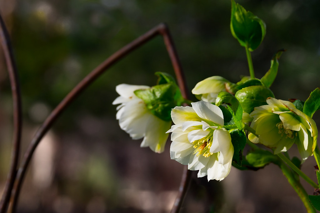
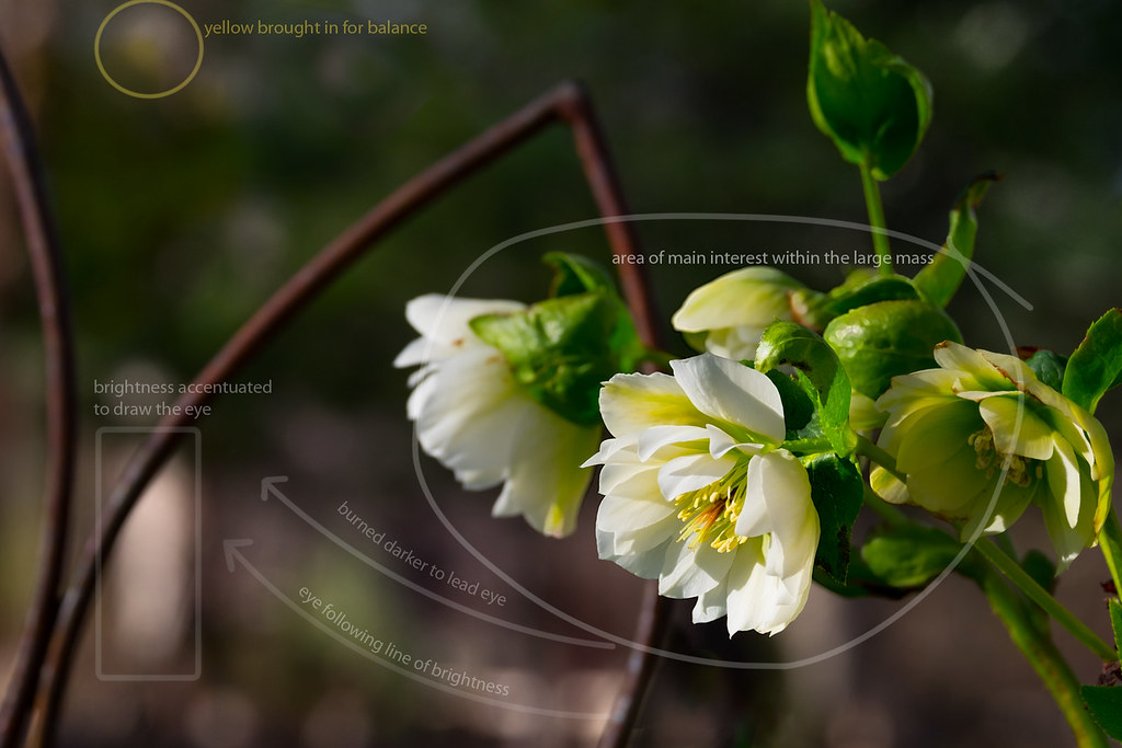
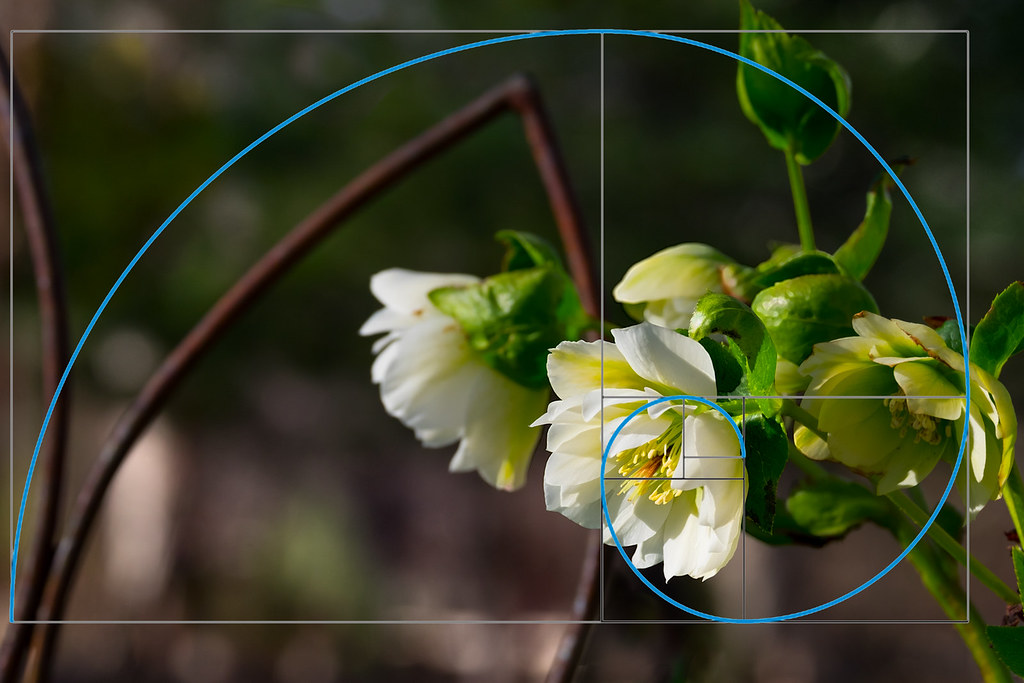
I try to place the primary visual element or main subject in frame often around that 1/3 line and then try to compose so that there is something else in frame that acts like Calder's small element at a distance. I'm editing right now a floral image shot this weekend which might illustrate this. The small elements might be luminosity related or color related; something which would tend to draw the eye toward that other side of frame momentarily.
I'm writing this now so that this becomes a "watched" thread and I can find it again after I finish editing and post to Flickr.
gk fotografie's geometric wall image in post #32 is a good example. His hello/you in post #30 is another.
His top photo in post #29 is subtle, with that large expanse of negative space pulling the eye toward the right from the highlighted mannequin.
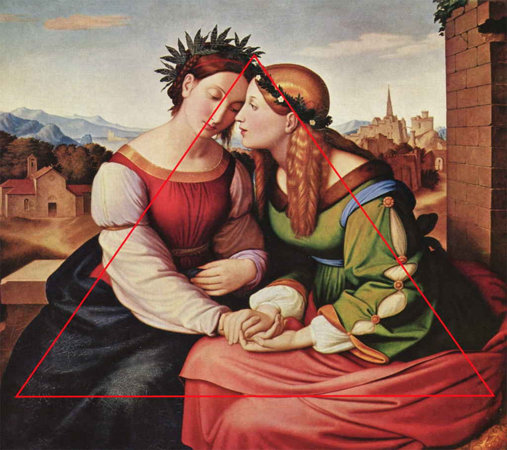
jc's vertical balance in post #28 is a great example using the diagonal between the mother and child with eye contact and the child's reaching hands providing connection.
Well, anyway, back to the editing.
Thank you, I've taken the images without knowledge of the theme of this weekly challenge. It seems that what I learned as a photographer and designer long time ago, is simply ingrained in my memory. Despite my diverse creative escapades, I'm still the same 'old school' photographer who unnoticed applies all the rules concerning composition, color etc. I see that many people indeed think of 'symmetry' when it comes to balance, while a balance in composition can also be achieved through repetitive patterns, light/dark proportions, hues and in many other ways. Nevertheless I think this is a very nice challenge!
GK those are great examples and wonderful photos as always.
Someone mentioned consistency early in the thread which I think is necessary to keep in mind with information online. Many sites are self done by someone who may not have adequate knowledge or experience or who may not understand a concept or not know how to explain it well. There are sites that will use an article submitted whether the person who wrote it has much expertise or whether it's well written or accurate or not.
If you search 'elements' and/or 'principles' of composition in 'art' instead of photography it should bring up some reliable resources. These art resources on composition seem consistent with what's generally known and used across the board.
Principles of Design
Composition and Design Principles
Balance - Revision 1 - GCSE Art and Design - BBC Bitesize
The Artist's Toolkit: Encyclopedia: Balance | ArtsConnectEd
http://www.getty.edu/education/teachers/building_lessons/formal_analysis2
Thank you for the compliment, you nailed it, for everyone who wants to become a 'good-better-best' photographer it's much better to look at websites about Design, Art or Architecture/Interiour design and read good books about composition, color theory, etc. than to gather so-called "knowledge" through all kinds of dubious photography websites where nonsense is often proclaimed. Composition and color theory aren't specifically something within photography and it's therefore a good idea to step into a (local) library for borrowing study books that are used at the universaties in Art courses or courses for Architects, Interior designers etc.
The balance is in the subject. It is the color.
View attachment 170339
Beautiful, when I saw this I immediately had to think of a piece of jewelry from Lalique that I saw years ago in the Gulbenkian Museum in Lisbon. (
https://gulbenkian.pt/museu/works_museu/peitoral-libelula/)
Is this taken with the Fuji GFX?
BTW, thanks for the POTM nomination, I feel honored!
")


![[No title]](/data/xfmg/thumbnail/36/36666-189f65b1addbb68da2a43dc6f7206a01.jpg?1734169172)
![[No title]](/data/xfmg/thumbnail/34/34691-2fa9779b0e77f698b193a633b9242553.jpg?1734165697)


