ewick
TPF Noob!
- Joined
- Dec 12, 2011
- Messages
- 464
- Reaction score
- 73
- Can others edit my Photos
- Photos NOT OK to edit
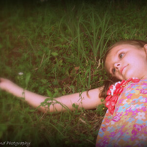
So here are the settings in general. nikon D90 with a AB1600 through a beauty dish.
I am asking whats wrong with these because I just got the ASUS flip monitor and this monitor is supposed to be calibrated and what you see on screen is what your are pretty much supposed to get in print. Well, my MBP's screen seems to be really bright and my histogram shows it to be good. so I am wondering if my MBP screen is not calibrated or my new asus is the one to blame?
Of course all C&C is welcomed. so how do these images look on your monitor? Thanks for your input.
1.
 [/URL] katie by pop-a-dot, on Flickr[/IMG]
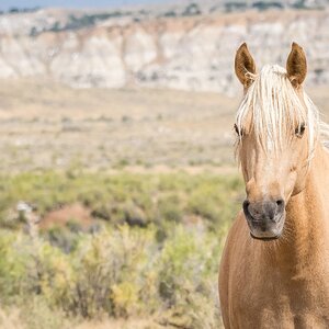
2.
 [/URL] katie by pop-a-dot, on Flickr[/IMG]
3.
IMG] katie by pop-a-dot, on Flickr[/IMG]
I am asking whats wrong with these because I just got the ASUS flip monitor and this monitor is supposed to be calibrated and what you see on screen is what your are pretty much supposed to get in print. Well, my MBP's screen seems to be really bright and my histogram shows it to be good. so I am wondering if my MBP screen is not calibrated or my new asus is the one to blame?
Of course all C&C is welcomed. so how do these images look on your monitor? Thanks for your input.
1.
2.
3.
IMG]
katie by pop-a-dot, on Flickr[/IMG] utput, luminance).