
Frequency
Been spending a lot of time on here!
- Joined
- Oct 17, 2010
- Messages
- 8,864
- Reaction score
- 683
- Location
- Calicut, Kerala,India
- Website
- www.photosenzitive.com
- Can others edit my Photos
- Photos OK to edit
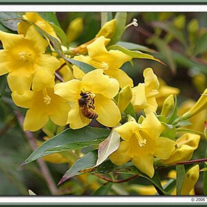
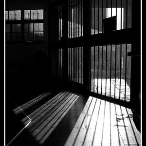
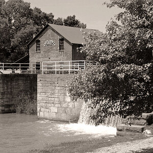
Edit has worked very well. This is a fantastic image; yet i need a bit more exposure on the foreground, retaining the overall gloom


![[No title]](/data/xfmg/thumbnail/38/38749-a4ef503184d13a9c7592221cb44ac5e8.jpg?1619738704)