Navigation
Install the app
How to install the app on iOS
Follow along with the video below to see how to install our site as a web app on your home screen.

Note: This feature currently requires accessing the site using the built-in Safari browser.
More options
You are using an out of date browser. It may not display this or other websites correctly.
You should upgrade or use an alternative browser.
You should upgrade or use an alternative browser.
Which pic?
- Thread starter Clay Olmstead
- Start date
scooter2044
No longer a newbie, moving up!
- Joined
- May 10, 2015
- Messages
- 396
- Reaction score
- 185
- Location
- South Central Pennsylvania
- Can others edit my Photos
- Photos OK to edit
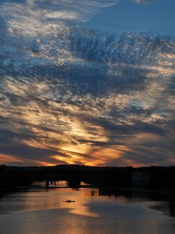
Both are very nice but the first one gets my vote because it doesn't have the plain blue sky at the top. I think you might be able to get away with lowering it just a little, somewhere in between the two you have here. It would also be nice if you could see just a little more detail in the bridge so you could differentiate it from the mountain in the background.
Marty2015
TPF Noob!
- Joined
- Jun 5, 2015
- Messages
- 14
- Reaction score
- 4
- Location
- Georgia
- Website
- www.facebook.com
- Can others edit my Photos
- Photos OK to edit
I like the first one also 
WesternGuy
Been spending a lot of time on here!
- Joined
- Dec 23, 2010
- Messages
- 5,281
- Reaction score
- 1,219
- Location
- Calgary, Alberta, Canada
- Can others edit my Photos
- Photos NOT OK to edit
I agree with the others - #1 is my favourite.
WesternGuy
WesternGuy
Clay Olmstead
TPF Noob!
Thanks. I'll see what I can do to get some detail in the shadows of the first one.
annamaria
Been spending a lot of time on here!
- Joined
- Sep 18, 2013
- Messages
- 3,595
- Reaction score
- 978
- Location
- Milledgeville, GA
- Can others edit my Photos
- Photos OK to edit
First one
OrionsByte
No longer a newbie, moving up!
- Joined
- Jul 6, 2010
- Messages
- 1,500
- Reaction score
- 261
- Location
- N. California
- Can others edit my Photos
- Photos OK to edit
I'd turn the first one in to a square crop and get rid of the top portion of the photo. 
Clay Olmstead
TPF Noob!
I see what you're saying. I'll give that a try. Thanks, BrianI'd turn the first one in to a square crop and get rid of the top portion of the photo.
ronlane
What's next?
- Joined
- Aug 3, 2012
- Messages
- 10,224
- Reaction score
- 4,961
- Location
- Mustang Oklahoma
- Website
- www.lane-images.com
- Can others edit my Photos
- Photos OK to edit
I would agree, for me, I like the first one better.
KenC
Been spending a lot of time on here!
- Joined
- Jan 18, 2010
- Messages
- 5,700
- Reaction score
- 1,472
- Location
- Philadelphia
- Can others edit my Photos
- Photos NOT OK to edit
Well, here's a vote for the second one. I agree about the blue sky at the top, but for me there is more water than necessary in the first one, and I would rather darken the sky at the top of the second and/or crop some of it out. Just my two cents ...
Clay Olmstead
TPF Noob!
Interesting ideas. I'll sit down this weekend and see what I can do.
vintagesnaps
Been spending a lot of time on here!
- Joined
- Jan 13, 2013
- Messages
- 9,119
- Reaction score
- 3,109
- Location
- US
- Can others edit my Photos
- Photos NOT OK to edit
I actually like the second one better with some adjustment. The first one has a lot of pattern in the clouds and the sky and they seem to compete in drawing the viewer's eyes. This could almost make for two pictures.
I like seeing the pattern in the clouds in the second one, but the balance could be better (seems top heavy) because of the silhouette of the bridge making for a dark shape across the composition. I'd think about a slight crop of the top and see if that looks better.
Nice getting that sky.
I like seeing the pattern in the clouds in the second one, but the balance could be better (seems top heavy) because of the silhouette of the bridge making for a dark shape across the composition. I'd think about a slight crop of the top and see if that looks better.
Nice getting that sky.
FinnelCake
TPF Noob!
- Joined
- Jun 11, 2015
- Messages
- 15
- Reaction score
- 10
- Can others edit my Photos
- Photos OK to edit
I prefer the first one as well, as that little hump on the horizon with the light protruding from it looks good in the center. However, I do like how there is more sky included in the second; the cloud pattern looks just a bit cut off in the first. Good pictures!
Similar threads
- Replies
- 20
- Views
- 508
- Replies
- 24
- Views
- 1K


